NATALYA SMITH ILLUSTRATION
  • Home
  • Summer 2021
  • 5050
  • 6050

YEAR 1 BLOG

Back to the Future

11/12/2019

0 Comments


We're in the 1980's Baby!

The 80's were an interesting time, a time of chance, politics, questionable fashion and rebellion - how fun! As well as the skinny jeans and punk rockers, art was taking big turns too, all forms of media branched off into the mainstream and the non-mainstream for each side of the social and political scale. This divide gave particularly young people a voice and a way to express themselves along side the still traditional older generation and this is what the 80's was all about. I think the 80's were pretty damn cool. 
Below are two mood boards, one embracing the mainstream of the decade and the other showing the brilliant media fuelling the youth. 

"Official"

Picture

"Non-Official"

Picture
0 Comments

Revolution in the Head

28/11/2019

0 Comments


1960's Counter Culture
Wes Wilson and his Influences

Picture
Picture
Picture
Picture
Picture
Picture
Wes Wilson is known for his classically 60's, psychedelic posters for bands and magazines, heavily embracing bright, complementary colours and his iconic - although hard to read - typeface. He really embraced using type to create imagery and didn't use a huge amount of structure in his poster designs. 
Wilson's inspiration was Alfred Roller (below), an Austrian designer who created heavily patterned paintings that were becoming very trendy in Vienna at the time due to the influence of the Bauhaus and also a lingering appreciation of Japanese art styles. His work is considered to be part of the modernity movement. 
Looking at both artists work, you can clearly see the influence Roller had on Wilson, most obviously in the typeface used but also the use of pattern and colour is similar, Wilson adjusted the style for his time by bumping up the colour and intensity. I personally really like Wilson's work because of the way it goes against what a poster should be; a poster is supposed to give you all the information you need at a quick glance whereas with Wilson;s posters, you have to put in a lot of effort to get the information from it while avoiding a headache from the bright colours and the hard to read type. 

Alfred Roller 

Picture
Picture
Picture

Lecture Notes

Picture
0 Comments

American Mid-Century Illustration

18/11/2019

0 Comments


Boring but Beautiful

Below is a selection of American post-war illustrations, a time when the Americans were rich on war profits. these images show very mundane situations that have been beautifully illustrated. (Norman Rockwell is a personal favourite) 
Row 1: Norman Rockwell
Row 2: Bernie Fuchs
​Row 3: Robert Weaver
0 Comments

Fashion Editorial

18/11/2019

0 Comments


Chaeyoung for GQ Korea magazine

The above gallery is Son Chaeyoung modelling for GQ Korea Magazine. Of the 9 images, 5 are in colour and 4 are greyscale, with minimal colour in the full colour images. Each picture has a different pose and frame, with some close face shots and some full body with landscape, portrait and square frames. Theres both more casual and some "high fashion". To me, the narrative shows different sides of her personality. 
For model choice, Chaeyoung isn't the "standard" model as she is 5'2" and obviously taller models are usually preferred. She is an icon in Korea for her opinions and carefree attitude as she confronts the standards in Korea such as having tattoos and wearing fashion that isn't the norm. 

ATEEZ for DAZED magazine

Picture
Above is ATEEZ for Dazed Korea Magazine, with photography by Kim Youngmin. This set of pictures has a really hazy, relaxed and casual vibe with the warm and muted colours and the mostly serious expressions of the models. They have a "boyfriend vibe" to them which is used to market towards women.
The models are between 5'6" and 6'1" in height which doesn't really mean much but the taller models are emphasised with shots taken from below to show off their height. 

Lecture Notes

Picture
0 Comments

High Modernity

11/11/2019

0 Comments

 
Richard Hamilton was a London born designer who spent most of his artistic career producing prints and collages. His work often focused on the idea of the future and what life might be like as technology and arts advanced over the years as this was happening more and more rapidly at the time. The collage below shows very misogynistic views with the naked lady on the couch, young romance poster and cleaning lady. It suits the male gaze with the "ideal man" and again the sexist imagery. 
Below is my version of a room from the future, obviously I took a more comedic approach but I realised how hard it is to envision what the future might be like as its hard to imagine what you don't have (wise words, I know). I did have fun making the collage despite not at all being a fan of collages. 
Picture
Picture

Lecture Notes

Picture
0 Comments

The Ulm School of Design

29/10/2019

0 Comments


Johannes Itten 

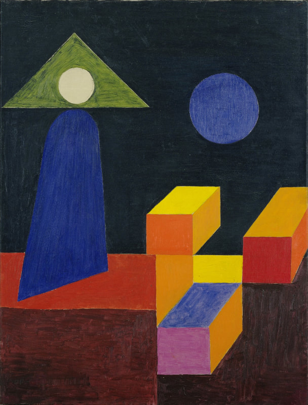
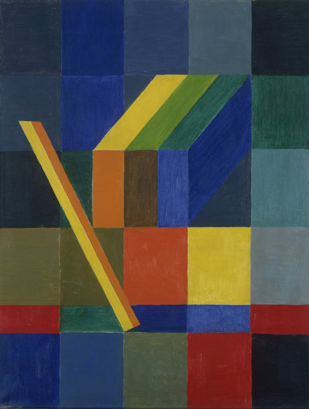
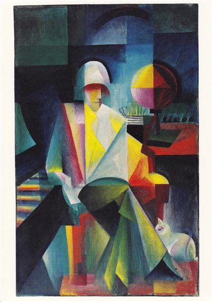
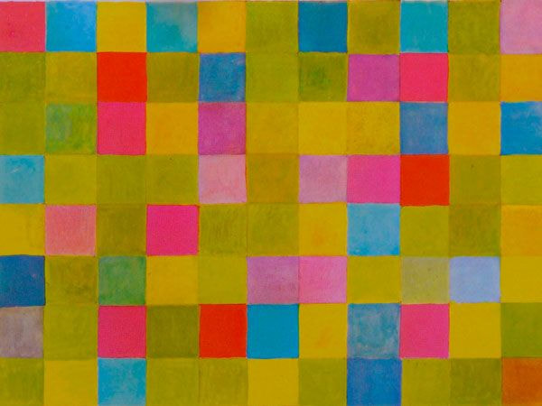
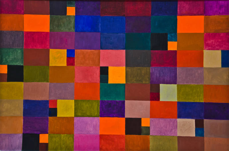
Johannes Itten was a Swiss expressionist painter who taught at the Bauhaus and then later at the HFG Ulm. His work focussed deeply on colour theory and he wrote books explaining his findings in relation to colour. His work were abstract and expressionistic but the main focus was always the colour. 

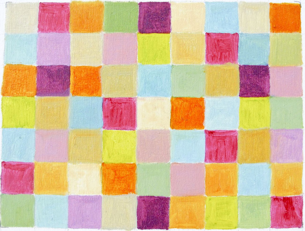
He taught on the preliminary course where he explained to his students his "seven types of colour contrasts" theory that he developed. The seven contrasts are; hue, value, temperature, compliments saturation, extension and simultaneous contrast. This gave his students a superior understanding of how to use colour. Itten also developed a few colour wheels and some colour palettes that were based on moods and seasons. He was strongly into meditation and used this as a way to develop inner understanding and intuition which he accredited his work to. 

Ittens seasonal colour palettes influenced cosmetics companies shortly after his death and are still used in fashion and cosmetics today because of his incredible colour schemes and how well they represent the seasons they were made for. Itten's influence was felt in almost all media though because he had such a profound understanding of colour and was kind enough to share it with.

Itten's idea of the purpose of the Bauhaus caused conflict among the other masters because while the others wanted to push the bauhaus towards manufacturing and producing products to reproduce and sell, Itten believed solely in artistic expression and self discovery. The Bauhaus did end up becoming heavily involved in manufacturing and while this displeased Itten, he continues to teach there until the school was dissolved. 
Picture
Picture
Picture
Picture
Picture
Picture
Picture
Picture
Picture
Picture
Picture
Picture

Lecture Notes 

Picture
Picture
0 Comments

Print Workshop

25/10/2019

0 Comments


Lino Cutting

Picture
Picture
Picture
Picture
Picture
Picture

Etching

Picture
Picture
Picture
0 Comments

The Bauhaus

25/10/2019

0 Comments


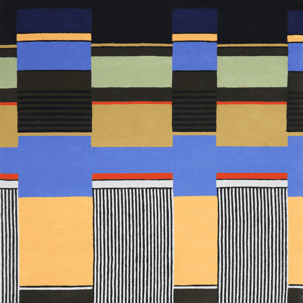
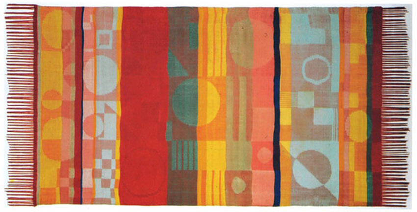
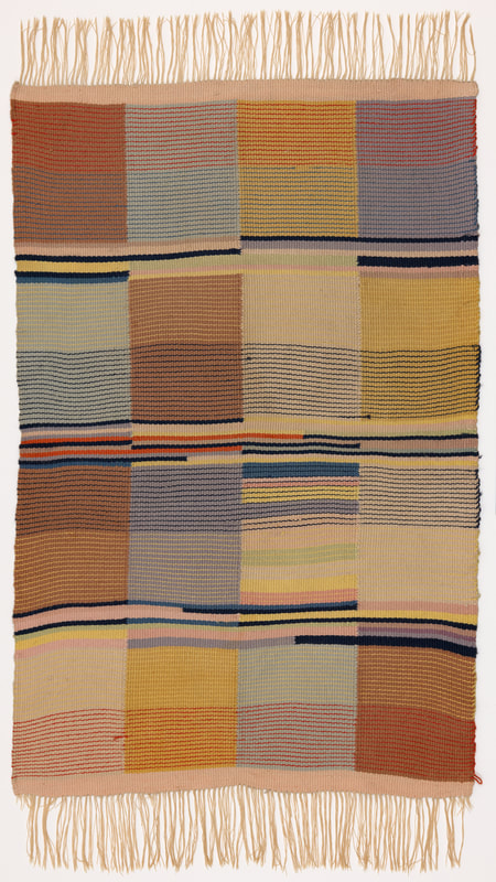
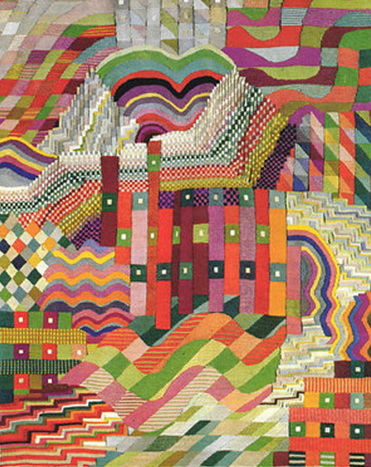
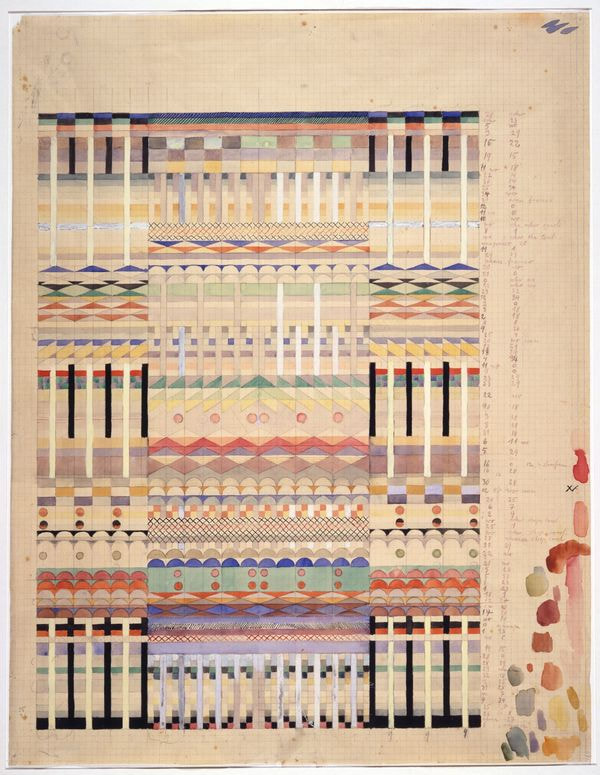
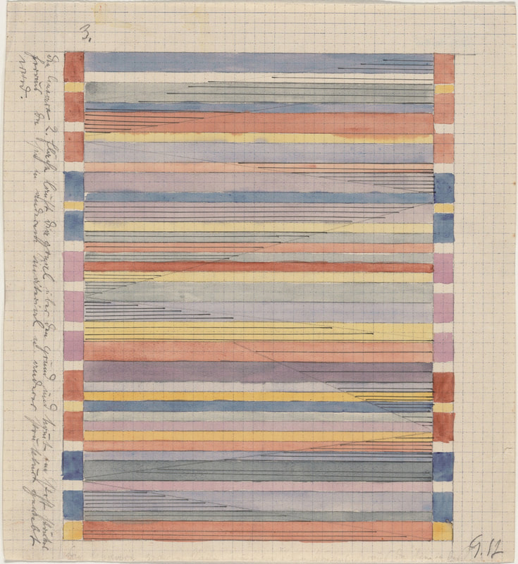
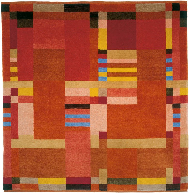
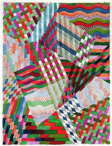
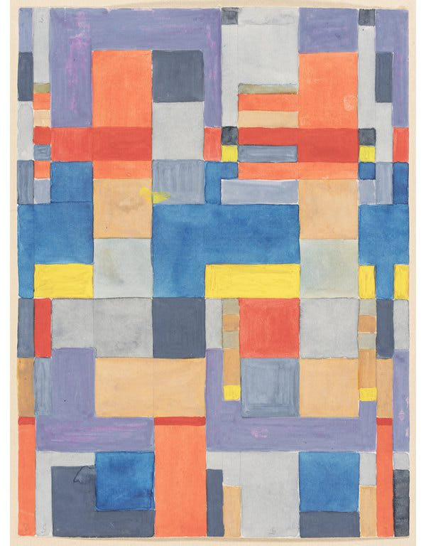
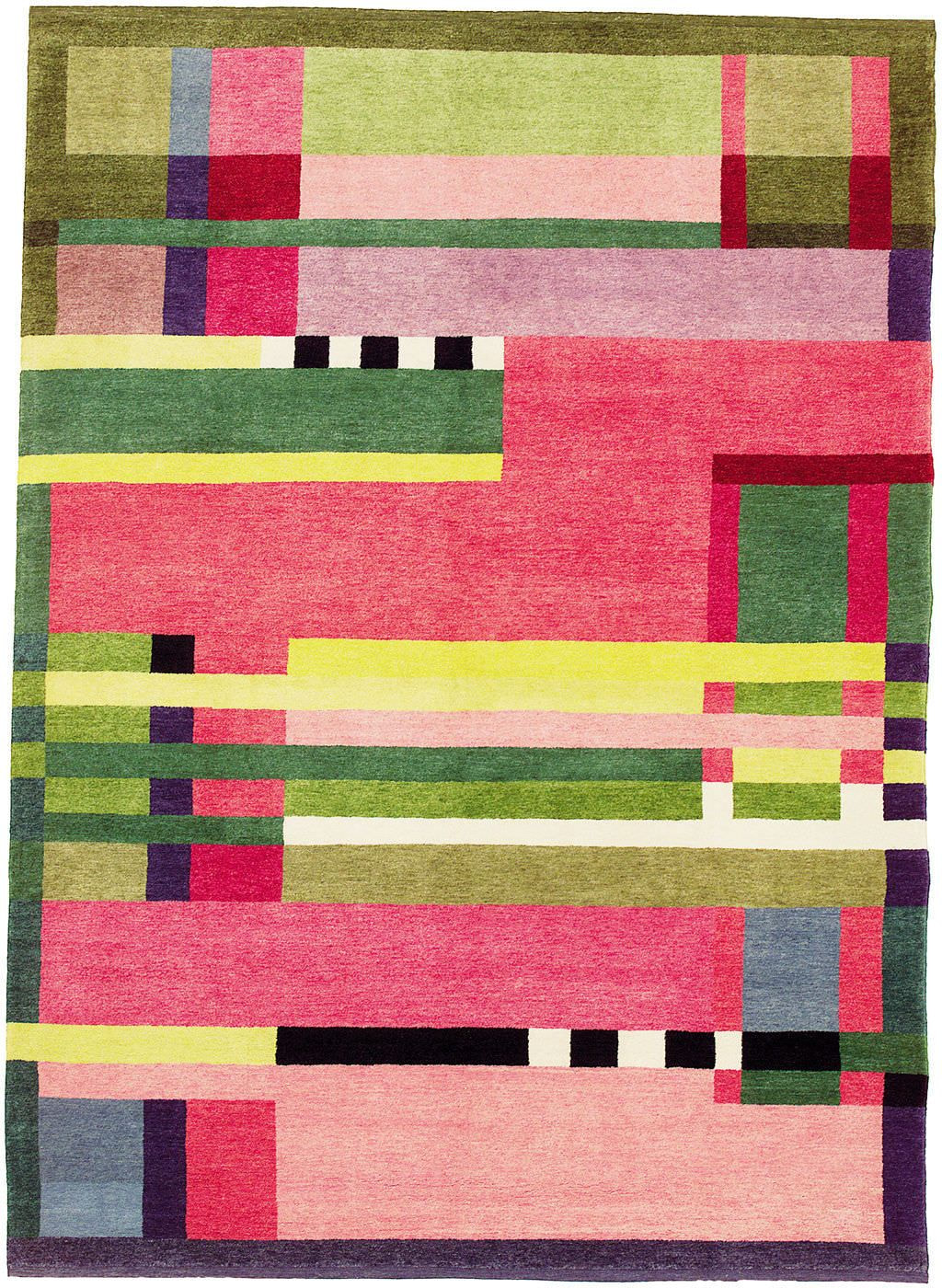
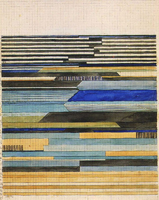
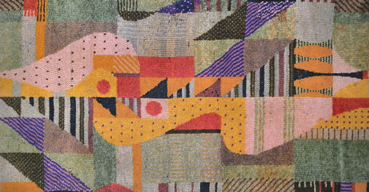
Gunta Stolzl

Gunta Stolzl was the first female master at the Bauhaus, teaching in the weaving workshop which was the only workshop that female students could access for much of the Bauhaus' time. She created this department to increase the number of female students attending the Bauhaus because the idea of the Bauhaus was to be essentially limitless and creativity should be open to anyone. 

Gunta developed a style of weaving that incorporated modern art into textiles, applying the Bauhaus teachings on colour theory, composition and abstract art while also creating practical products that could be sold with a purpose. Almost all of Gunta's large knotted rugs and tapestries were sold at the Bauhaus exhibitions along with other projects she took on such as chairs with textile coverings and straps and abstract artworks on paper inspired by Paul Klee and Wassily Kadinsky; fellow masters at the Bauhaus. 

Gunta dedicated her life to the art of tapestry and weaving and continued to produce beautiful textiles all the way until her death in 1983 aged 83. Her passion for both the arts and teaching was immense and she threw so much passion into her projects and her students alike. After her death, her daughter discovered a file of plans for future projects and samples of materials and colour schemes. Her former students also carried on her legacy by continuing to produce textiles influenced by her. 
Picture
Picture
Picture
Picture
Picture
Picture
Picture
Picture
Picture
Picture
Picture
Picture
0 Comments

Russian Constructivism

15/10/2019

0 Comments

 
​
Picture
Picture
Gustav Klutsis, 1930                                                          El Lissitzky, 1919
Above are two examples of Russian Constructivism, both created with strong political outlooks to convey a message; propaganda. Klutis' poster is mainly collage whereas Lissitzky's is just ink but they obviously favour the same colour scheme that has become so iconic and indicative of constructivism. The composition is also similar with the diagonal format. Both pieces keep text to a minimum to let the image have the impact, in Klutis' case this is the saluting hands and figures among them and with Lissitzky's it is the way the shapes look as though they have collided, with shards flying off; representing volatility and conflict. Both pieces give the feeling of unity and fighting a common cause which was important in the country during the early 1900's. 

Lecture Notes

Picture
Picture
0 Comments

Screen Printing Workshop

9/10/2019

0 Comments


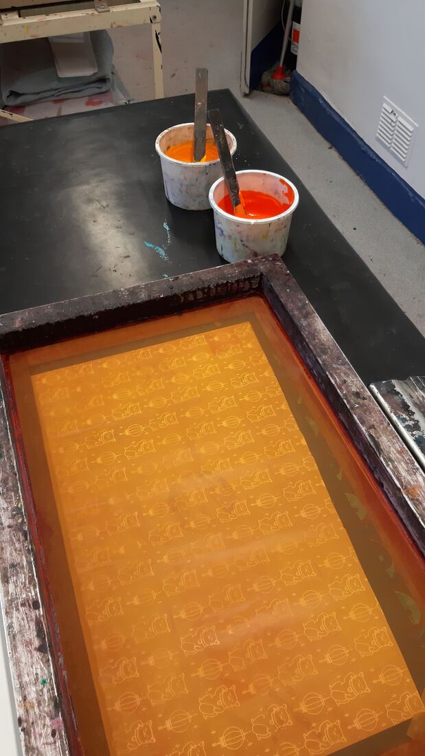
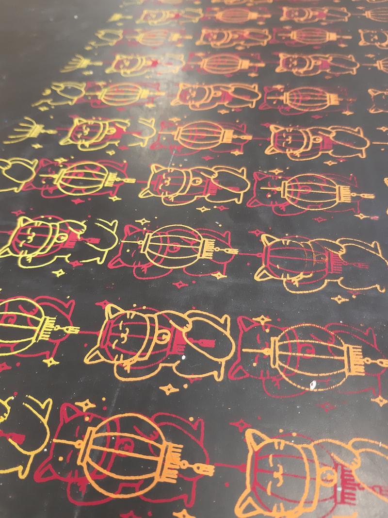
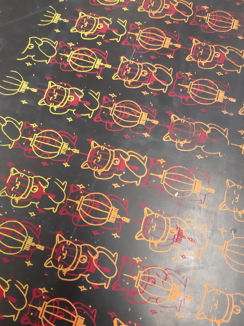
SCREEN PRINT 

Design

Picture

First Print

Picture
Picture
Picture

Second Print

Picture
Picture

Some nice looking leftovers

Picture
Picture

​LASER CUT

Picture
Picture
0 Comments
<<Previous

    Archives

    December 2019
    November 2019
    October 2019
    September 2019

    Bibliography

    blog_bibliography..docx
    File Size: 15 kb
    File Type: docx
    Download File

Site powered by Weebly. Managed by 34SP.com
  • Home
  • Summer 2021
  • 5050
  • 6050