Project 3Weeks 5, 6 and 7Decision Making
In the new brief we have been given four choices and within each choice there are more to be made so right when I saw the brief I sat down, read it all through and made notes to decide which project I want to do. (option 4 isn't in my notes but it was illustration based on lyrics and it just really didn't appeal to me) So once I made some notes I followed all the links through and decided on the ones that spoke to me and I've settled on option 3 which is "early readers children's book" and of the two options given I have picked Rudyard Kipling's "How the Elephant got its Trunk". I'm super excited for this project, I've got three weeks to produce 1 double page spread, 1 single page illustration and a front cover design. I want to be really ambitious with this project and try to really out-do myself.
In my notes I basically just decide what I want to do and some really basic first ideas on how I could execute this so that I know where to direct my research and what kind of things I might need to acquire to make this happen. I'm going to look into effective children's books and particularly at Martin Salisbury's book on the subject as well as find out what kind of colours and compositions are often used in this kind of illustration. I'm thinking using fabric and embroidery as my medium but I need to get some research about that in before I make my decision - I have plenty of experience with embroidery but not in this kind of context but I have some ideas on how I could make it work. Another thing to consider with doing embroidery that I hadn't thought of in my notes is the time scale, once I've decided what I'm doing I'll have to draw up a schedule for myself to keep to.
Research and Inspiration
So the very first thing I did was look up Martin Salisbury as the brief suggested in this section and saw his books on creating children's illustrations... then I saw how expensive they are. Lucky for me some people on eBay didn't know how much they could've sold their copies for and I snatched up "Illustrating Children's Books: Creating Pictures for Publication" which was published in 2004 and "Children's Picture books: The Art of Visual Storytelling", published in 2017. There is a second edition for that book but I couldn't find one second hand and I'm sure the first edition will be great anyway. While they make their way through the post I had a look at some other helpful stuff;
I'm enjoying the spreads where the text isn't overlaid on the image but they interact on the page together around each other on a blank background. I do think something could be done with the background though but I'm definitely enjoying this kind of approach to combine the elements.
Oliver Jeffers
I've got a massive soft spot for Oliver Jeffers' work, particularly "Lost and Found" so I had a good look at a load of his work and put together some of my favourites below. There's something about his work that I find so magical and I would love to be able to give that kind of feeling with my work.
Thumbnails and Ideas
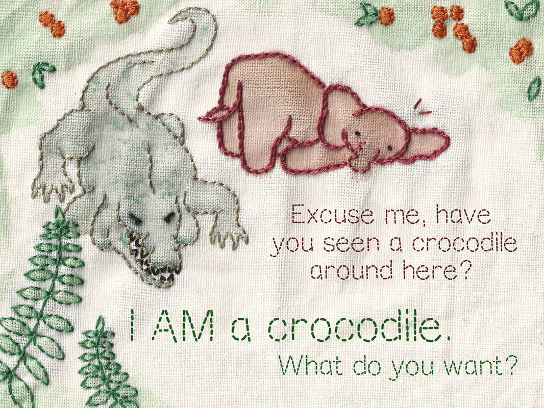
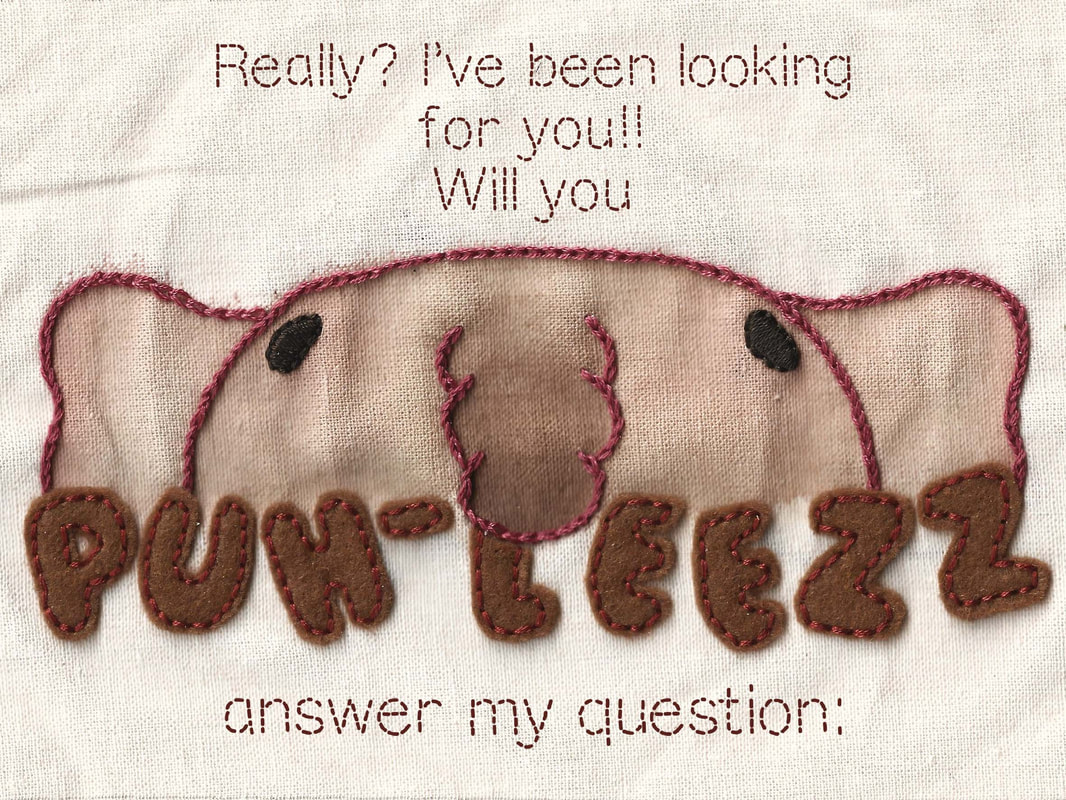
I wrote out the entire story because I thought it would really wedge it into my head, it worked but I definitely didn't need to do that. I picked out some lines that I had a really strong mental image with and this is where my first thumbnails will stem from for the double page and the single page. I also doodled down what I was imagining this little elephant looked like and I'm in love with him. He's not a final design obviously but for the first time in my life I got the exact image from my imagination onto paper so that's nice, he won't stay this way though because I need the style to match the medium better.
Above is my thumbnailing and working-things-out process. Kind of messy particularly in the beginning because I was going back and forth between different things a lot but I got there eventually.
I decided to pick Botswana as my setting just so I could research more specifics to the area. It's not an information book but I'd still like the elements to be accurate and Botswana has the biggest elephant population in Africa. I found 10 plants that are native to Botswana because I want to use plants as decoration. While looking for them the colour orange really stands out and that's great because I want to include orange in my colour scheme.
Feeling very inspired by these Dulux paint colour swatches, mainly the middle two and top two on each square. I want to use colours that are visually appealing but also obviously relate to the setting which is Africa so these are the sort of tones I'm liking for that.
Martin Salisbury
I got my hands on two Martin Salisbury books that were going for cheap on eBay, I got "Illustrating Children's Books: Creating Pictures for Publication" and "Children's Picturebooks: The art of visual story telling". They're both full of great stuff so I've just put below some of the pages that were most useful to me for this project.
Process
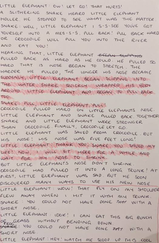
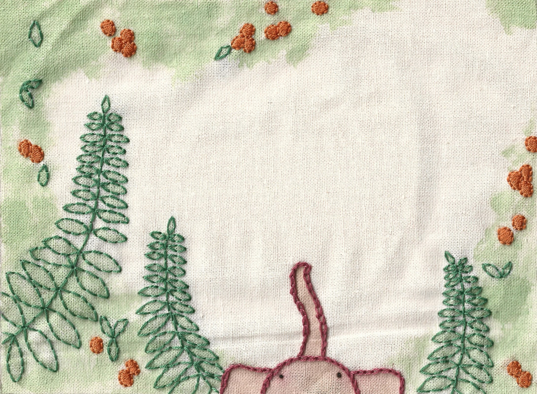
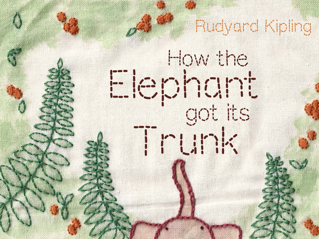
These are my four pages, the cover first then the single page and the last two are the double page. These are my final designs that I will use as a "map" for my embroidery. The colours in the drawings aren't spot on by any means but they give the right indication to me while I'm working. They're the exact size that the embroideries will be which is 20x15 cm and again this is so I can follow them as I work.


​I made this project bigger than it needed to be but it certainly paid off. It took me a good while to get the embroidery done but it was worth it. I left wrinkles in the fabric when I scanned them in because I like the way it looks, I feel like it keeps the handmade, authentic feel and to me it feels friendly? Not sure how to describe what I'm meaning but I like it anyway so that's why its like that.
Outcomes
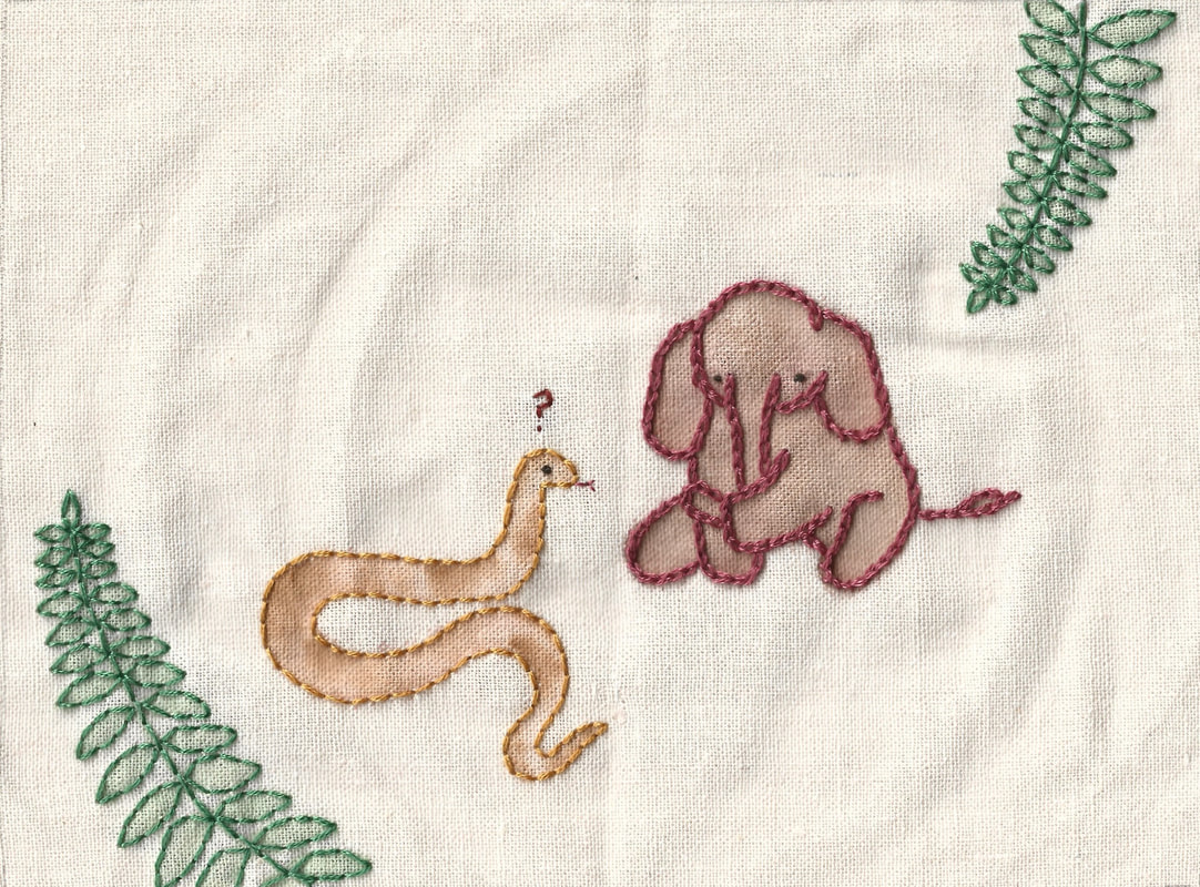
So here are the finished pages! I'm SUPER happy with what I have made. I used an embroidery font I downloaded for a few reasons, I knew if I had hand embroidered the text it would have never come out clean, neat and easy to read and with this being a children's book, it needs to be easy to read. I think the font has a good mix of obviously looking like stitching but being super clean and legible.

I made some mock-ups of the book to see how it could look in person. This is my first time making mock-ups because I didn't know how to do it and I thought it was super hard to do. I was wrong. They were so easy to create with these ready made photoshop documents, I do want to learn to make my own template from scratch though because with this one, I couldn't find a template that was the exact size of my pages - luckily I knew this might happen so I left space around the edges of my pieces that was fine to lose. I love these mocks so much and I'm super excited to start mocking all my work up! :)
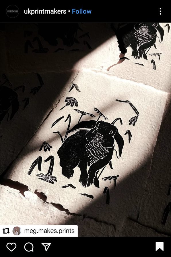
Instagram Posts of the Week(s)
0 Comments
Project TwoWeeks 3 and 4The Brief:
A very very brief synopsis of the story is; Richards buys some binoculars from Baxter and lends them to Fanshawe and when Fanshawe looks through them he is able to see things that are no longer there like gallows and crowds up on a hill and a tower in a village that is no longer there. Richards servant has stories to tell about Baxter being suspicious but Fanshawe wants to go to the village and the hill to see if what he thought he saw was really there, it wasn't. He tried to used the binoculars to read something in the church but couldn't see though them so concluded that they must not work inside. On gallows hill there is only woods and as he walks through he feels like he's being watched and chased and he feels a hand on his shoulder. He stumbles upon three large stones that he finds suspicious and he avoids them, eventually getting back to Richards place at 9 o clock. The servant then tells his story about Baxter boiling down bones and making a mask from part of a skull and eventually one night leaving his shop and speaking in a voice that didn't belong to him. He disappears and is later found between the three stones on Gallows hill with a broken neck. Richards and Fanshawe try to use the binoculars once again the next morning and discover that neither of them can see through them. Fanshawe drops them and they crack and a black, smelly liquid oozes out. Its pieced together that the men hung on gallows hill were dumped on the stones and Baxter had been and stolen their bones and boiled them in a pot. He put this liquid into the binoculars to "see through a dead mans eyes" but the spirits felt extremely disrespected by his actions and killed Baxter.
Research and Inspiration
I also collected some pictures of various time-appropriate things that I feel like will be helpful to me. Thumbnails and IdeasWith the full page illustration since I'll be printing black ink onto coloured backgrounds I think I'll try a few versions out, like one with the colours as expected and then some printed onto a gradient background. It took me quite a while to arrive on an idea that I felt would work for the full illustration, I wanted to do it so that we were close up in the crowd with the horse and cart because I thought the detail in that on lino print would be really beautiful but it just didn't feel right and I couldn't get the composition to work how I wanted so I took a step back, almost in a literal sense and went back to the story. When Fanshawe sees this scene he's looking through the binoculars from a fair distance away after all so I went back to the idea of being far away from the scene and I got something I was finally happy with. In terms of the chapter header it didn't take me long to design something I was happy with. I constantly went back and tweaked it and tried slightly different things out but ultimately the idea was there pretty quickly and I'm really happy with it. I briefly wrote it on one of my thumbnails but when I read books as a kid I loved the mystery of a chapter header. I loved when they seemed so obscure and you couldn't understand what it meant until you got to that point in the story so that's what I wanted to create with this. ProcessAfter waiting around all day for my Amazon delivery, I'm ready to get going on producing my stamps. I'm so excited to get going and just spend some time listening to music and cutting away at the lino :)
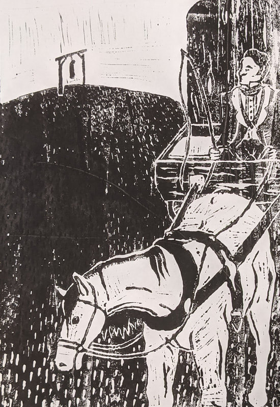
Here's my first lino cut and my three first prints. Print 3 is definitely really close to what I had imagined while I was thumbnailing so I'm very happy about that. I will admit that there was blood lost over this print but has anyone ever done a lino cut without shoving the blade into your finger at some point? Clare Leighton
I had a look at some of Claire Leightons work because its got the sort of look I'm going for and a similar process, hers are etchings but it still applies well for what I'm doing and I like the way she handles the perspective of the scene and that something I want to be considering in my piece.
Its a shame that my best thumbnails and the ones I'm taking forward are so small but that's just how it goes sometimes. I'm deciding to have the horse right in the foreground to get some really nice detail in there with the print and to really break the composition up. The horse and cart takes up half of the frame within a diagonal line from the top right to bottom left corner. This composition was a suggestion from Dwayne and once I tried it out I really like it. Dwayne emphasised that this piece isn't being used to communicate information or a deep message so its aesthetic value is really important and this is definitely going to make it look really great.
OutcomesThat took so much longer than I had anticipated. This is definitely the messiest project I've done so far, thanks to the giant pile of lino shavings, the spilled ink and the dozen failed prints. I can't pretend like it wasn't fun though; below are the results. Chapter Header I photoshopped the header print onto some book paper for that authentic™ look. I think it's really cute - as cute as a spilled pot of bones and water can be I suppose. I initially thought I wanted to redo this print but this one really grew on me and especially after cleaning it up a little in photoshop I'm really happy with it. Full Illustration    
 This print took me a couple of days to finish cutting and it was heart breaking when I just couldn't get a good print of it. I think the ink I bought wasn't exactly up to the quality it said it was so I REALLY struggled to get a good clean print. This was my best one and I still had to clean it up in photoshop but I had to keep reminding myself that this is the exact reason I wanted to do a lino print in the first place and the imperfections are part of the charm of the piece. Since I struggled to get good prints I didn't print onto coloured backgrounds like I thought I would because it was just too unpredictable so I used the magic of photoshop to do that for me and as you can see I tried a few things out that I had wanted to do with actual backgrounds. The orange was a fluke because I was thinking back to one of the pieces that really inspired me and I loved the orange colour used so I tried it and with the white highlights I really love it. In feedback it was suggested I put a paper texture on the finished piece so there's two different versions of that and I think they look a lot better than it did without it.  Just to finish off, I made a version of the header that matches the final illustration that I'm happy with just to see what it would look like and I think it's pretty cool!  Instagram Posts of the Week(s)Project OneWeek 1 and 2The Brief:
The main gist I got from the article is that the writer is pretty heartbroken about Debenhams closing down and this meaning the demise of the high street in a "nation of shopkeepers". A prevalent theme was blaming online shopping on killing the high street which I won't disagree with I just don't see it as such a horrible world changing issue as the article makes it out to be. But this idea of ONLINE SHOPPING IS KILLING THE HIGH STREET is what I'm deciding to focus in on because after doing some quick initial thumbnails just getting my ideas onto paper I think I've come up with a really good way to illustrate this and I think the gif will be really effective. Thumbnails and Ideas
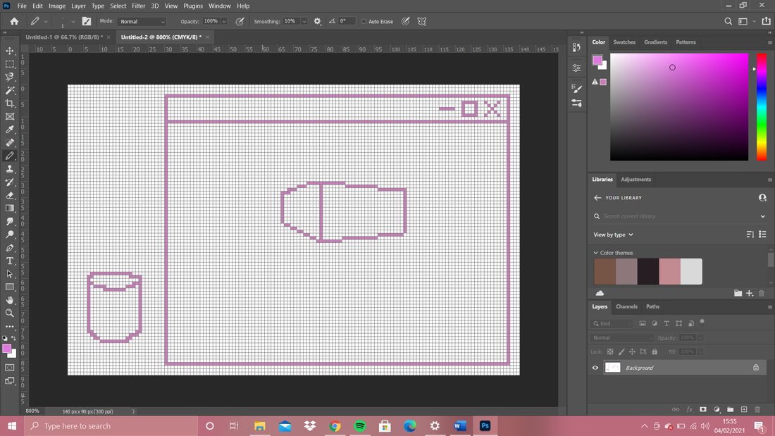
Above was just my very initial ideas and notes just to get everything out of my head and onto paper so that I could start to make sense of it. Next thing to do is some bigger, properly scaled colour thumbnails :) So my idea is to have Debenhams be deleted with a mouse cursor to bring the online aspect into it and to treat the illustration with the same dramatic conclusion as the article did. I can picture the kind of style and colours I want to use but I cant quite get it out yet so a lot of my research and inspiration will be looking for that. Right now I think my plan is to make two paintings, one with the background and Debenhams and the second with just the background and I'll paint the mouse cursor and delete cross separately and add it all together in photoshop, ill add the little "poof" marks onto the painting of just the background after it has been scanned in because it seems like a waste of time to do a third illustration for it. For the stand alone illustration I'm thinking of using a frame from the animation where the mouse is hovering over the cross but I could add an error message that has popped up on the screen saying something like "are you sure you want to delete the high street?".... Ill work on it.   So. After a while of sketching and trying to figure out what point I'm trying to make and how I want to do it, I've come up with a new idea. I'm thinking of having a cursor hand reaching into the image and plucking the Debenhams out and putting it into the desktop trash can - going back to the quote in the article saying the loss of department stores leaves a hole in the heart but this way it leaves a hole in the picture. How ill do it now is ill paint the whole background with the desktop and window and the image inside of it and ill paint the Debenhams building separately so that it can be easier in photoshop for me to place it down on the image and move it around. I had a go with my Posca pens for these images but I forgot how often posca's leak so I probably wont be using them for my finished piece.  I tried to figure out some colours as well as making the perspective make sense, I'm not happy with these colours but at least I know exactly what I don't want to do. I'm tempted to digitally colour this piece since I'll find it easier to get the exact colours that I want but I don't want it to be too digital heavy, I want it to have the hand made charm since I really like that look. I'll probably scan the sketch in and if I'm not happy with my colours by the end of it then I have a backup to do digitally. Research and Inspiration
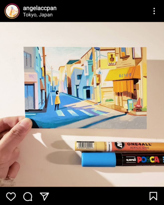
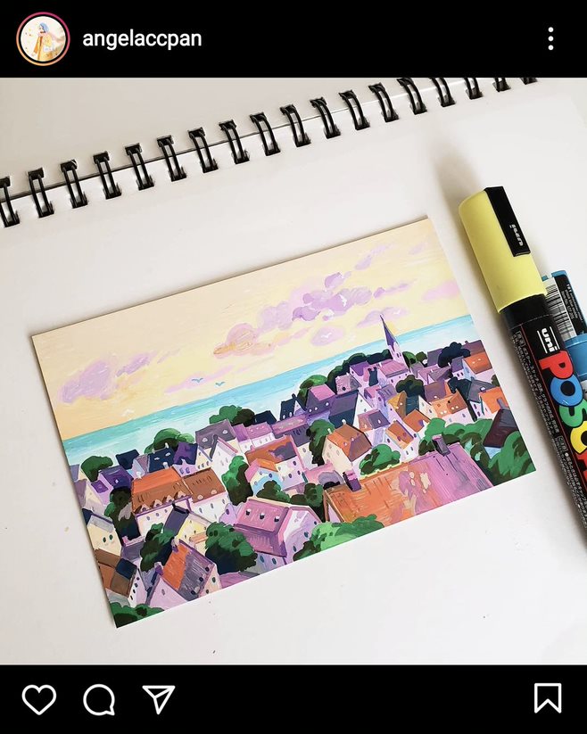
Angela Pan
I really like these illustrations by Angela Pan, they have the soft and pleasing colours I'm looking for and I really like the interesting view points. I have been following her account for a while now and I know she works using Posca pens a lot and I do have a collection of Posca's so I definitely want to try this way of working, I'm not certain if my finished outcome will be produced this way though as I think I want to try alcohol markers and maybe gouache too and see which gives me the results I'm looking for. ProcessI wanted to try something I've never done before so I attempted to make this piece on photoshop in pixel art, I followed a really good tutorial to set up the canvas and grid and I enjoyed trying it out but I'm just really unsure about how it looks. Its quite cute but its not exactly what I imagined. I think I would need more practice at doing pixel art before trying something this ambitious.
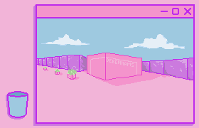
The IllustrationWhat I wrote above? Yeah ignore that. I went for the pixel art anyway and I think it looks great! I did a few versions that are all slightly different, I think 2 and 5 are my favourites, to me they are the most effective of the bunch and I suppose its the preference of whether the pop-up boxes are there or not. 1 - as I imagined it would look 2 - only slightly different but the bin is also highlighted to make it more clear 3 - I wanted to try using the pop-up box idea that I had thumbnailed right at the beginning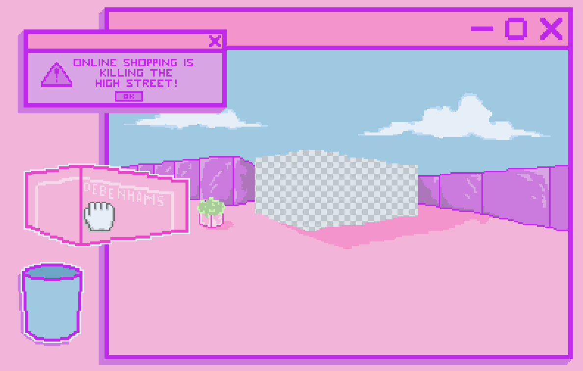 4 - more pop-ups make it look more urgent and also more annoying 5 - more dramatic, boxes popping up everywhere The AnimationWho knew making gifs was so fun? This is the first time I've made an animation of any kind other than maybe a few stop motions when I was young so there was a bit of a learning curve... and by a bit I mean I spent an entire day watching videos, reading articles and tutorials and trying to do it myself. Long story short I struggled for a long time until it suddenly clicked and I made the first animation in about 30 minutes. The first animation is exactly what I thumbnailed and I love it, I think its really cute and it does exactly what I want it to. The second gif is just because I was getting carried away with the pop-up idea on the illustration and I thought it could be fun to try it out as an animation. I really like this one too but it wouldn't be suitable for the brief because without the rest of the context it doesn't really make sense.
Instagram Posts of the Week(s) |