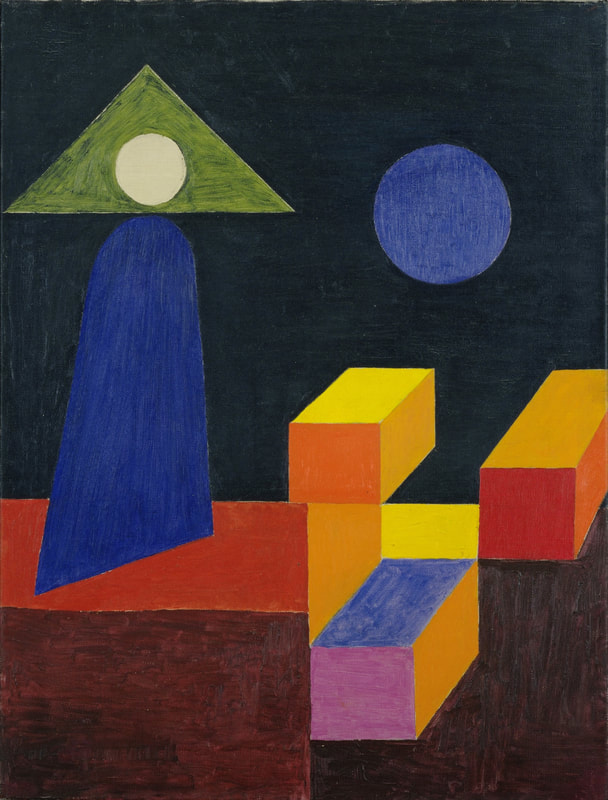
Johannes IttenJohannes Itten was a Swiss expressionist painter who taught at the Bauhaus and then later at the HFG Ulm. His work focussed deeply on colour theory and he wrote books explaining his findings in relation to colour. His work were abstract and expressionistic but the main focus was always the colour. He taught on the preliminary course where he explained to his students his "seven types of colour contrasts" theory that he developed. The seven contrasts are; hue, value, temperature, compliments saturation, extension and simultaneous contrast. This gave his students a superior understanding of how to use colour. Itten also developed a few colour wheels and some colour palettes that were based on moods and seasons. He was strongly into meditation and used this as a way to develop inner understanding and intuition which he accredited his work to. Ittens seasonal colour palettes influenced cosmetics companies shortly after his death and are still used in fashion and cosmetics today because of his incredible colour schemes and how well they represent the seasons they were made for. Itten's influence was felt in almost all media though because he had such a profound understanding of colour and was kind enough to share it with. Itten's idea of the purpose of the Bauhaus caused conflict among the other masters because while the others wanted to push the bauhaus towards manufacturing and producing products to reproduce and sell, Itten believed solely in artistic expression and self discovery. The Bauhaus did end up becoming heavily involved in manufacturing and while this displeased Itten, he continues to teach there until the school was dissolved.
Lecture Notes
0 Comments
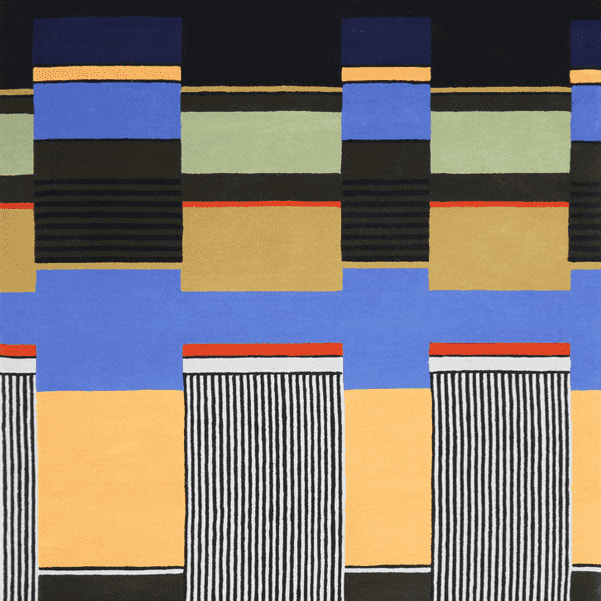
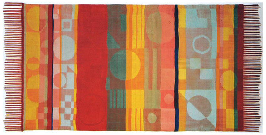
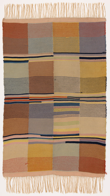
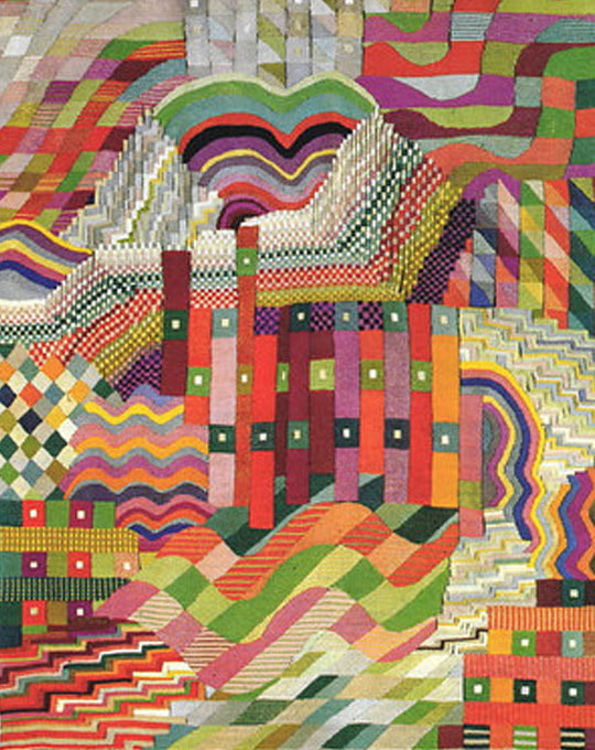
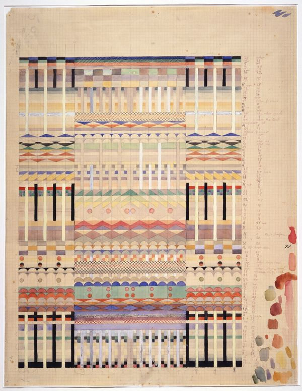
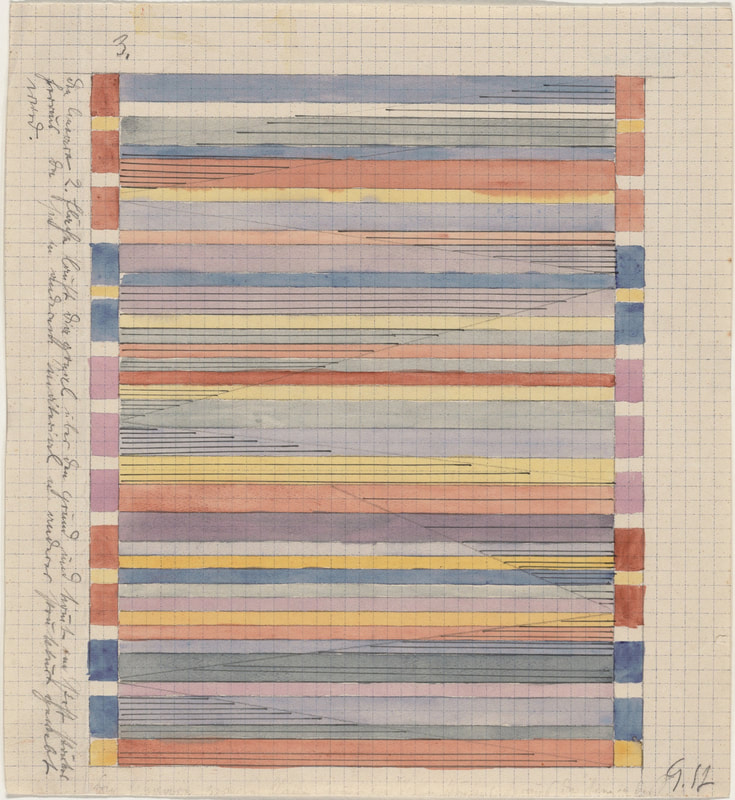
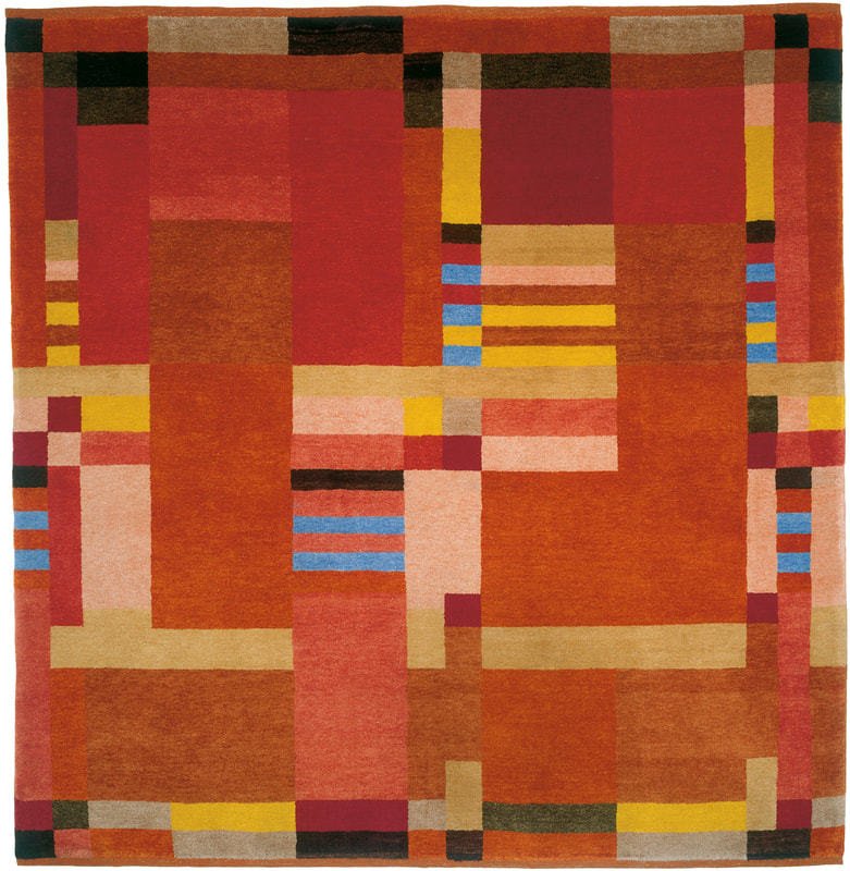
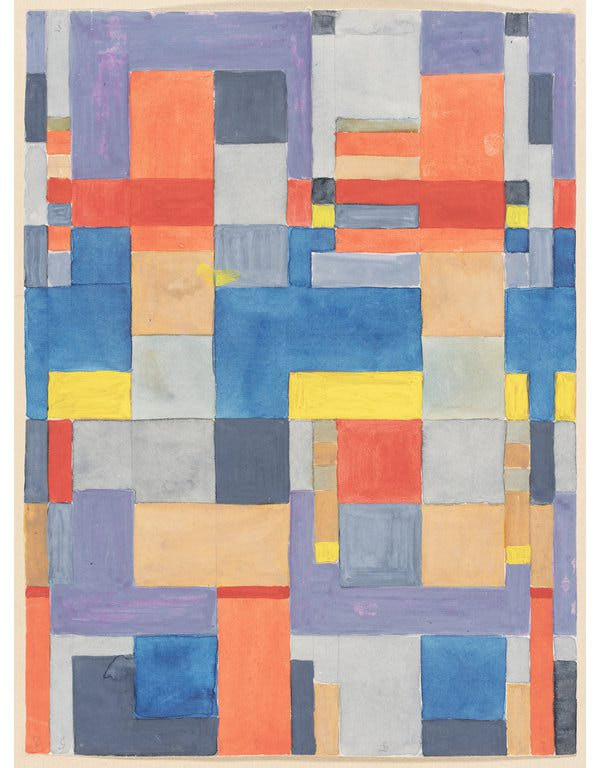
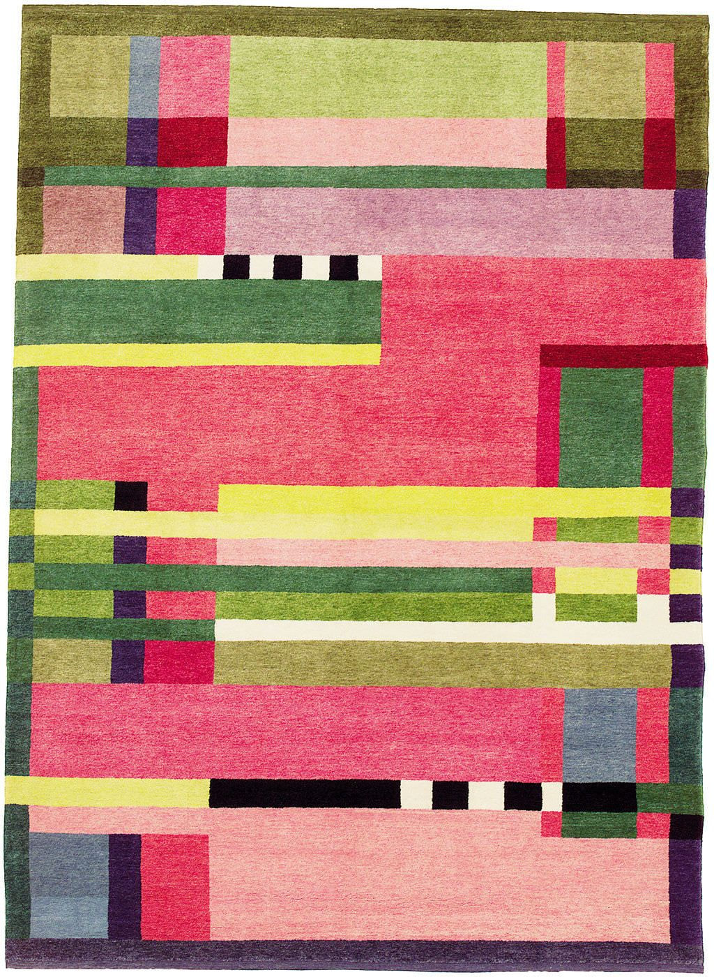
Gunta StolzlGunta Stolzl was the first female master at the Bauhaus, teaching in the weaving workshop which was the only workshop that female students could access for much of the Bauhaus' time. She created this department to increase the number of female students attending the Bauhaus because the idea of the Bauhaus was to be essentially limitless and creativity should be open to anyone. Gunta developed a style of weaving that incorporated modern art into textiles, applying the Bauhaus teachings on colour theory, composition and abstract art while also creating practical products that could be sold with a purpose. Almost all of Gunta's large knotted rugs and tapestries were sold at the Bauhaus exhibitions along with other projects she took on such as chairs with textile coverings and straps and abstract artworks on paper inspired by Paul Klee and Wassily Kadinsky; fellow masters at the Bauhaus. Gunta dedicated her life to the art of tapestry and weaving and continued to produce beautiful textiles all the way until her death in 1983 aged 83. Her passion for both the arts and teaching was immense and she threw so much passion into her projects and her students alike. After her death, her daughter discovered a file of plans for future projects and samples of materials and colour schemes. Her former students also carried on her legacy by continuing to produce textiles influenced by her.
Gustav Klutsis, 1930 El Lissitzky, 1919 Above are two examples of Russian Constructivism, both created with strong political outlooks to convey a message; propaganda. Klutis' poster is mainly collage whereas Lissitzky's is just ink but they obviously favour the same colour scheme that has become so iconic and indicative of constructivism. The composition is also similar with the diagonal format. Both pieces keep text to a minimum to let the image have the impact, in Klutis' case this is the saluting hands and figures among them and with Lissitzky's it is the way the shapes look as though they have collided, with shards flying off; representing volatility and conflict. Both pieces give the feeling of unity and fighting a common cause which was important in the country during the early 1900's. Lecture Notes
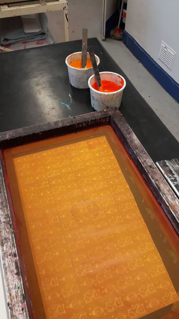
SCREEN PRINTDesign First Print
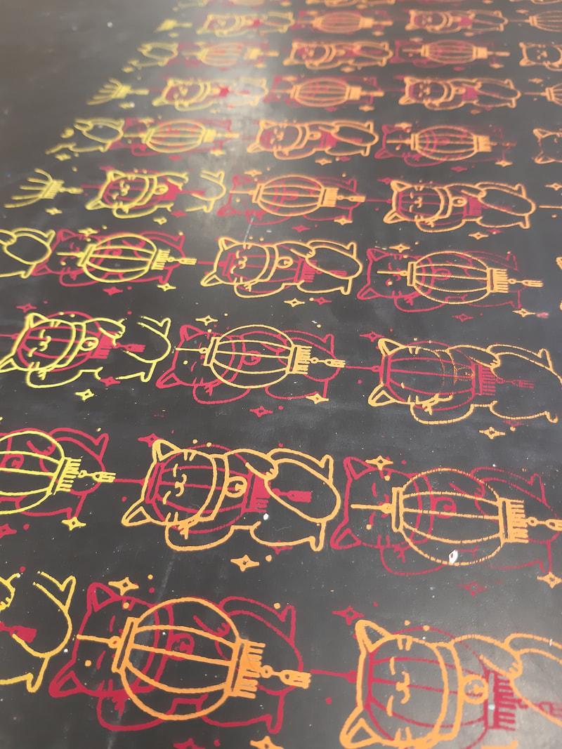
Second Print
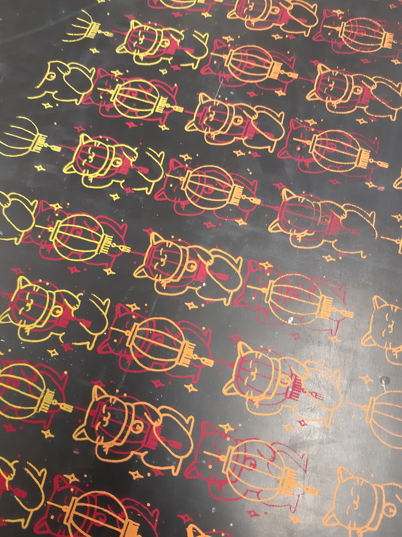
Some nice looking leftovers
LASER CUT  The art nouveau movement was a somewhat rebellion against the common style of art, pulling influences from the Japonisme movement but also pioneering a lot of new styles too. Because art nouveau is such a broad style, each country and each individual took their own approach. Glasgow
Charles Rennie Machintosh (1868 - 1928) Mackintosh was an architect functioning during and fully embracing the art nouveau movement. He took a particularly geometric approach in both his architecture and especially his furniture design. Mackintosh's pioneering take on art nouveau later inspired the art deco movement. Vienna
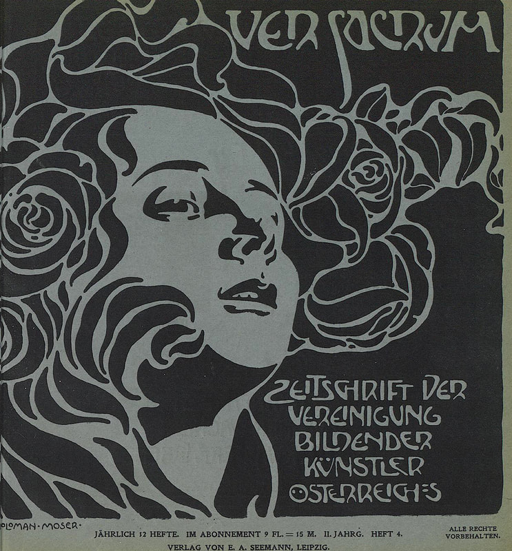
Koloman Moser (1868 - 1918) Viennese art nouveau was inspired almost entirely by Mackintosh. Moser took the idea of art nouveau and took the natural route, being inspired by the flow of flora and fauna. He embraced this movement by expressing himself through pattern design and decorative posters. Madrid
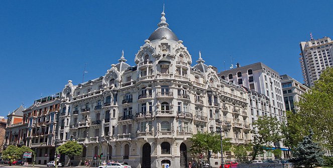
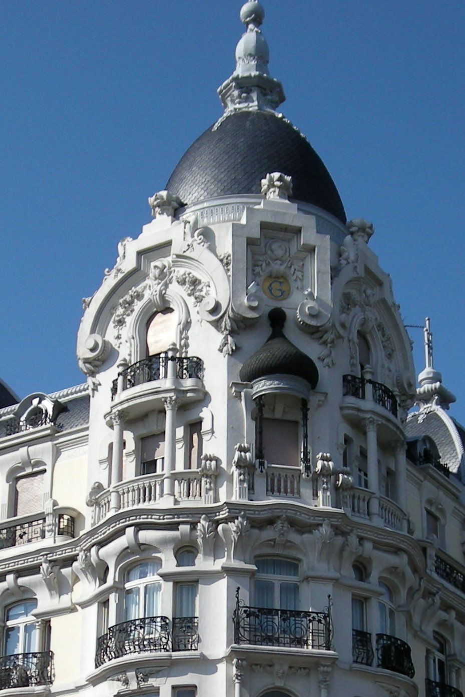
Federico Arias Rey Rey designed the House of Gallardo, a hugely decorative building. Again, he took the natural approach to art nouveau, using swirls and curves. He did embrace the geometry on a bigger scale with the general shapes and angles on the building. His style was very decedent with a lot of decoration for decorations sake. Nancy
Emile Andre (1871 - 1933) Andre was inspired by nature and as well as incorporating them designs into his architecture, he also included a lot of colour. His style was less decedent than that of the Spanish however it was along the same lines. Lecture Notes
 "YOUR GOD HAS BEEN GIVEN RIGHT"For the comic project my line was "your god has been given right" which made me think of the Buddha being given the right to become enlightened. My initial idea was to split the nine panels into three along the top, three along the bottom and one long panel in the middle. I was then going to put animals in the six individual panels and the Buddha in the middle to give the impression that the natural world around him gave him the right.
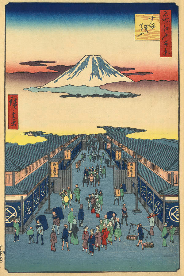
After speaking with Tony I realised that I was too bothered with the aesthetics and I wasn't telling a story so I went back and told the story of the Buddha's enlightenment; where he leaves a life of royalty to find some meaning. He experiences suffering and turns to spiritual leaders to find his way. He then sits beneath a tree and becomes enlightened. 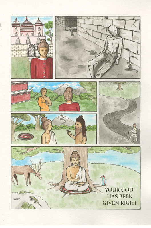 Japanese Influence in Western WorksJaponisme is a French word describing art and material that has been influenced by Japan. This came from the aesthetic movement in Japan that saw artists like Hokusai and Hiroshige creating beautiful wood prints and illustrations but despite their incredible design, within Japan they had nearly no value. So little value that when the French began buying pots and decorations from Japan, they were delivered wrapped in these prints to protect the valuables inside. Eventually artists began to admire this artwork and experimented with this more free and meaningless way of producing art. Vincent Van Gogh
Helen Hyde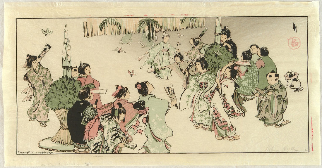 Above is an illustration by American artist Helen Hyde titled "Hagoita in the New Year's Day" (1914). In 1890 Hyde moved from New York to Paris in search for some new approaches to art as she was initially inspired by the European art of the time. After experiencing the wave of Japonisme in Paris she began to create wood prints and etchings of her own. She then moved back to San Fransisco and started her career creating Japanese artworks such as the one above. Eventually she moved to Japan to be amongst the art that she as so inspired by and she continued to create these kinds of works for the rest of her career.
Sans Japan
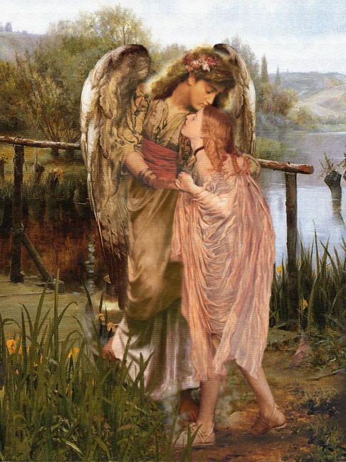
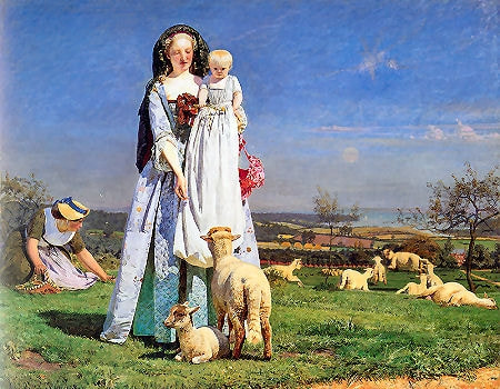
Arthur Huges "Kissed by an Angel" Ford Maddox Brown "The pretty Baa-Lambs" Before Japonisme was the pre-Raphelites, beautiful paintings depicting striking realism and gorgeous scenery. These art works served to show grace and beauty and they were immaculate. Theres no colours where they shouldn't be, theres no harsh lines and theres no creative endeavours. Despite how close to life they look, they're incredibly boring. Lecture Notes
|
Archives
December 2019
Bibliography
|
||||||||||||||||||||||||||||||||||||||||||||||||||||||