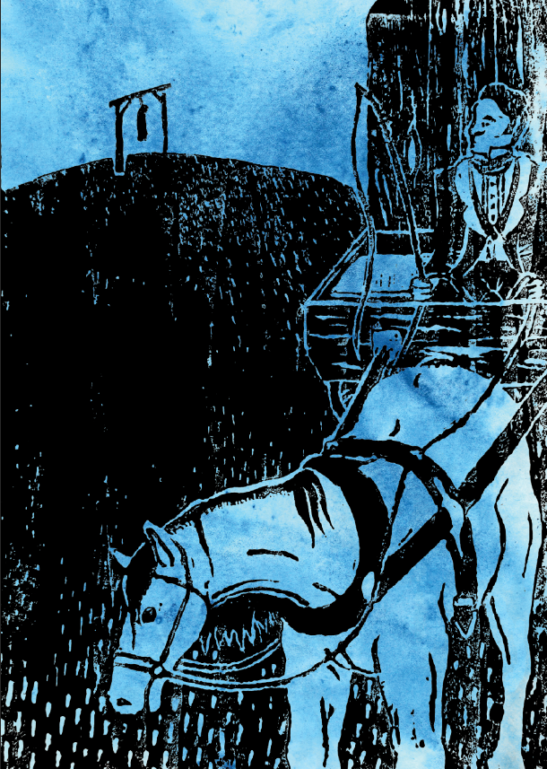
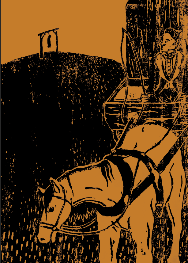
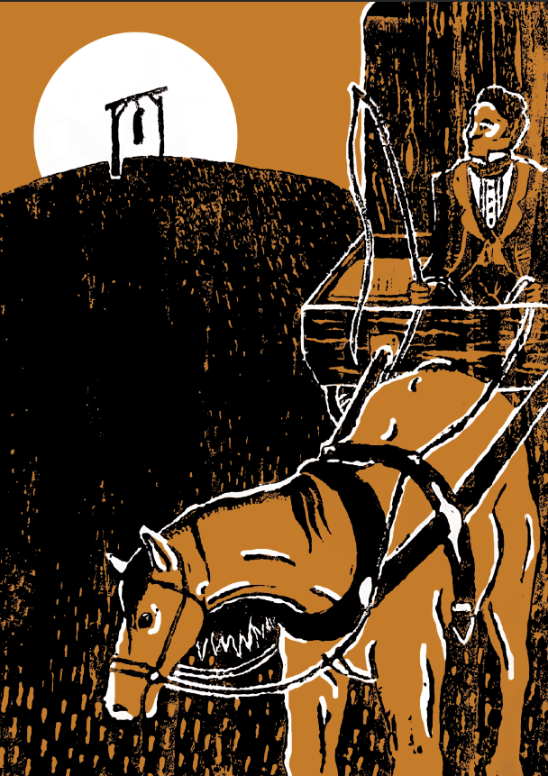
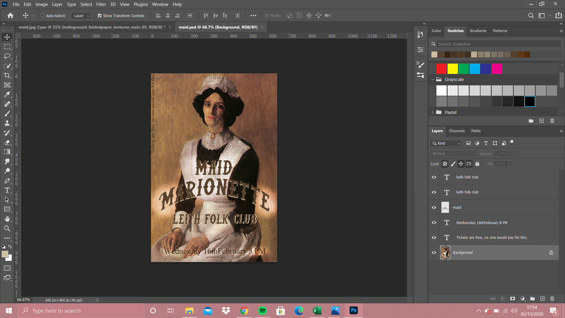
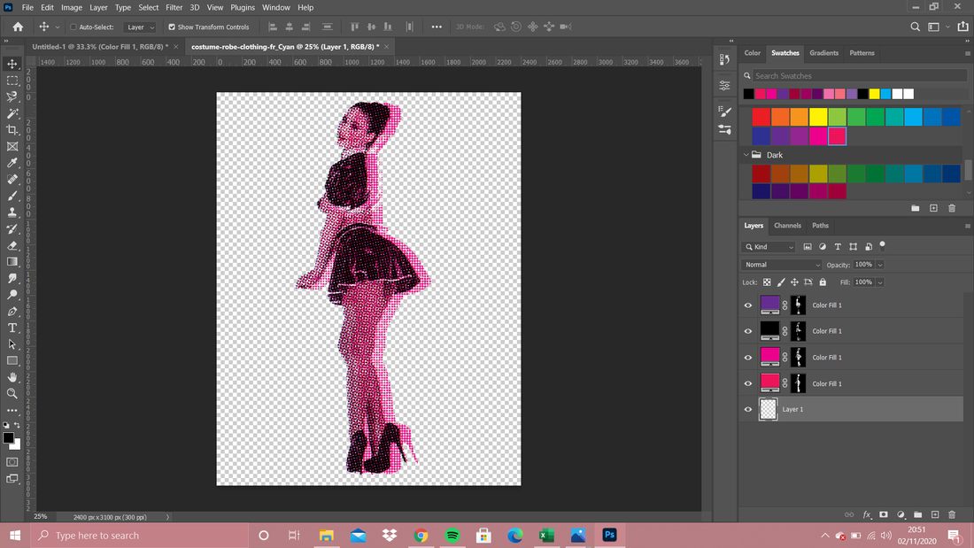
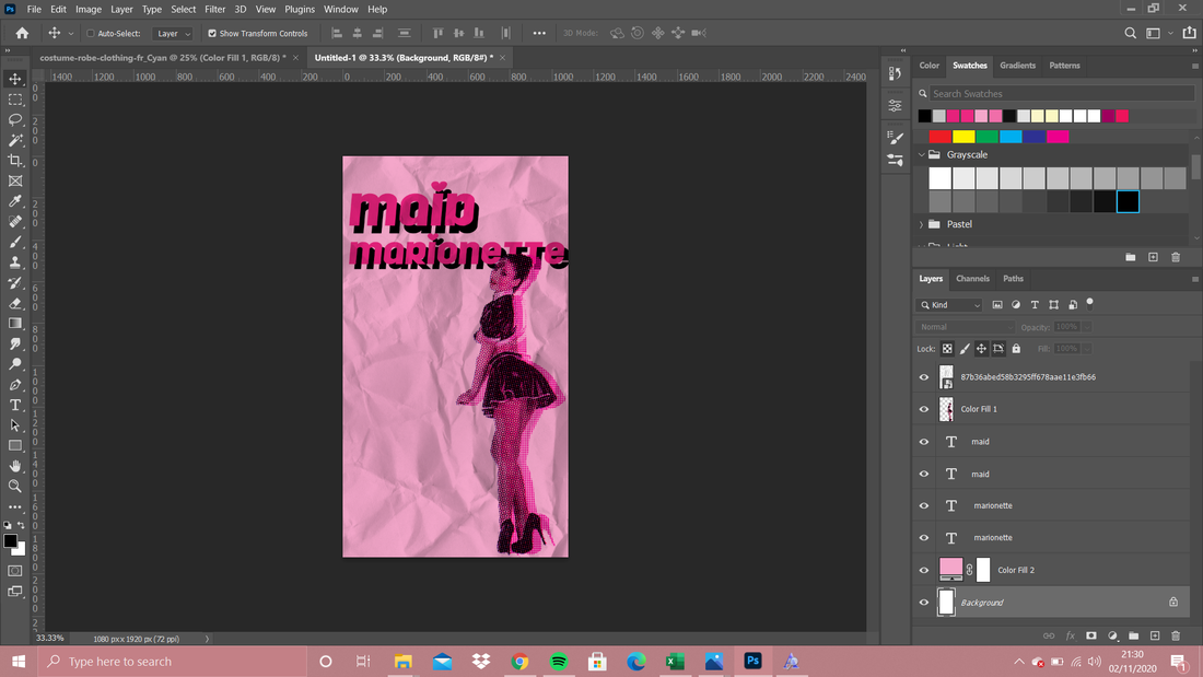
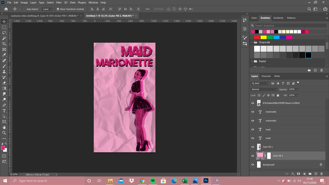
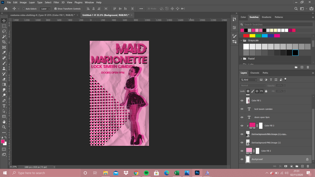
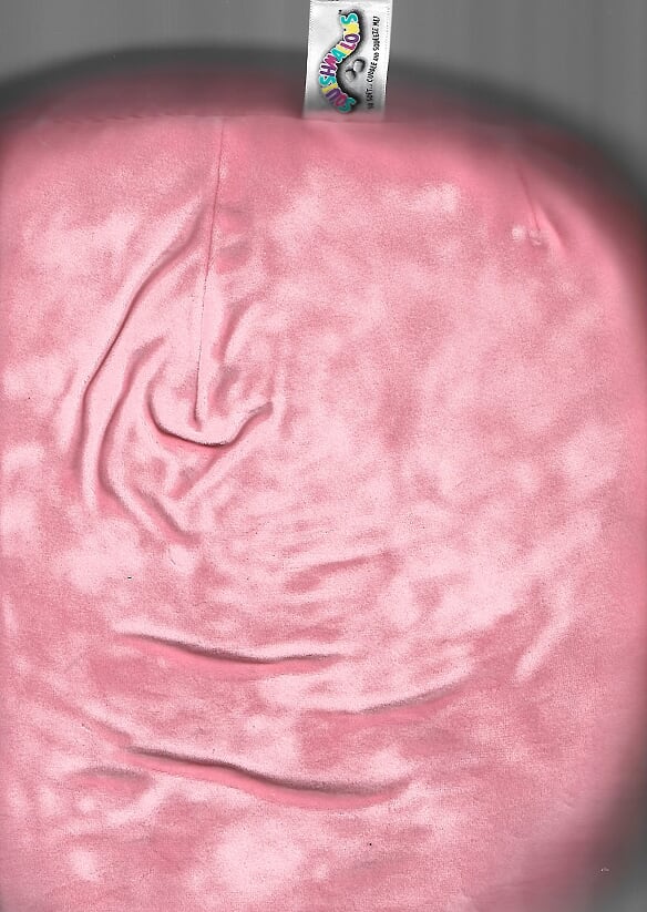
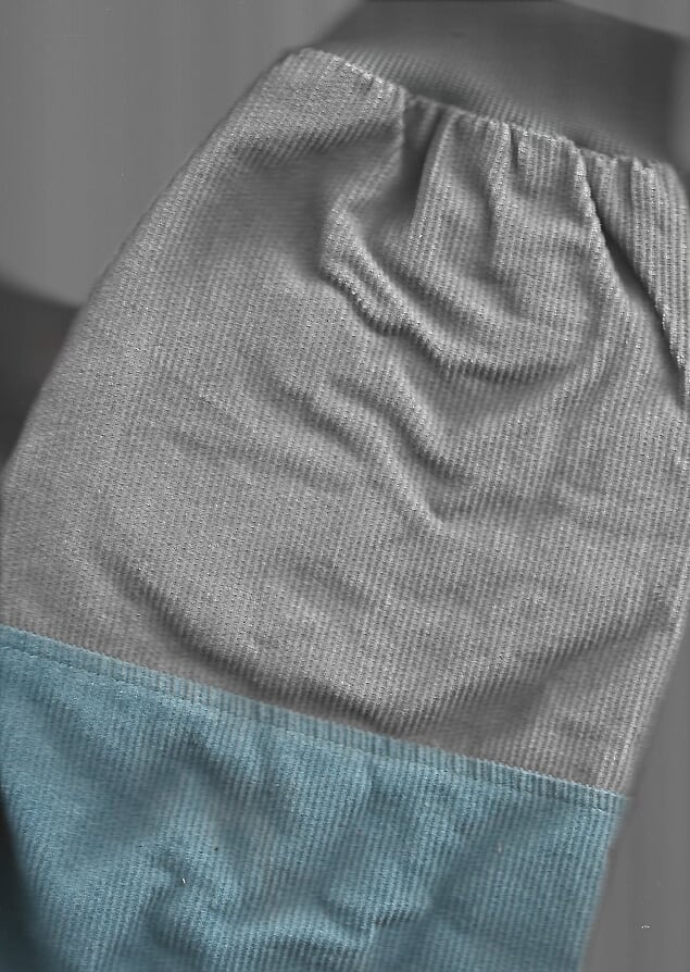
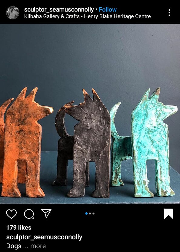
Weeks 5 &6A Poster for a Band that doesn't ExistThe random name picking really did me dirty. My band is called "Maid Marionette" so here's what I did with that: Poster 1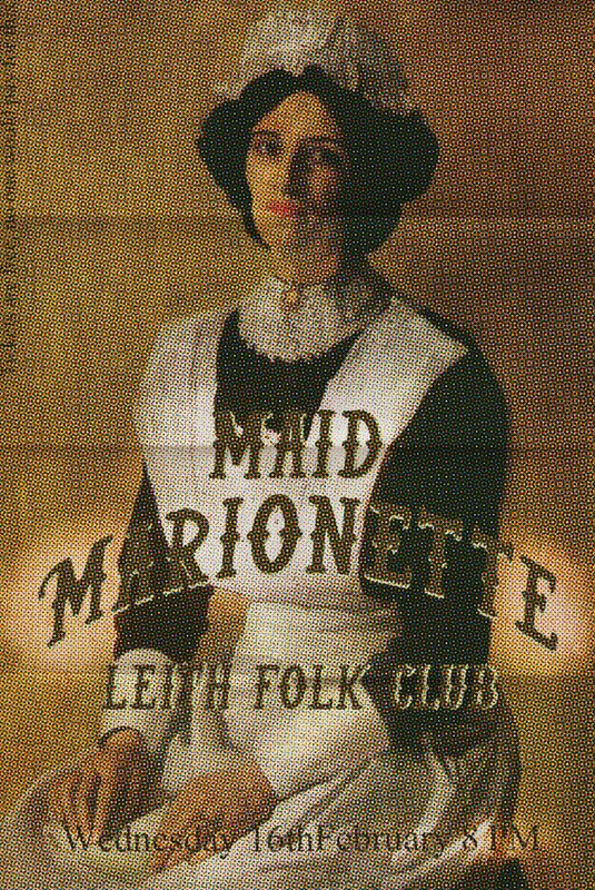 So for poster number one I went for a kind of folky theme, the kind of folk duo that is used to performing to an empty room probably. I'm picturing this poster to have spent time on an old pub window to then be neatly folded up and stored by the landlady because you never know what you might need in the future. So I started with a painting by George Lambert (creatively) called "The Maid" because for my first poster I just wanted to make something that is fairly reasonable. I picked out a paper texture first even though it was the last thing I actually added because I needed the dimensions to be right. So I then had to find a font that suited the old-timey-folky vibe and I ended up downloading this font called "kind of rock". I didn't add much text because again, I wasn't going for anything hugely ambitious. Once that was all together I did the halftone print effect (after watching Dwayne's tutorial a few times) and finally I added in the paper texture. So, yes it is a bit boring but I'm pretty certain the point of this is ~more~ about the photoshop skills. Poster 2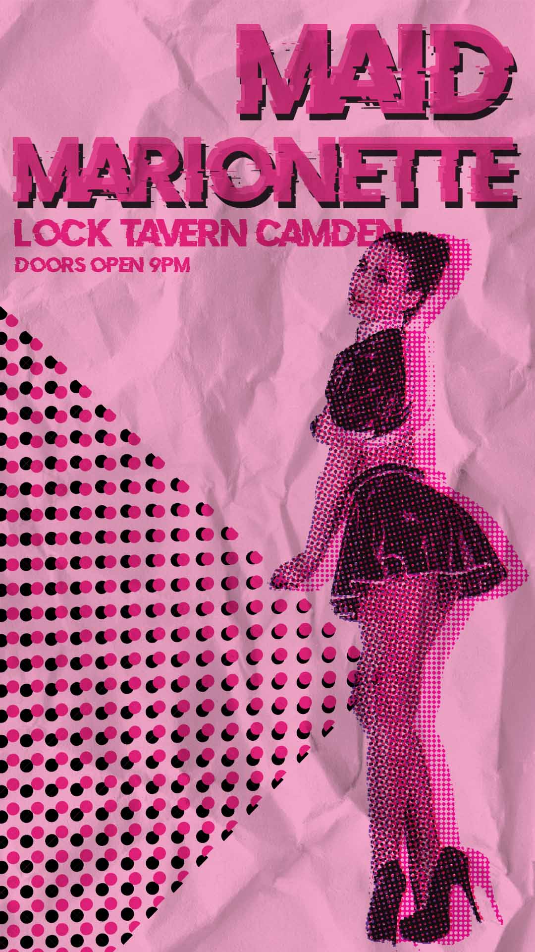 Clearly this one is a bit different. I decided to go to the complete other end of the spectrum, this flyer spent some time in a young mans pocket. He didn't even go to the show - its not his kind of thing, he just felt a certain way about the pretty lady. Not that it matters but maybe something kind of techno-rock-indie-house vibe; because that's definitely a genre. I like this poster a lot more than the first one, its a lot more fun and definitely looks like it has more purpose. It was more fun to make too because I had gotten some confidence from the first one and I just played around and tried things out until I liked it. I knew I wanted to do pink and dots but that's all I went into this with. If this poster ever did exist, it would be one of them small flyers that you can pick up at uni or in venues and it would be on that REALLY glossy paper. Random Practice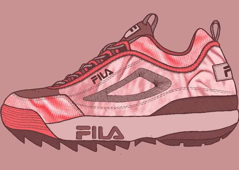 since this project is more about photoshop skills than it is about band posters, i figured id stray from that just to practice some other skills. so this is a line drawing i did during lockdown of one of my nicest looking but most uncomfortable shoes. i scanned the drawing in along with two textures, one of a courdoroy jacket and the other of a very squishy, velvety plush toy and just tried stuff out until i got this pretty decent image. below is the three original components that made this piece. Instagram Posts of the Week(s)
0 Comments
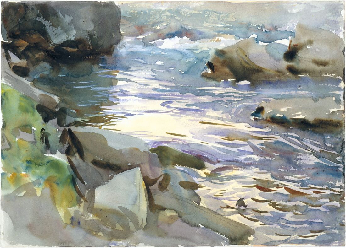
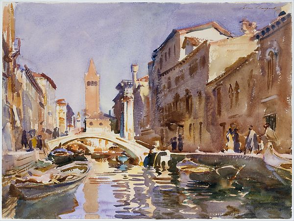
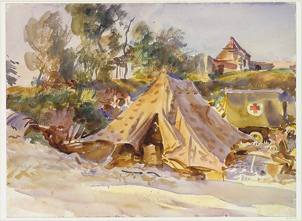
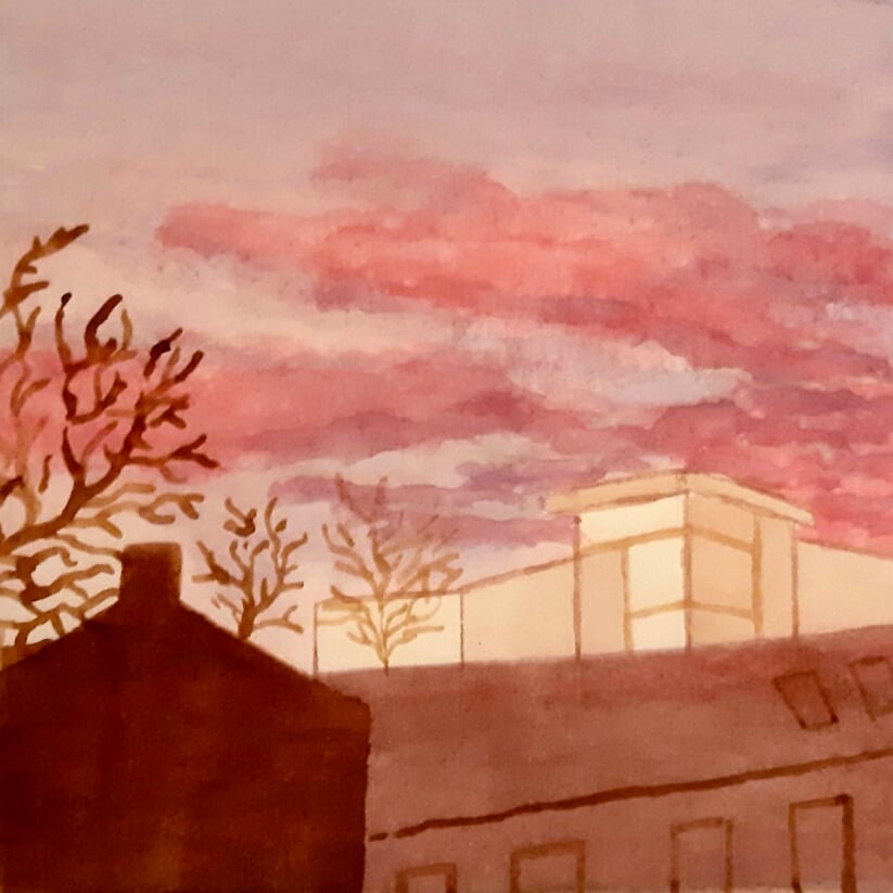
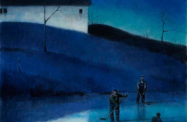
Weeks 3 & 4WatercolourJohn Singer SargentFrom a distance these paintings look really detailed and concise but when you look closely, that's not necessarily the case. In the painting of the stream the water is just some blue and brown brush strokes but they're placed in a way that convinces the eye that its running water and it works really well. I feel a bit stupid saying that his art "works well" because obviously it does he's a renowned artist, I'm just a little out of my comfort zone with this as in the past I've only really used watercolours to colour in ink drawings, I've never really used them on their own to create a full piece so it'll be interesting.
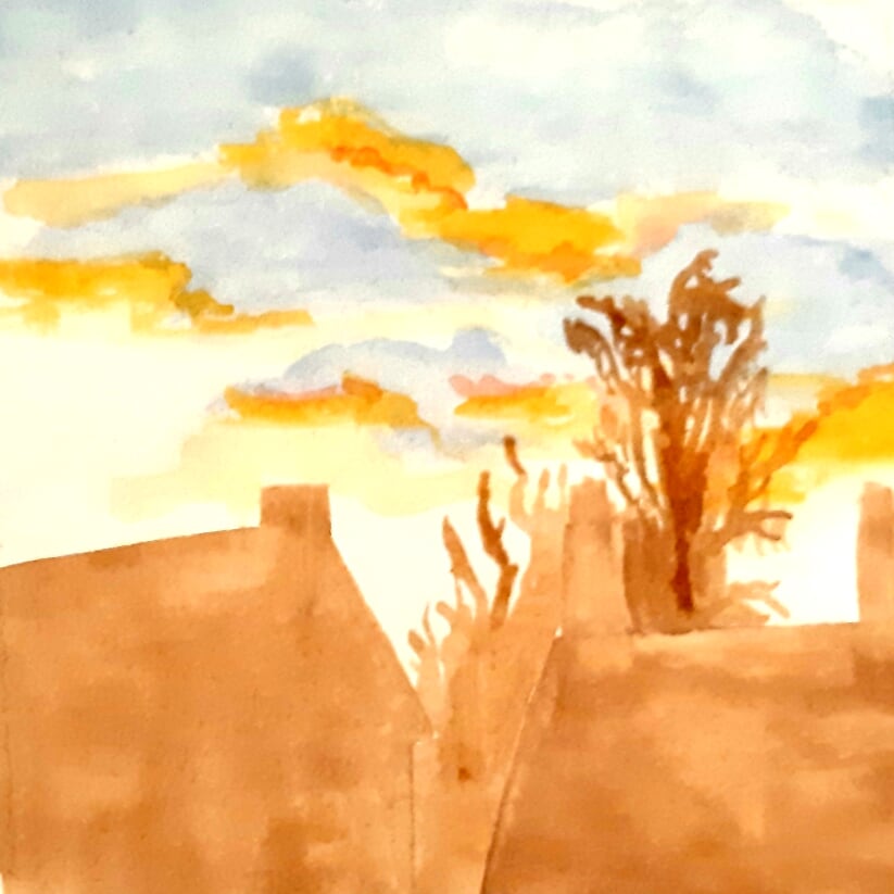
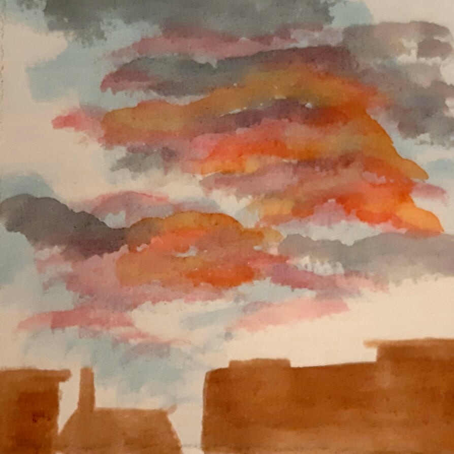
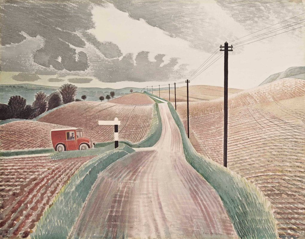
I don't think I really like watercolour - not like this anyway, I enjoy it as a way of colouring in basically but for these I just absolutely went for it, no sketch or planning and they're not incredible in all honesty. They were really relaxing to do though which was nice and it was definitely good practice for me. Of all the paintings I've done for this post these are my least favourite but the lessons learned were valuable regardless. Or something like that. Eric Ravilious Eric Ravilious' work is more detailed but also less colourful than John Singer Sargent's - basically why I chose it. Their styles don't really have any similarities so I think its a good way for me to try two very different ways of working. Ravilious uses techniques like cross hatching which I feel isn't very commonly done in watercolours or paintings in general really but its something I like to do when drawing so this is a nice way for me to tie them things together. 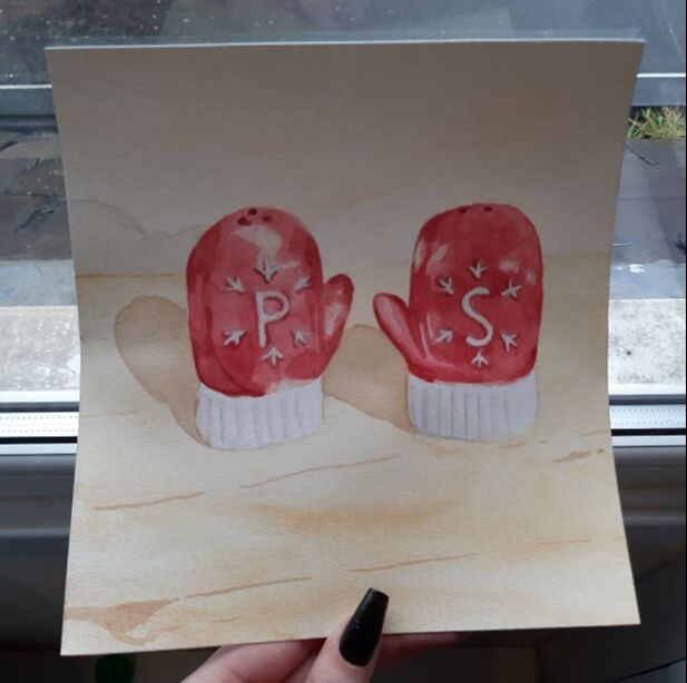
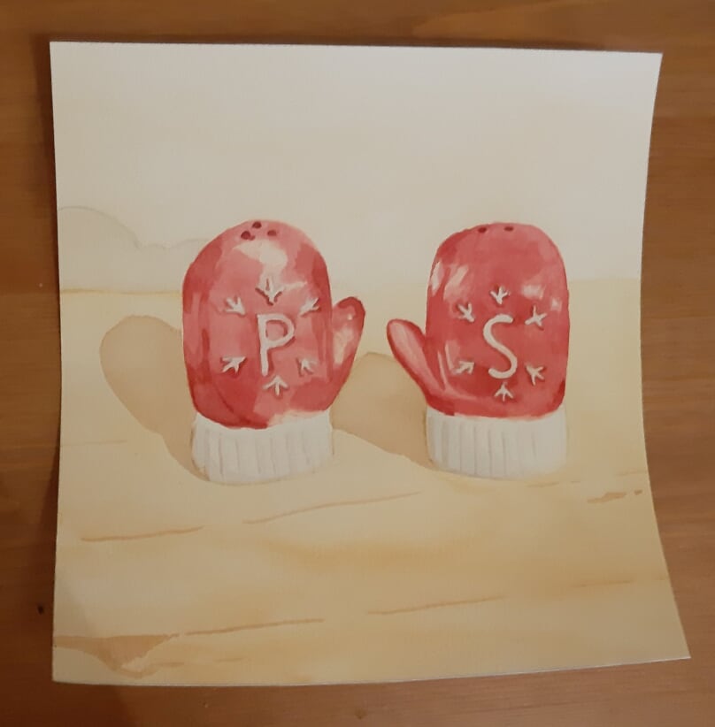
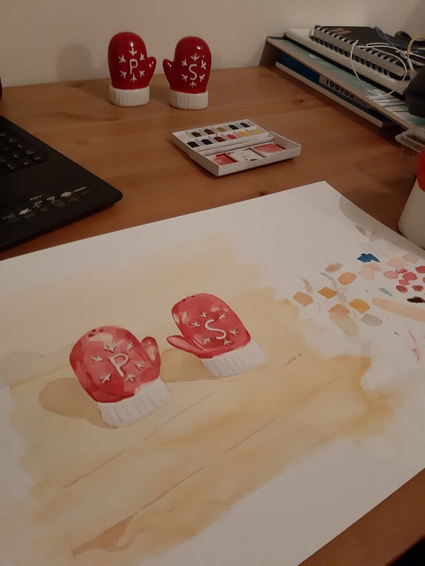
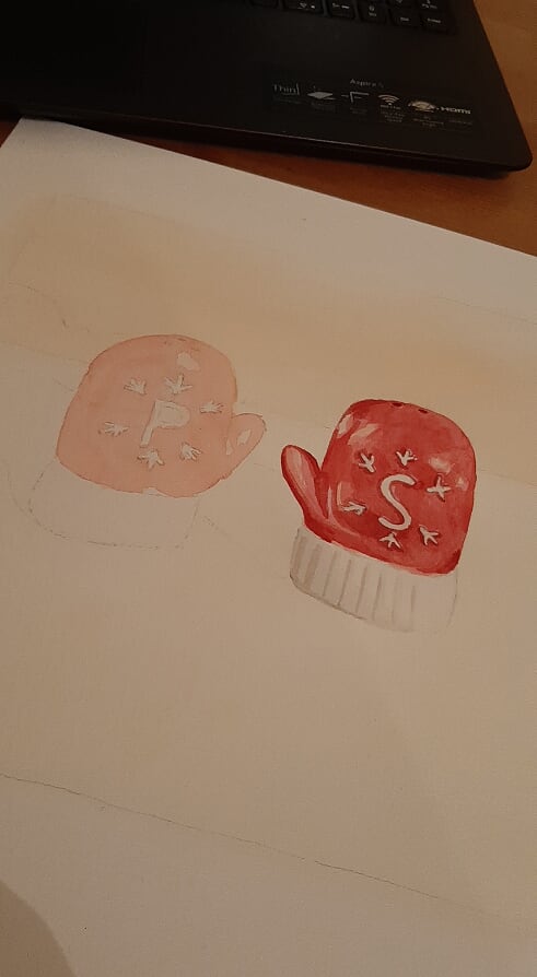
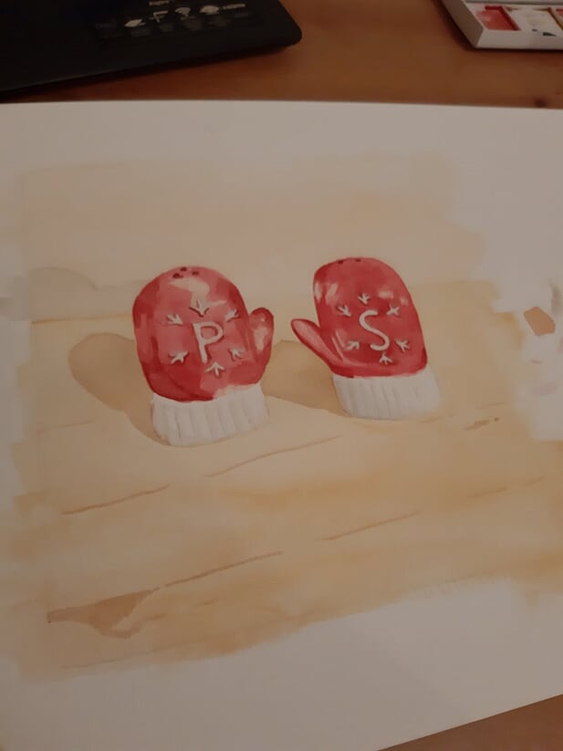
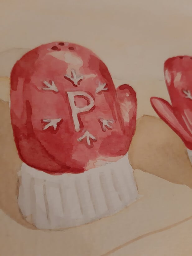
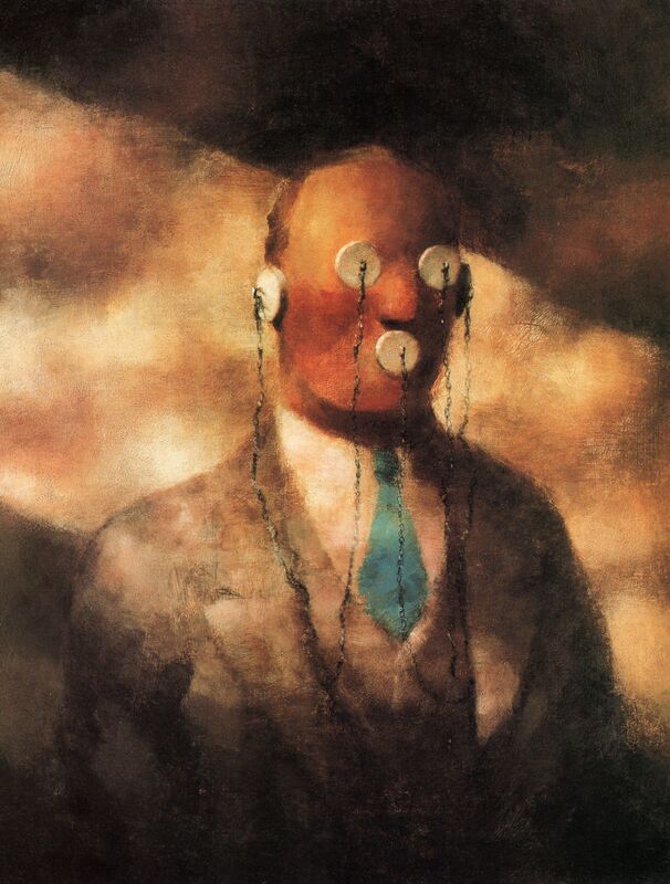
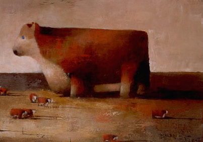
Click the pics above for a closer look This is the first of the watercolours I did so I was kind of just figuring it out as I went along. I painted the salt shaker before the pepper and you can definitely tell because the pepper shaker just looks way better. I should maybe address the festive shakers in October but this year has made no sense, time means nothing and if I want Christmas to start now then that's just how its going to be. Back to the work; I tried to keep my colours very muted to mimic Ravilious' style - which was quite hard to do with red. I do really like how it looks though, but the pepper is definitely better because i had more figured out what i was doing by then. AcrylicBrad HollandMy favourite paintings of Brad Holland's are the ones where his colour palette is very limited, as you can see I particularly like the brown/beige ones (how boring, I know) but something about just using earthy tones seems really interesting to me. I particularly like the pop of blue in the tie of the left hand picture, I also really like the fuzzy look of that one, it just makes it feel even more surreal and kind of fever-dream-ish. 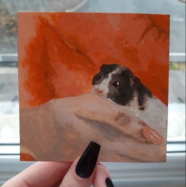
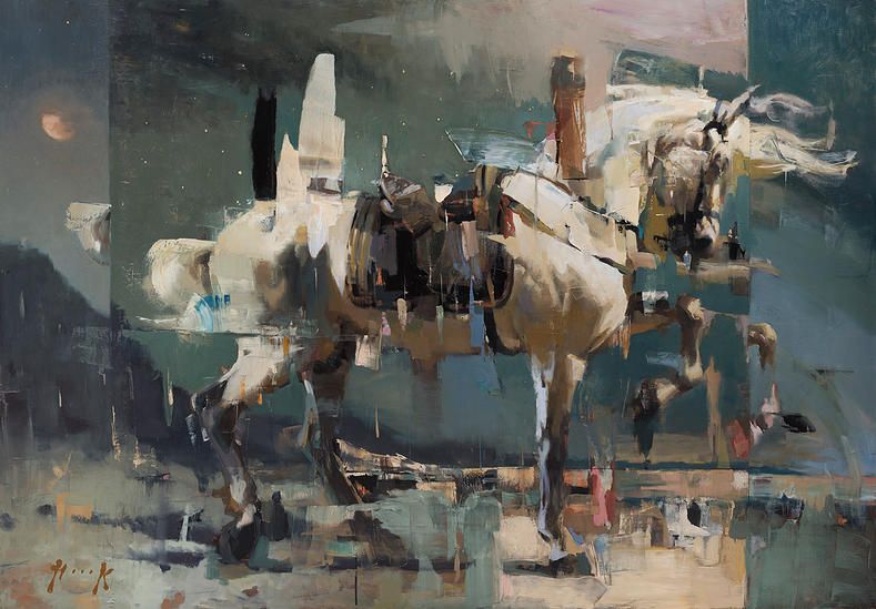
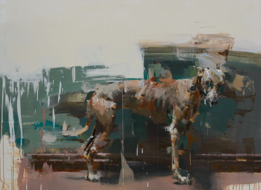
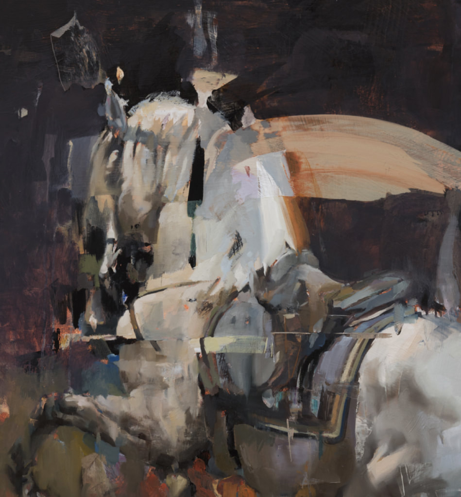
 Click the pics above for a closer look. For this piece inspired by Brad Holland I tried to heavily consider my colour palette and my technique to result in a kind of fuzzy look. For my colours I just used a few orange tones, some browns, white and paynes grey. I wanted to entirely avoid using black, which is something I'm trying to do in any painting in general. As for my technique, I laid down large areas of colour with a bigger brush and then using a small (previously ruined) brush, I took very small amounts of paint and stippled it on in an effort to get the blurred edges. I had a really good time with this piece - it took me just short of two hours to do. I was worried about over-doing it an taking it too far which I might have done on the hand a little bit, I could have probably left it where it was in the sixth picture in the gallery above but even still, I'm really happy with how this piece cam out:) Christian HookI LOVE Christian Hook's paintings, particularly the series of horses he did. I found this gorgeous dog painting too - could have done with it as a reference while I was doing my A level project on dogs! I really admire how insanely detailed but also messy and not detailed his pieces are. I really love how they almost look like a glitched image. I also really like the colour palettes used for these pieces, the neutrals with some blue and orange to add warmth and cold is really nice. There's a huge number of artists whose work I really love and admire but something about Christian Hook's work puts him right near the top for me, really excited to try out some work in his style! 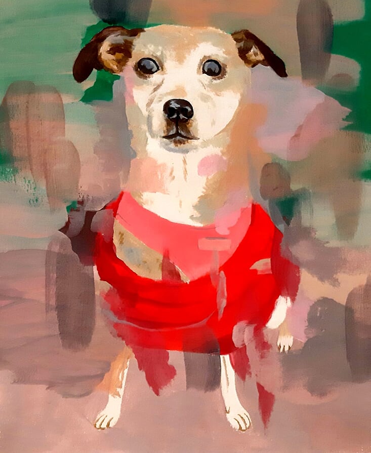
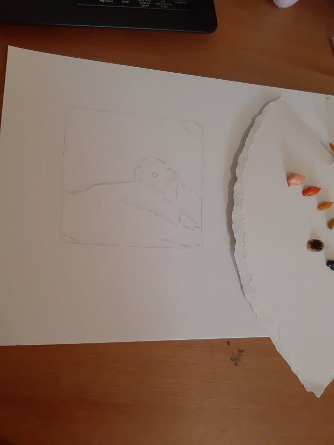
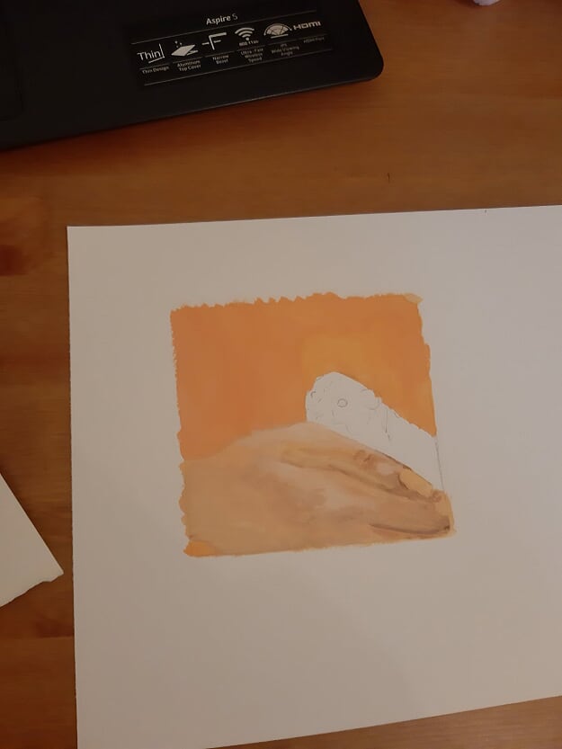
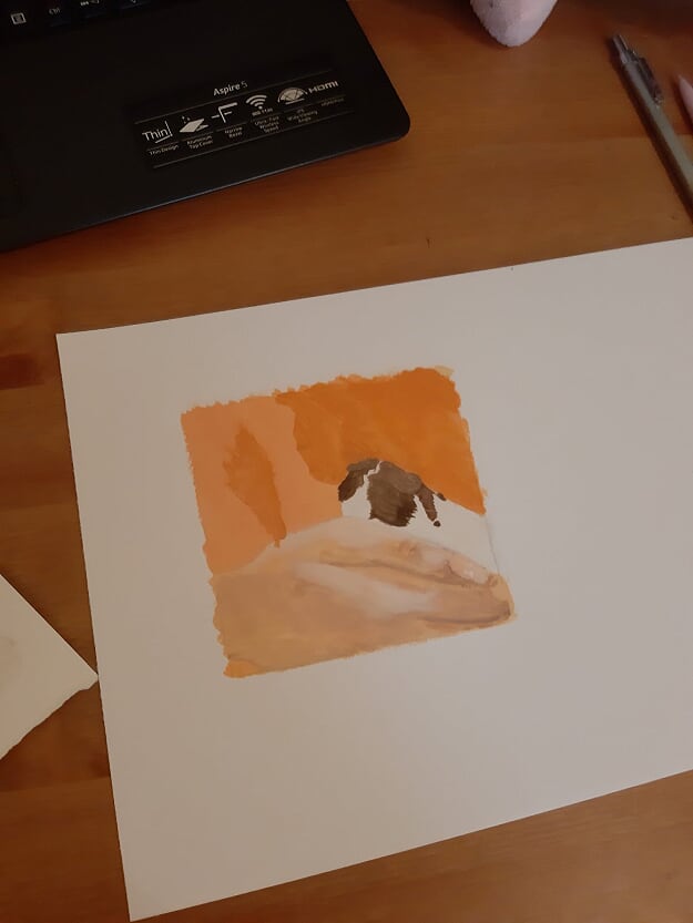
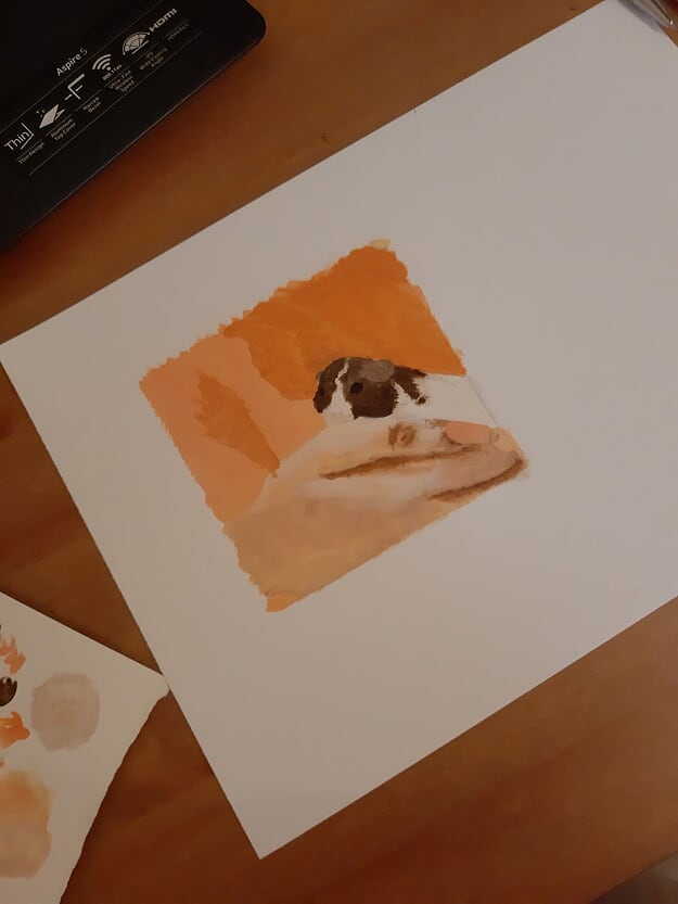
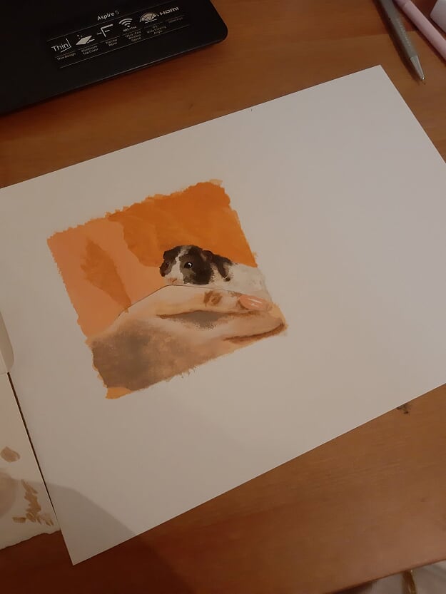
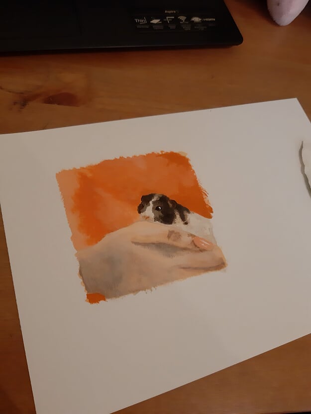
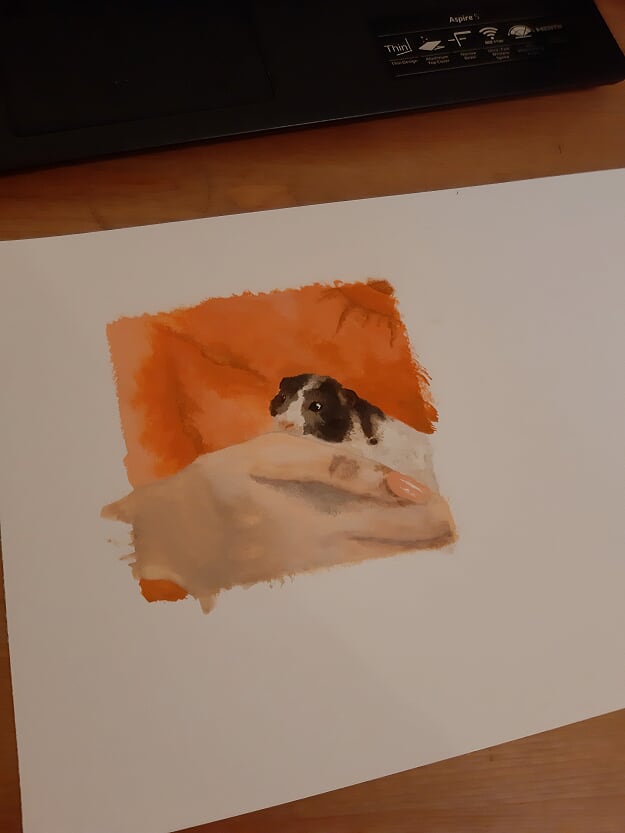
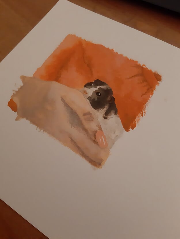
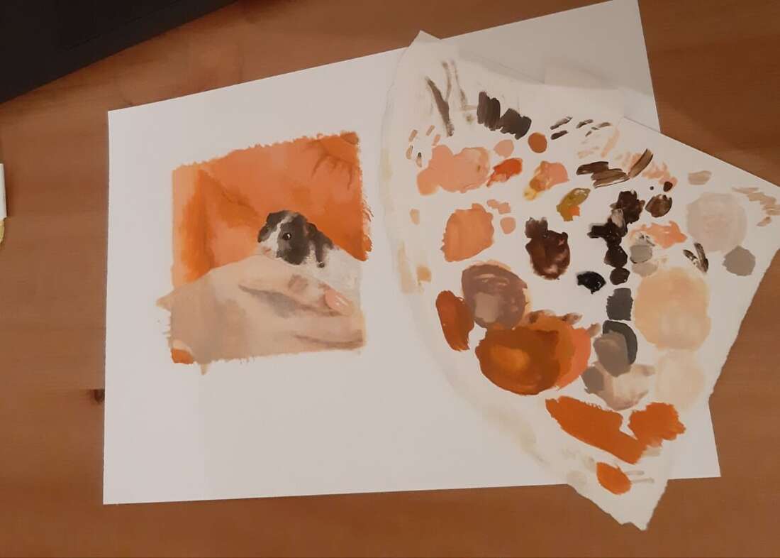
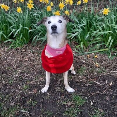
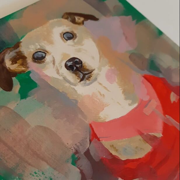
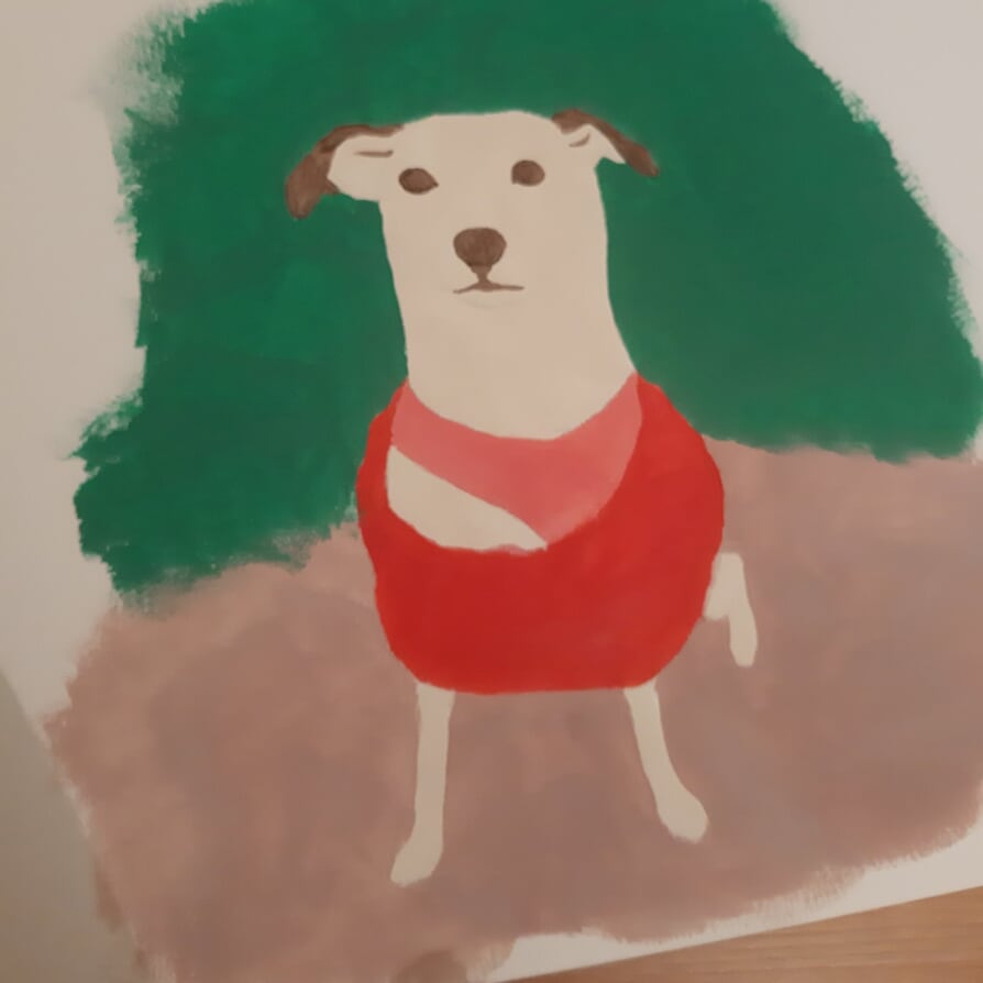
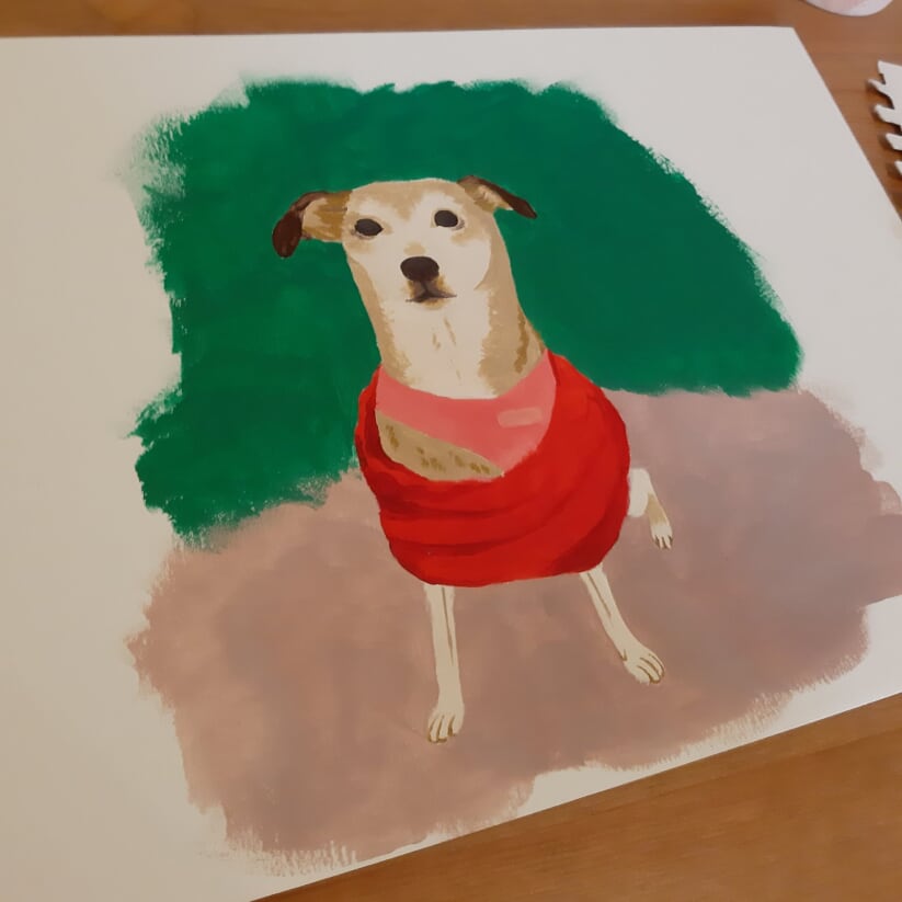
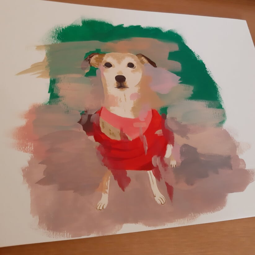
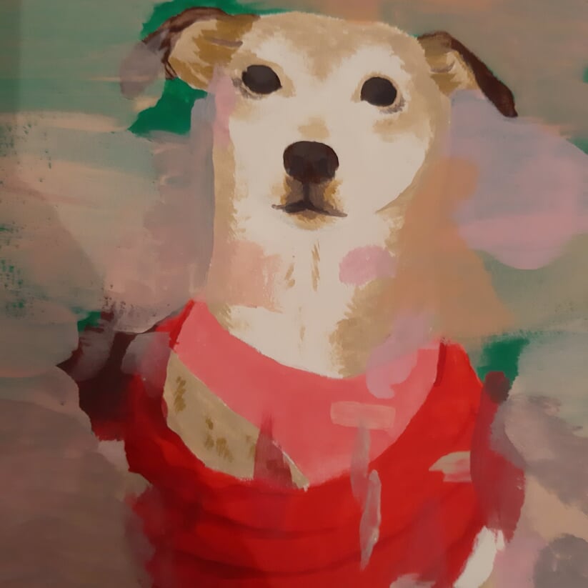
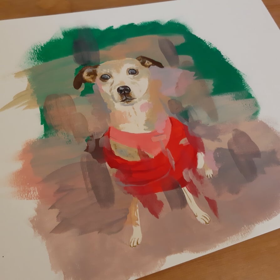
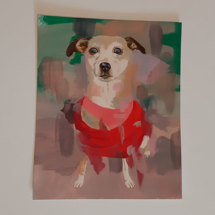
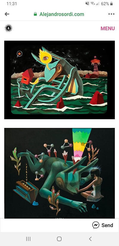
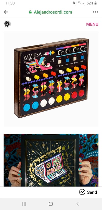
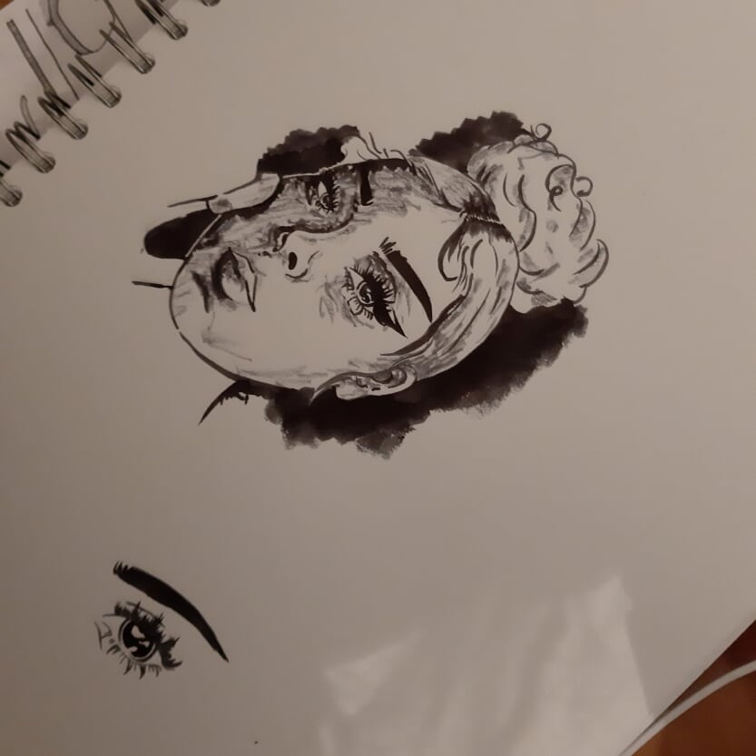
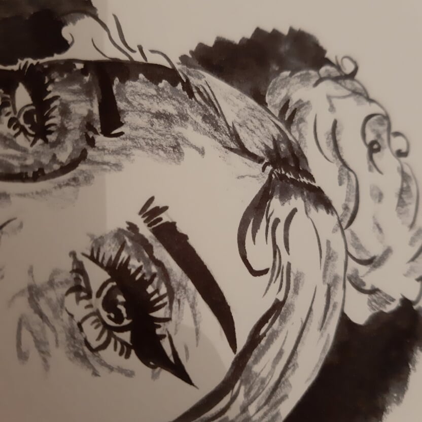
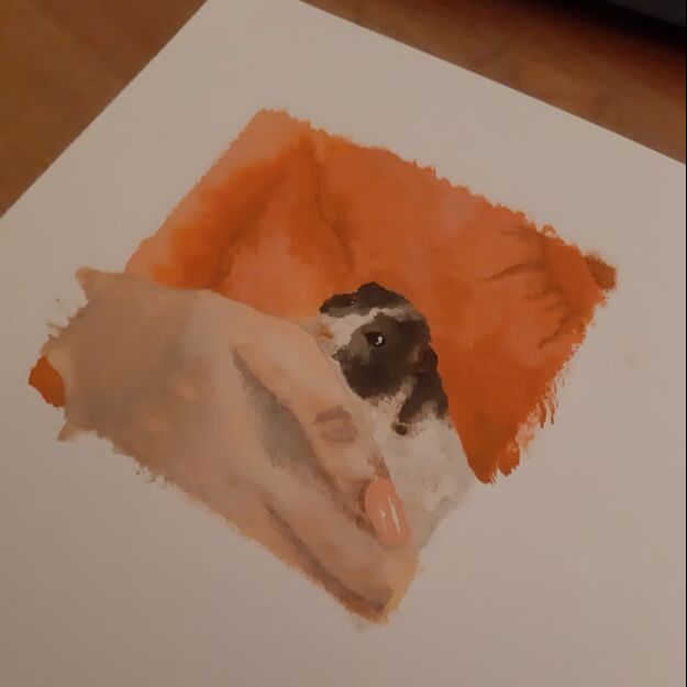
Click the pics above for a closer look. So this is Polly. I took inspiration from Christian Hook's dog painting but this one is actually really special to me. We got Polly when I was two years old and sadly she passed away this summer while we were all still in lockdown at the incredible age of 17. I didn't get to see her before she left us and this weekend gone I finally was able to go home again and having her not be there was really hard for me. I'm trying not to be too down about this, but I really wanted to do a little memorial piece for her and I feel like I've really done her justice. Now actually about the process, it took me about 4 hours over two days to do this piece, its about 18x13cm so its fairly small. there's another painting that's already made it to the box under my desk that I started before this one, it was A3 (of the same picture) but I abandoned it about an hour in because although it was a decent painting, it just didn't capture the essence of Christian Hook that it needed to. I feel like this one really captures that though, and I really love how it came out - it was also really fun to do and I think I might incorporate this method into future works:) Alejandro SordiWhile I was just scrolling on Facebook I saw these (first picture below) digital illustrations done for Cartoon Network by a Spanish illustrator called Alejandro Sordi so I followed the link to his website and was firstly greeted by such a beautiful illustration (second pic) and upon clicking the menu I found that he has a pretty huge collection of really beautiful acrylic paintings, I've included a couple of my favourites:
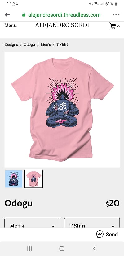
There's LOADS more on his website and more on his Instagram page too. As you can see, I got very tempted by one design he sells on clothing, as of right now I haven't bought it but don't be surprised if it ends up on my blog again later on hehe. This very tempting button will open up his website if you want to go have a look yourself! Instagram Posts of the WeekWeek 2Research and Inspiration
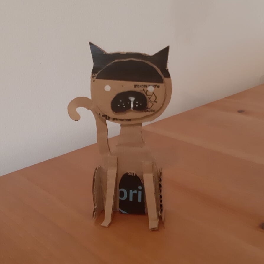
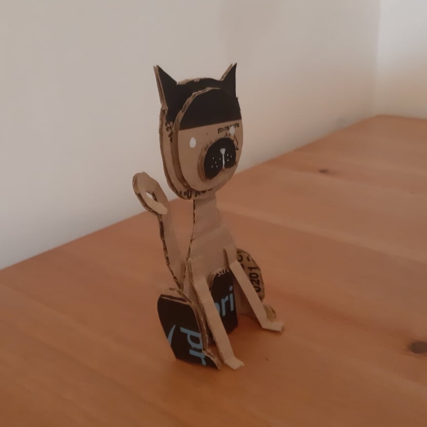
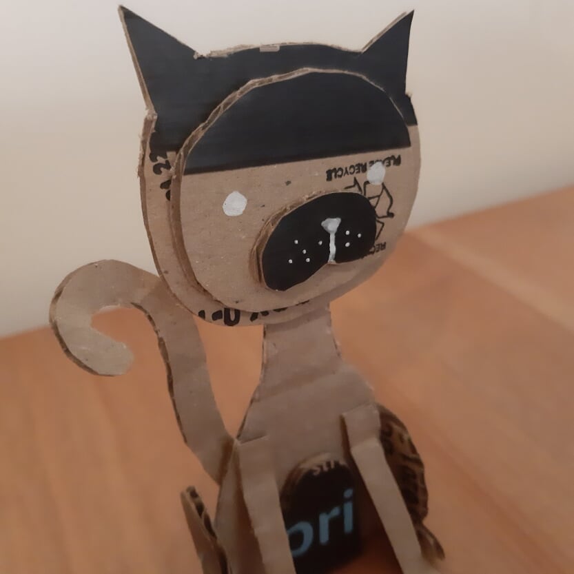
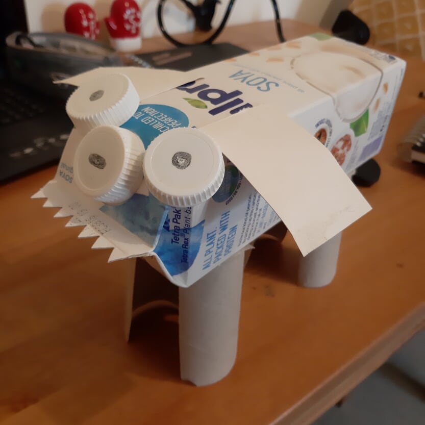
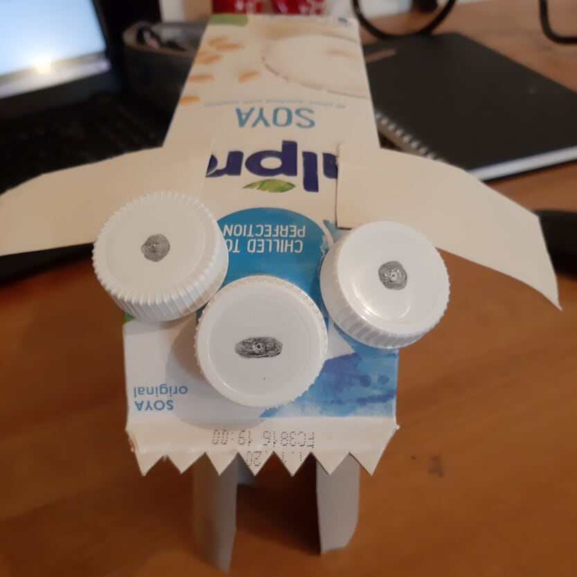
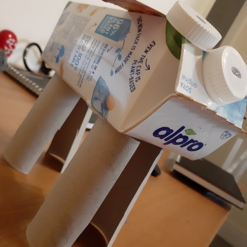
Recycled CrittersClick the pics above for a closer look. 'Steven Prime" the cat and "Dennis the Mistake" the dog. Masked
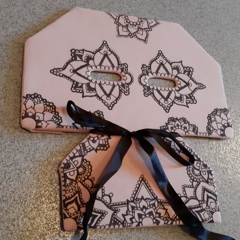
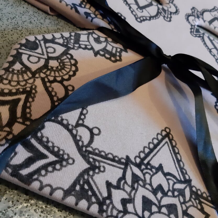
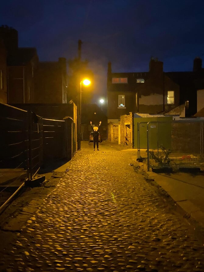
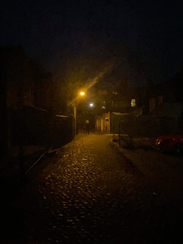
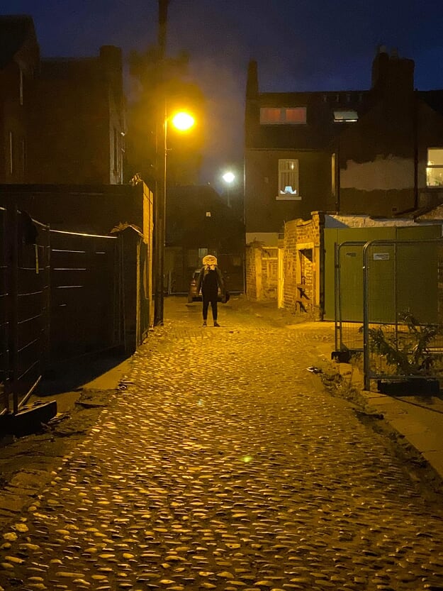
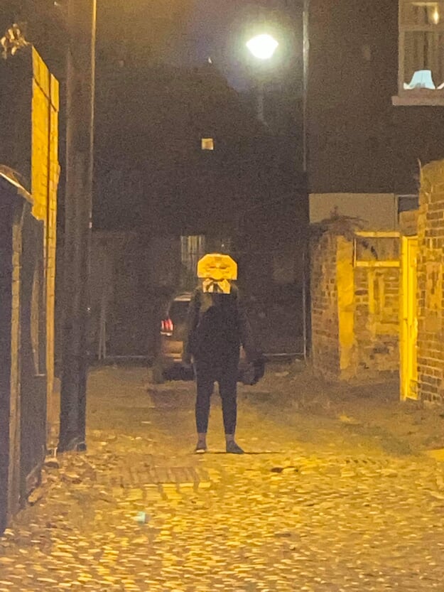
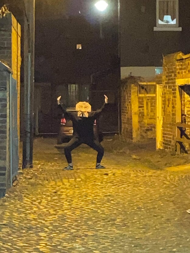
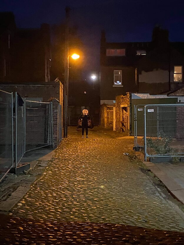
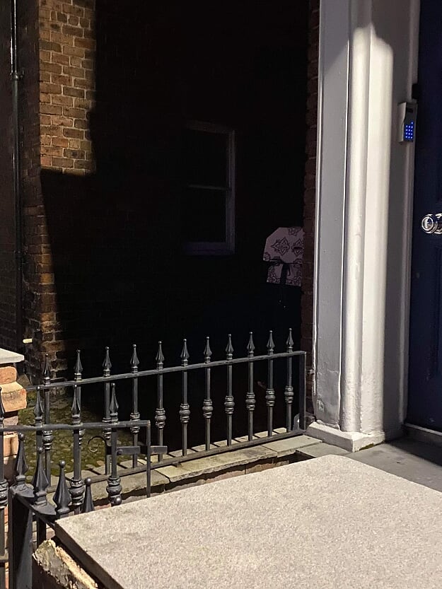
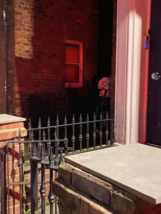
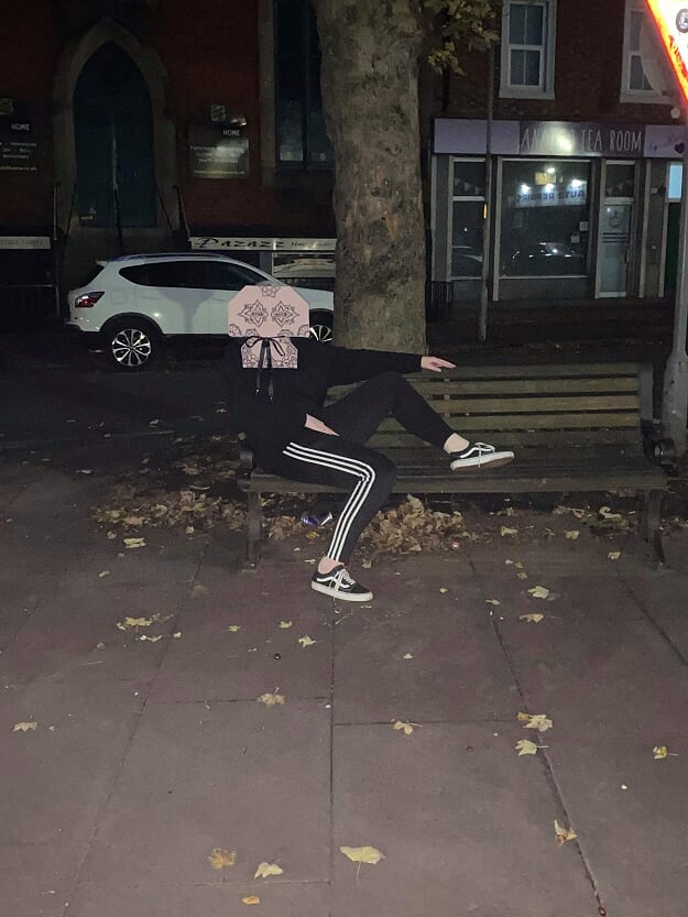
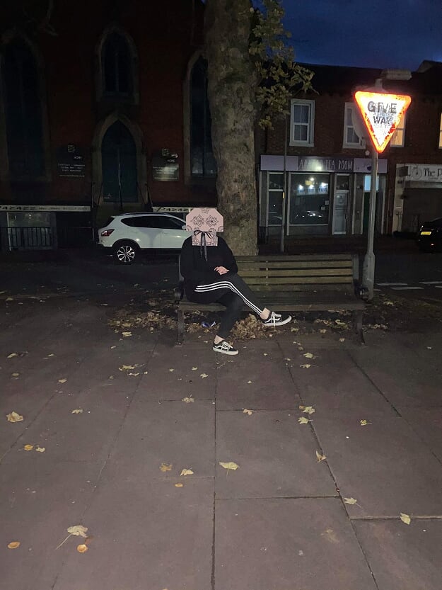
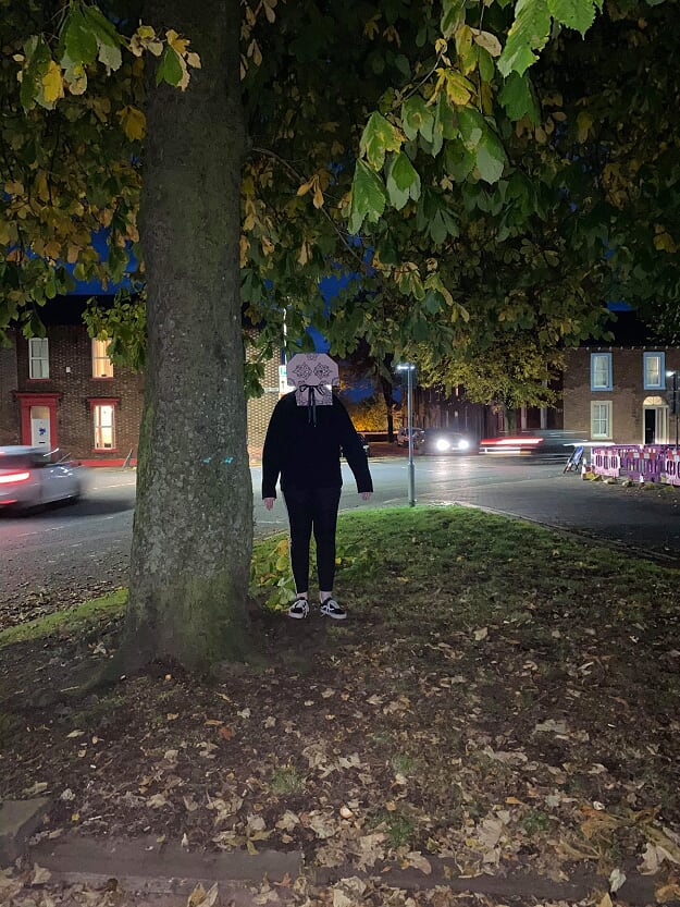
I was pretty limited in my resources to make the mask since the recycling bins were taken out the day before so I made the shape from some cardboard and covered it with some fabric from an old hoodie. I was kind of wanting to make it eerie but not stereotypically scary, I felt like the drawings on it give it kind of a spooky Victorian vibe. I'm not sure. While writing this I am yet to take the pictures wearing it but I hope it looks as mildly unsettling as I'm hoping. Click the pics above for a closer look. ...um yeah, they're as mildly unsettling as I was hoping. I really don't even know what to say about them, it was fun to go out and be vaguely spooky. I would love to know what the cars driving by thought of my gorgeous hand crafted mask. I keep scrolling up to look at the pictures to think of more to say about them but I'm thinking maybe some things are better left unexplained. Instagram Posts of the WeekWeek 1First week of year 2 has been interesting, getting used to everything being online has been hard and somewhat frustrating so I was especially glad that the projects this week have just been ink on paper because I'm already pretty sick of the headaches from staring at screens all the time! It’s been so nice getting back into it though, especially this blog. I didn't love my blog very much last year but I really want to get into it this year:)
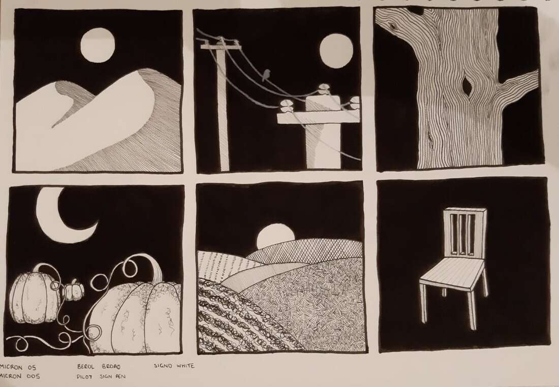
For these drawings I used two Micron fine liners in sizes 05 and 005, a very inky Pilot pen and (I'm sorry Tony) a Berol broad pen - only to fill in the large areas of black I promise. I basically just drew what came to mind and tried to experiment with different uses of line to create different looks and textures - one of my favourites is on the drawing of the hills on the second hill back, Tony showed us an illustration of Dwayne's where he had used this technique of drawing 3 parallel lines then doing another 3 in a different direction, I really liked how it looked so I gave it a go and ill definitely use it again:)
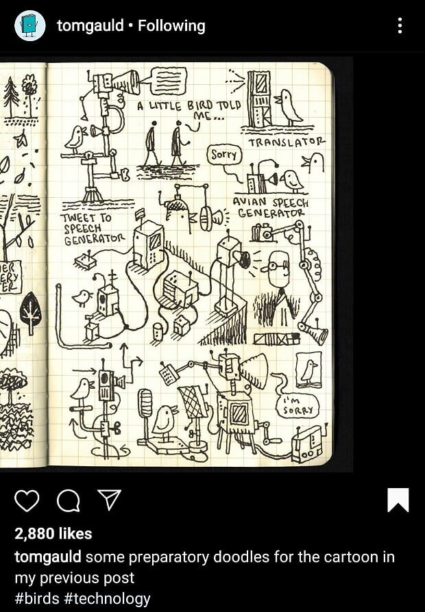
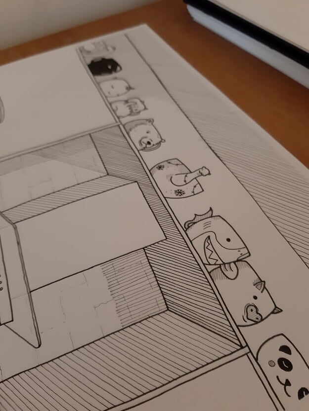
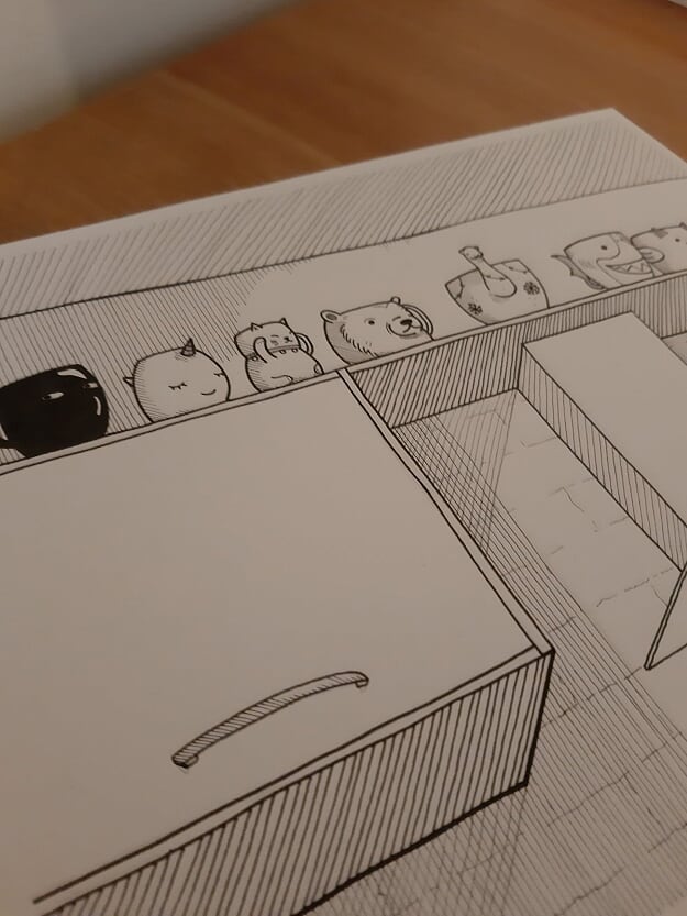
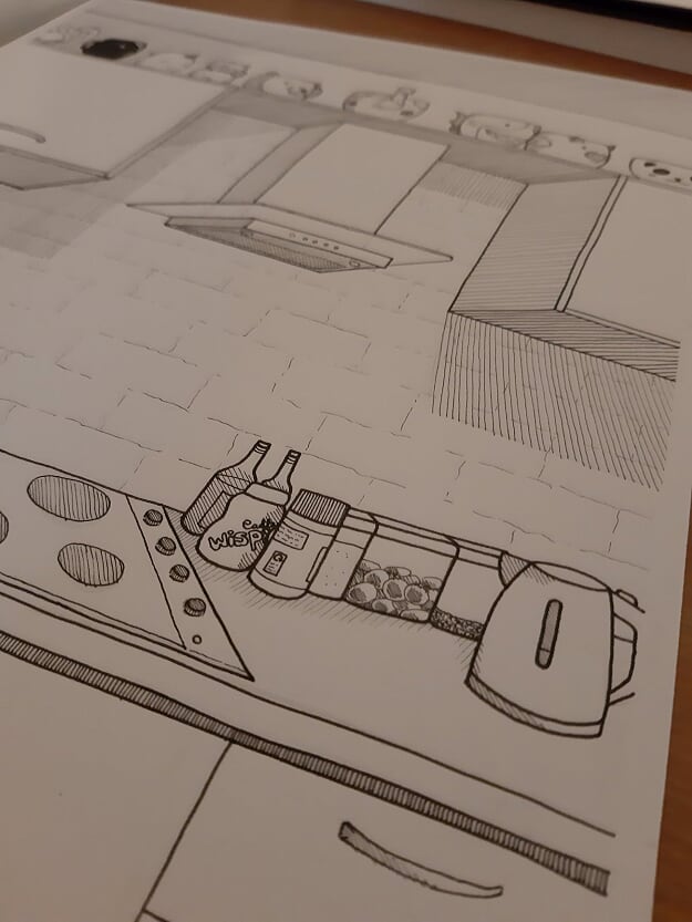
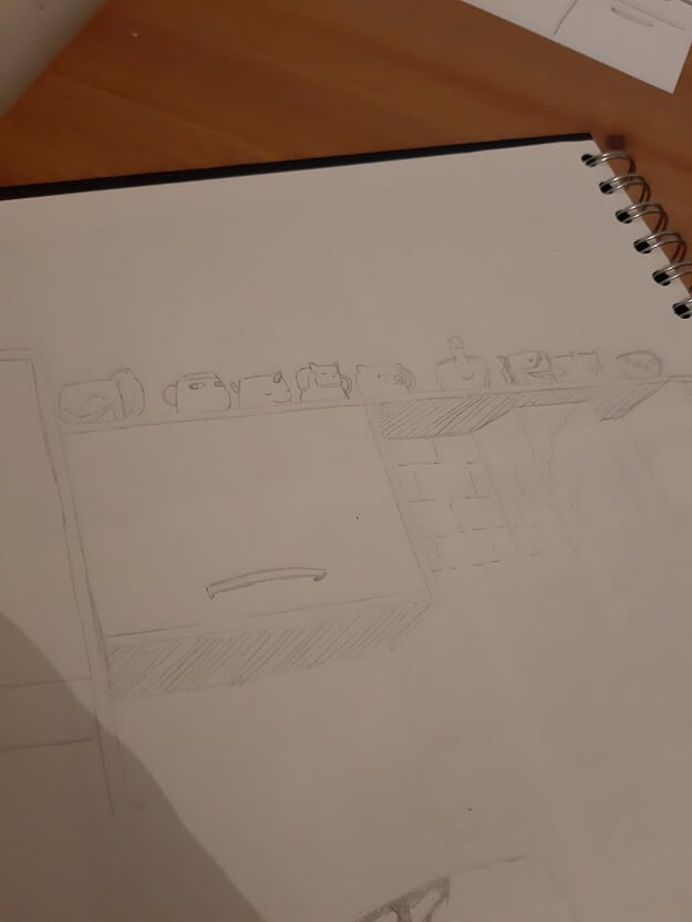
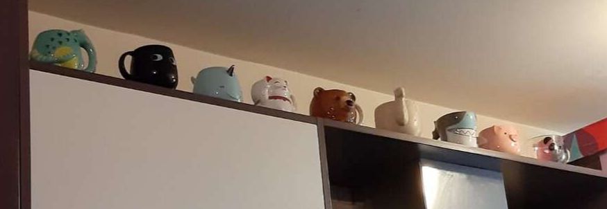
I used Quink and a brush for this, I got the messy grey strokes just by doing all the dark areas then just basically smushing the almost dry brush around on the page. This isn't a style I would usually do but it was nice to do something looser and with less pressure to look perfect. A Room in the FlatI chose to draw my kitchen, mainly because I have been spending all my time in here recently and will be continuing to do so for the foreseeable future since the desk in my room is far too small to sit at, so I have claimed the kitchen table as my new work space. I also have been wanting to do a drawing of my novelty mug collection so now seemed like the perfect opportunity for that. I've always been a fan of Tom Gauld and other just really clean line drawings so that's what I channelled for this piece. 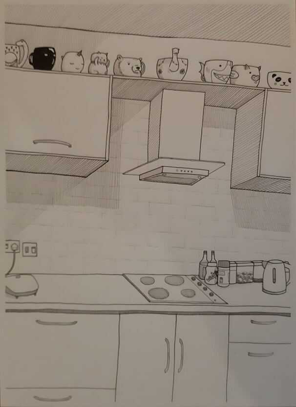
Thought it would be fun to film some hyperlapses of me drawing this piece and it was really fun but I know - they look terrible. I had to stand my phone against a mug to be able to see what I was doing and the videos just haven't come out that well because of that but I still wanted to show them regardless because I have ordered a stand arm for my phone to hopefully film more in the future from a better angle. Also, they're filmed vertically which I know is a sin but again, I was doing my best with what I had. Another issue I ran into was struggling to get the videos onto this blog so I've had to upload them to YouTube and link them that way but this should mean that hopefully by the end of the year I’ll have a channel full of videos of me drawing and such. Instagram Posts of the Week I've decided I’ll put some Instagram posts that I'm loving or that have had me feeling inspired during the week at the bottom of my blog posts, so here they are! |