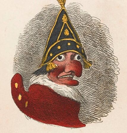
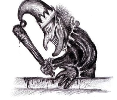
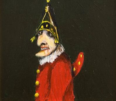
Communicative ColourWeeks 11 & 12The final project of the Illustrators Toolkit module is to create a final illustration based on text we have been allocated. My text was two poems about Mr Punch so my first thing to do was research him. I knew the concept of a Punch & Judy puppet show but I cant say I've ever seen one so I needed to familiarise myself and while doing that I found some illustrations that I've kept looking back to despite how uneasy the two coloured ones make me - there's something not quite right with them, very uncanny - especially the one with the dark background however this one is my favourite I suppose because of how unsettling the eyes and the cracked lips are.
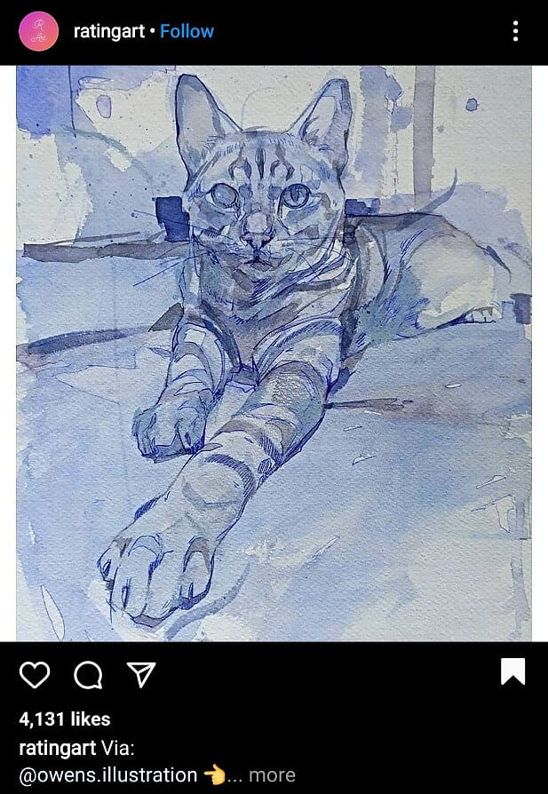
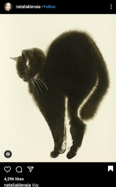
Once I had gotten acquainted with good ole Mr Punch I looked to Instagram as I usually do to find some more inspiration for my piece.
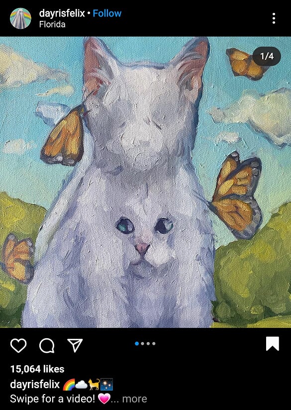
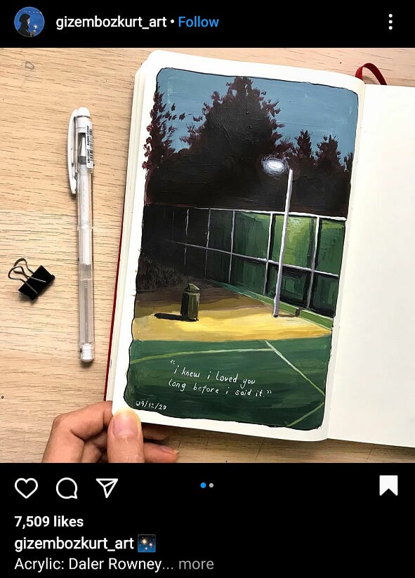
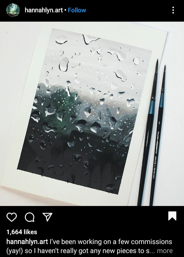
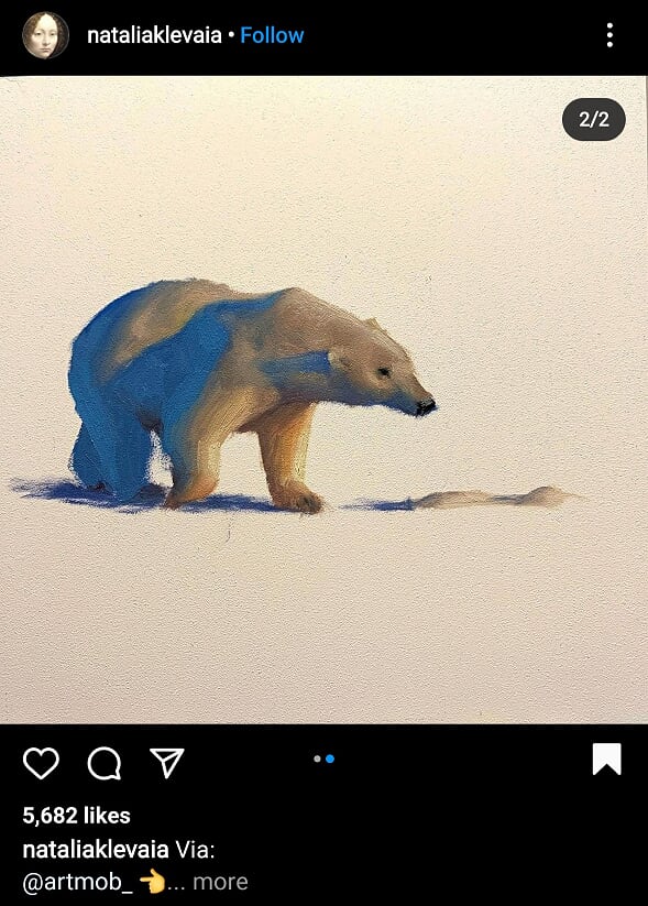
For most of these posts it was the colours that really drew me in and the water droplet one is potentially to use as a reference for some blood drops... contradicts the cute cats and stuff I know. My IllustrationNaturally thumbnails come first and I actually had a lot of these as my mail goal was to make each one look more disturbing and unsettling than the last, as well as considering framing, body language and everything else I have learned in the other parts of this project. 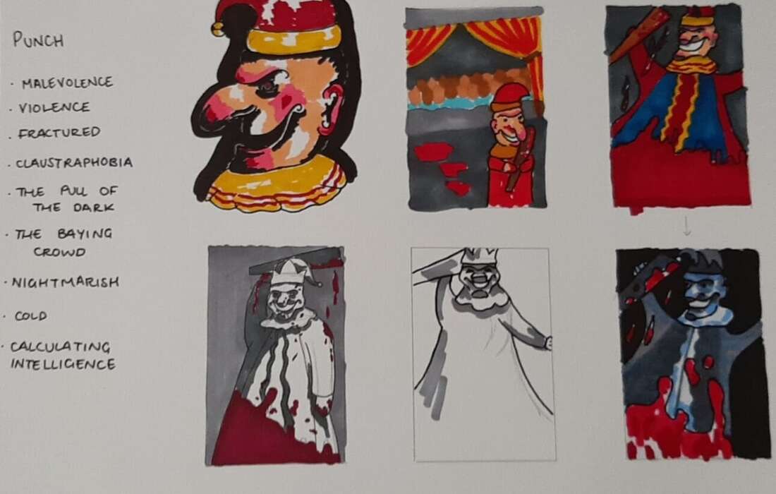 Next I did a thumbnail at full size so I could put in more details and better see what I was working towards and to be honest it is absolute nightmare fuel but I will use it as my reference when I'm painting the final version because I made sure to get the kind of tones I want particularly on the face. 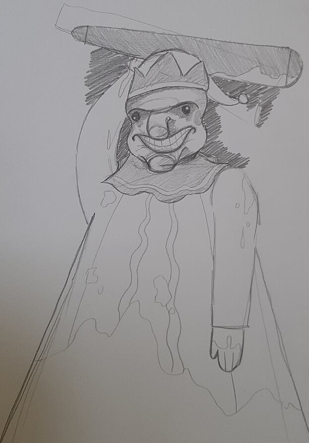 I did the sketch for the final piece in blue pencil - I know that this is far from revolutionary but I thought it would be useful since a lot of the painting will have blue tones and its easier to cover with paint than pencil marks are. 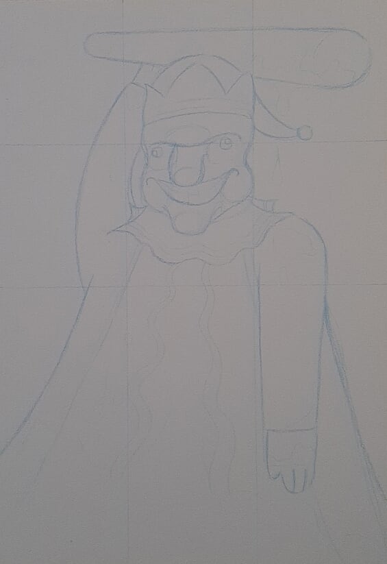 Attempt one... I just didn't get on with this painting at all, something about it just wasn't right for me so I saw no point in pressing on with it when I knew I was just going to start over. I hadn't planned on doing colours so obviously that's thrown it off massively, I don't even really know what I was thinking but anyway - an extra piece of nightmare fuel I suppose. 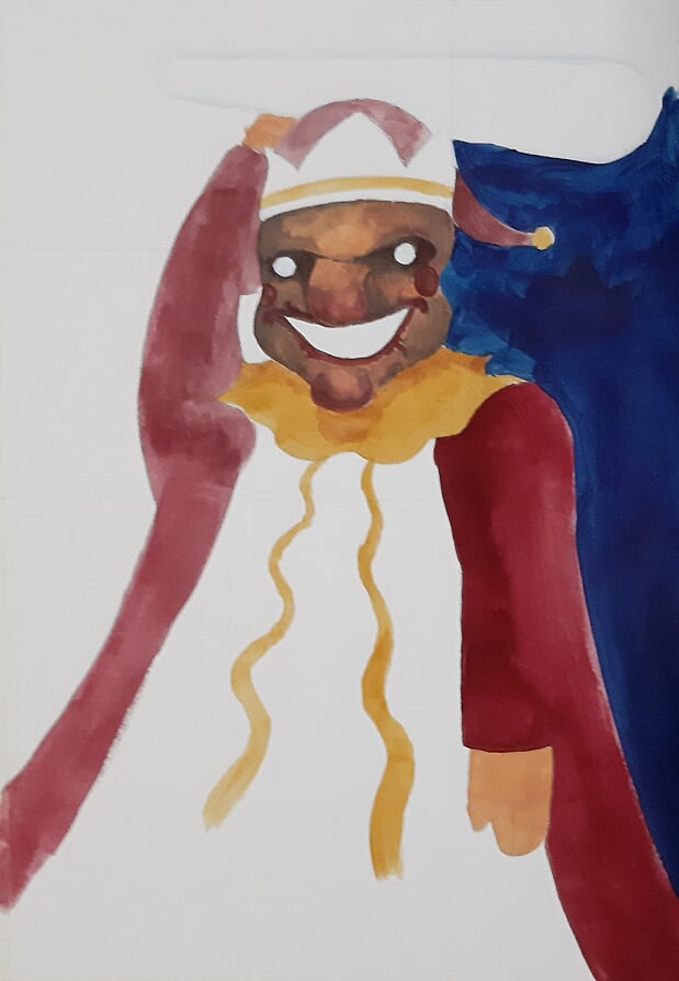 It just keeps on getting worse doesn't it. I swear this one is headed in the right direction though. I have just laid down all the flat tones and I will VERY GENTLY add some dark, dull colours into it and then completely offset that with the vivid, shiny blood. 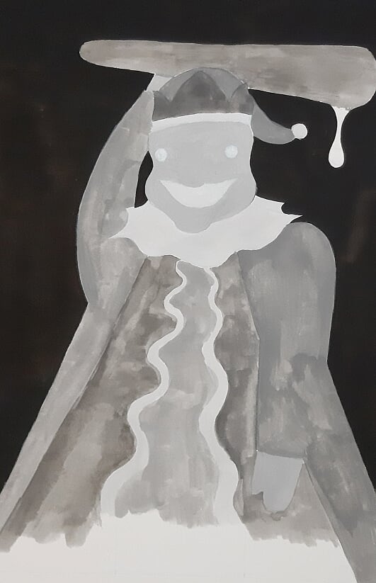 This is how the final painting turned out and I LOVE it, it came out so good and I'm so proud of it. This is just how it looks raw, just scanned in and that's it - completely untouched at this point. It isn't entirely true to life, looking at them side by side the colours of the scanned in version aren't perfect but I'll be adjusting it in photoshop anyway. 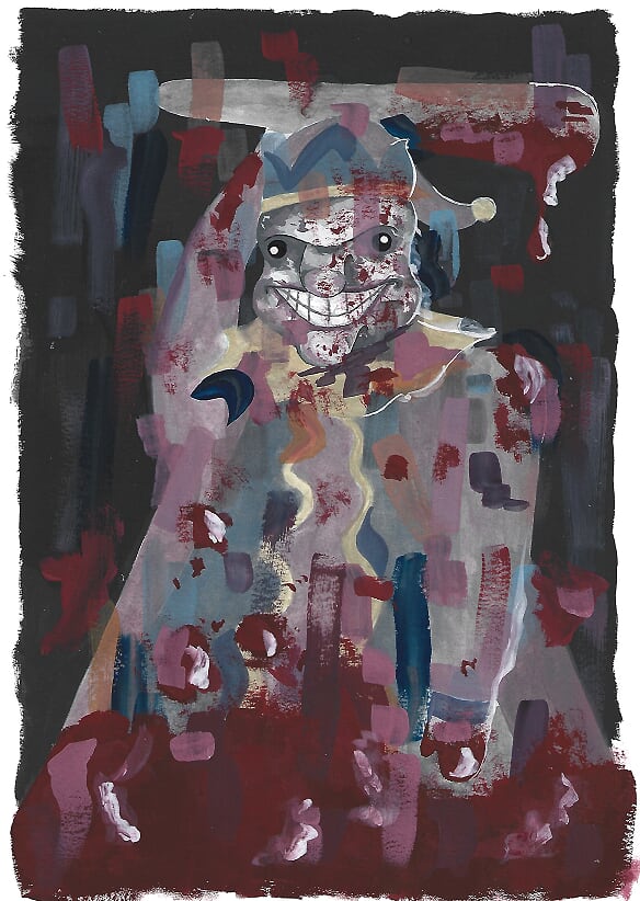 The Final Illustration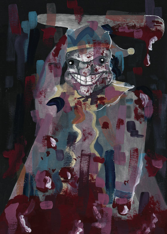 And here it is! I didn't do much to it in photoshop, obviously adjusted it to the required size and then just messed with the levels, contrast and brightness until I was happy with it. I wanted to make it a bit darker so that was my main focus and I think it turned out really great. Very proud of this piece even is the whole project just had me creating nightmare fuel. Instagram Posts of the Weeks
0 Comments
|