Week 10This week is similar to the last but this time with the focus on body language. I struggled a little bit with this one to remember that the focus was on the body language and not necessarily the dynamic poses like last time but I like the six images I've ended up with. I used jelly gouache for all of them because I've been loving using it and I find that they give off such a lovely effect that makes an unfinished image feel a little more finished. Research and Inspiration
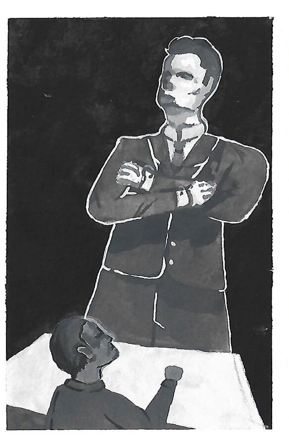
Thumbnails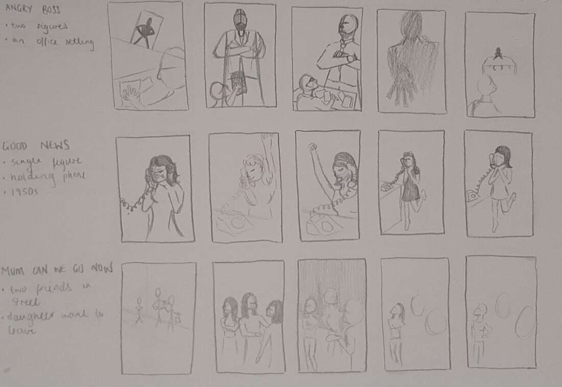 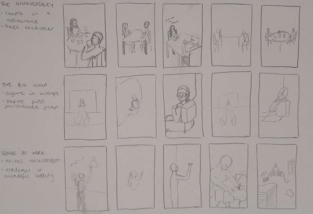 Angry Boss
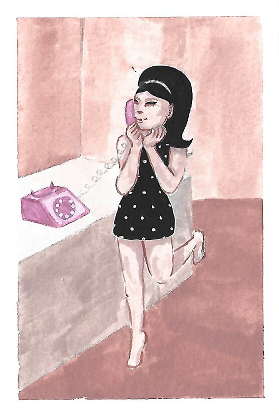
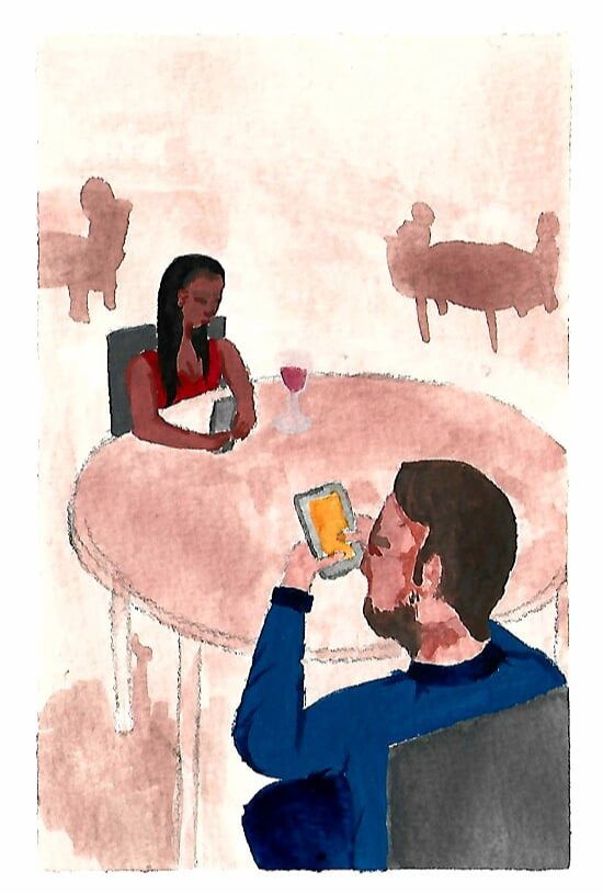
 Good News
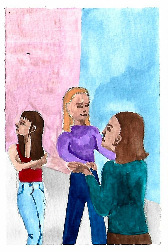
 Mum can we go now?
 The Anniversary
 The Big Jump
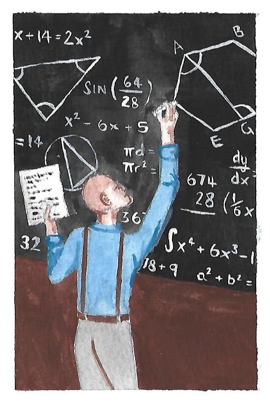
 Genius at Work
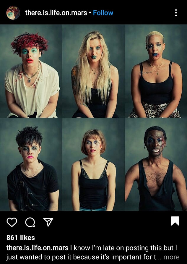
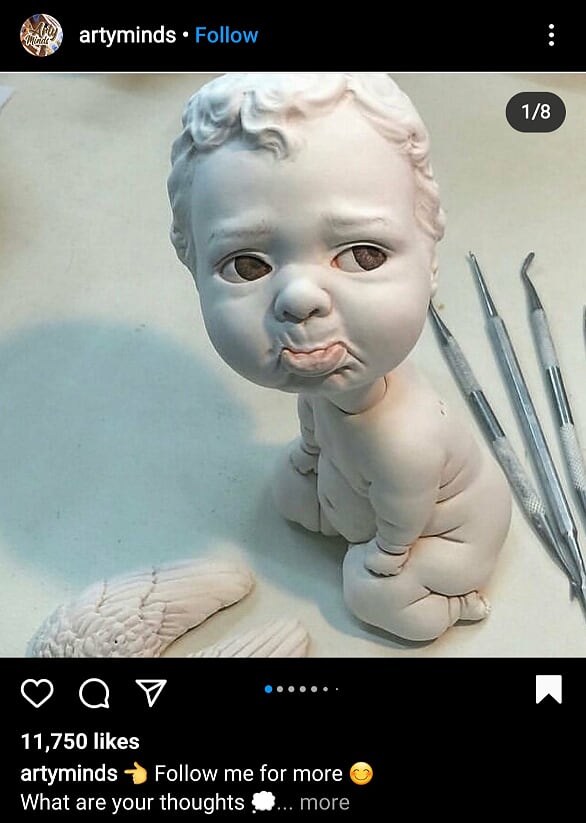
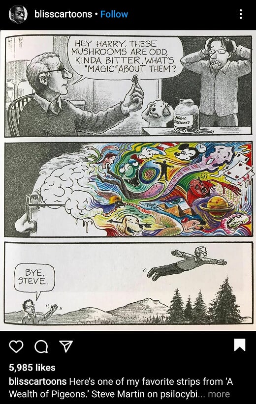
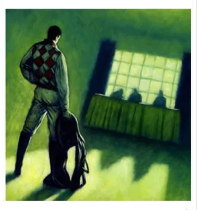
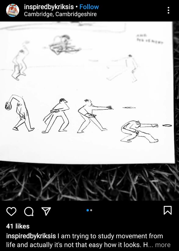
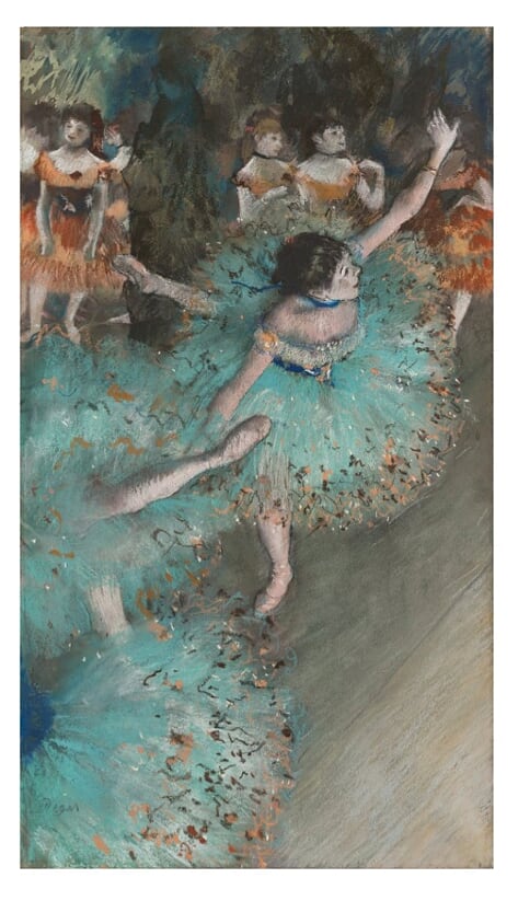
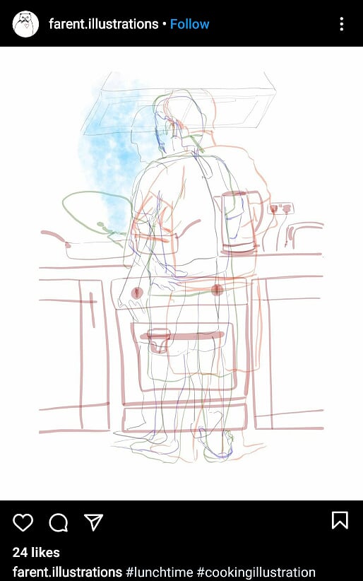
 Instagram Posts of the Week
0 Comments
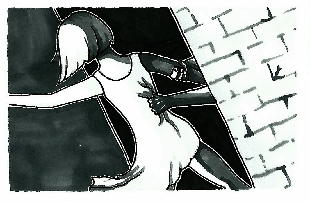
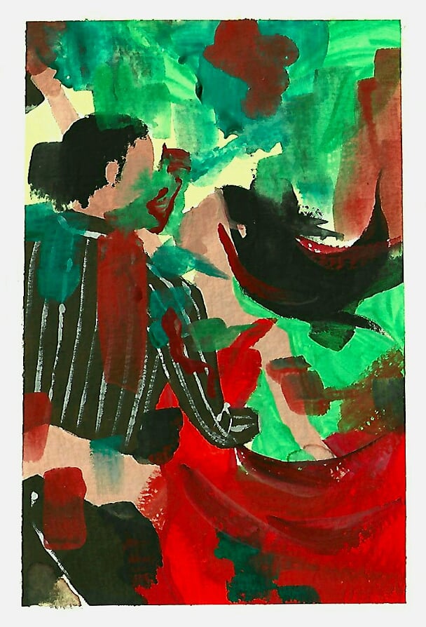
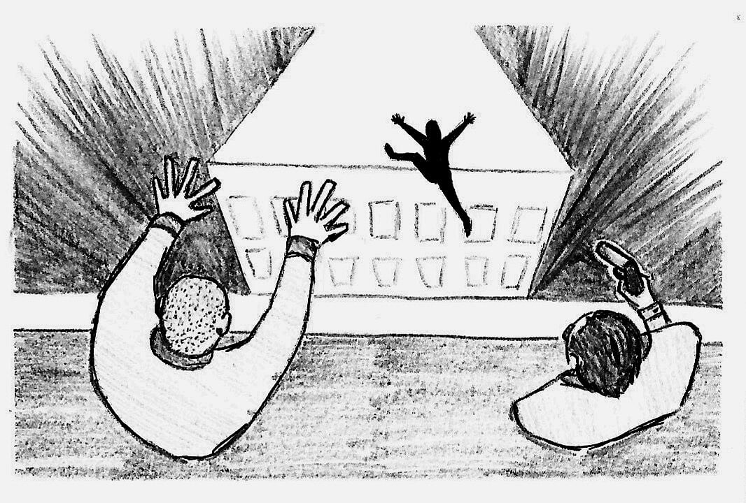
Week 9This week is about making illustrations that look dynamic and show movement but also getting the process done quickly, with the thumbnails being very quick and the resulting images taking an hour at most. Research and Inspiration
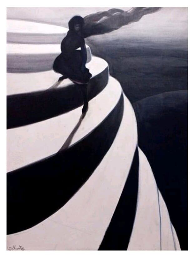
Thumbnails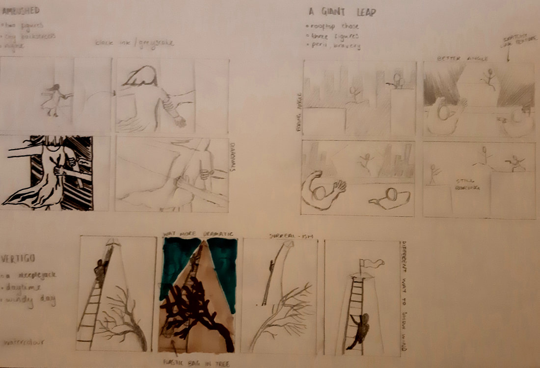 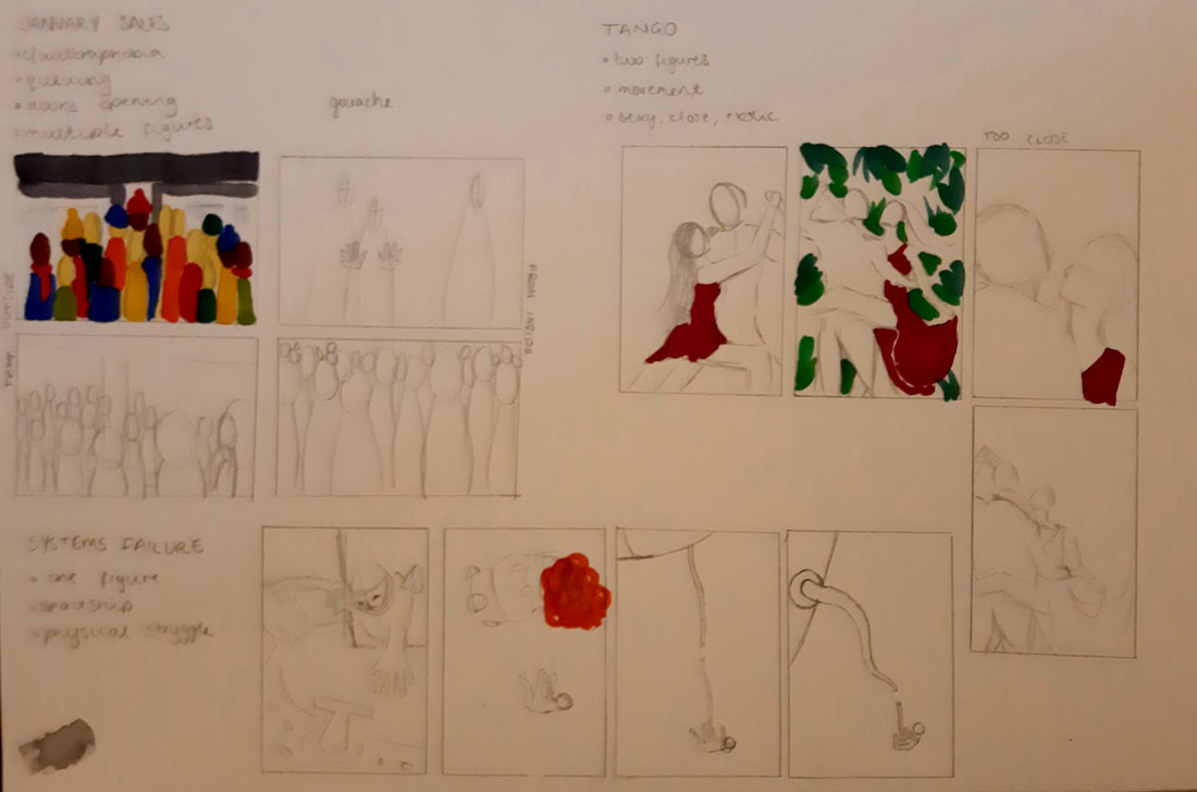 Vertigo
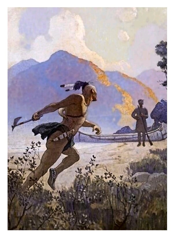
 Ambushed
 Tango
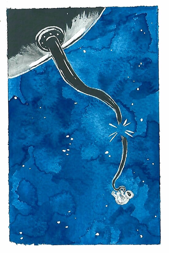
 A Giant Leap
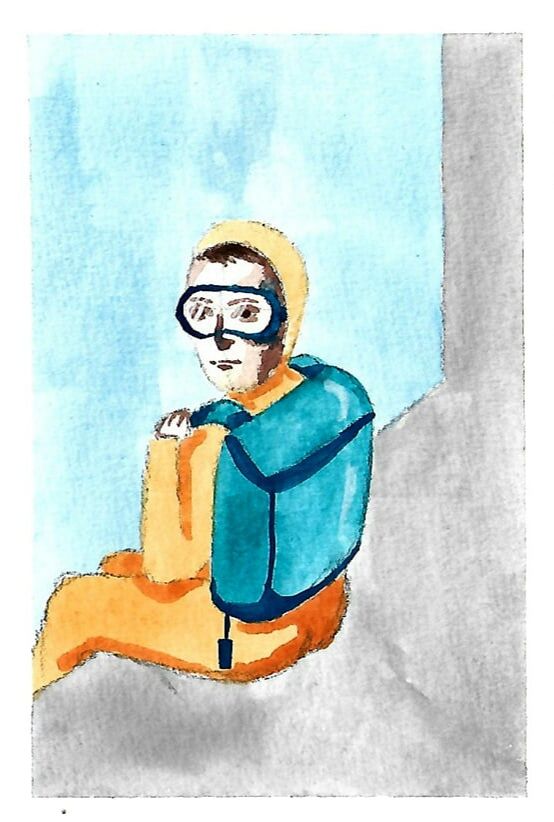
 Systems Failure
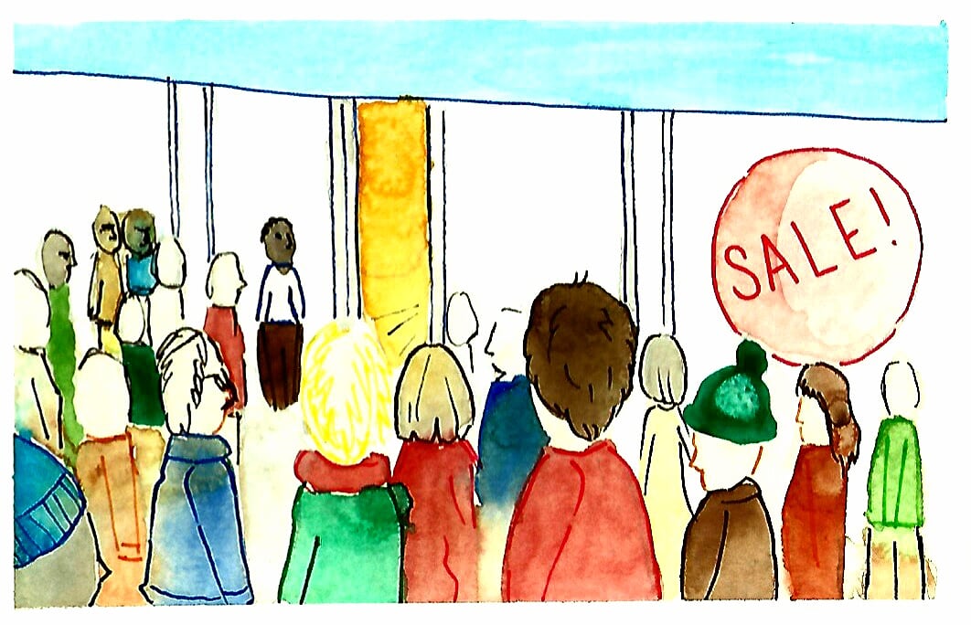
 January Sales
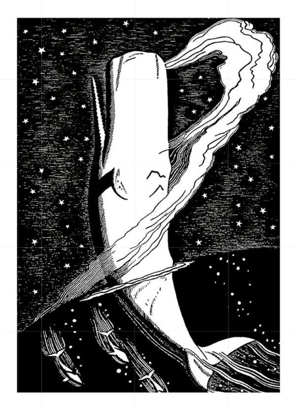
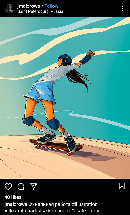
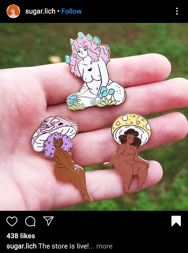
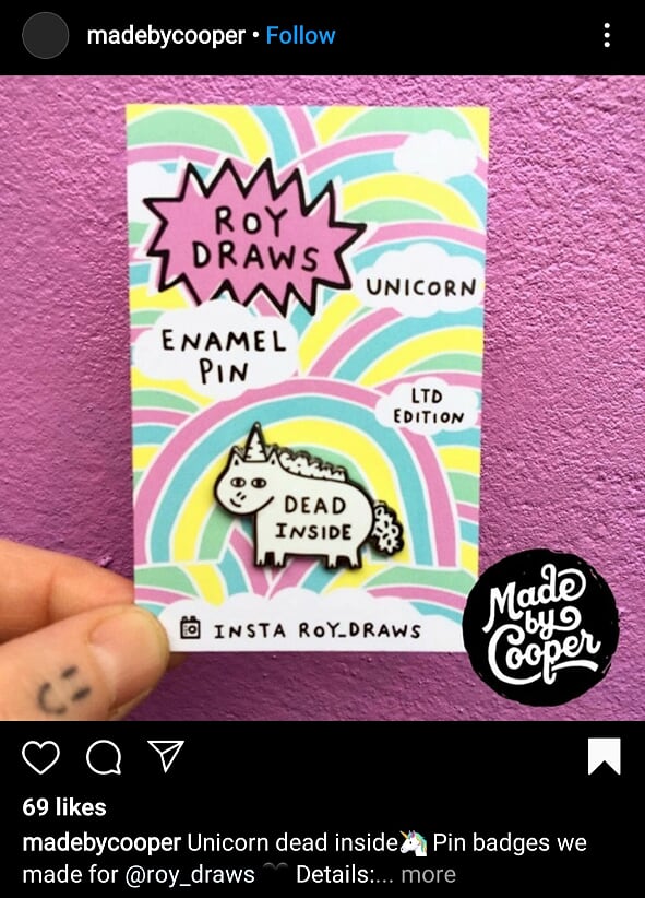
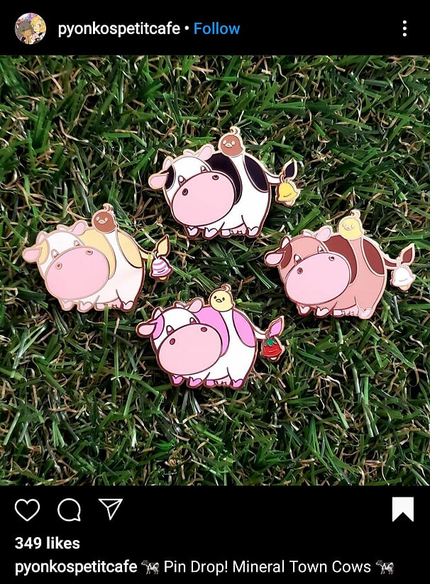
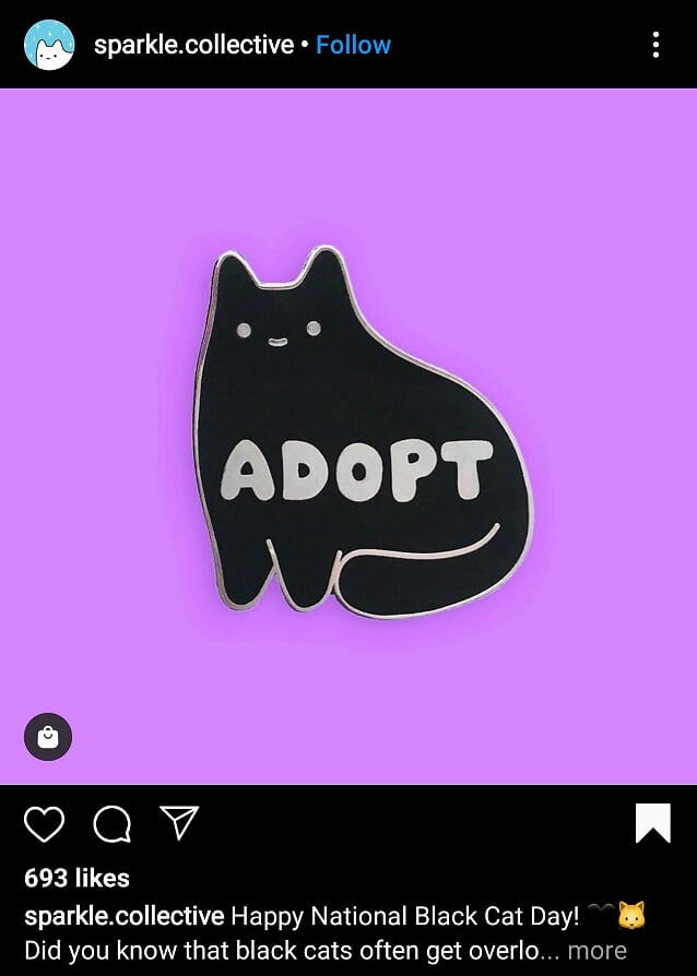
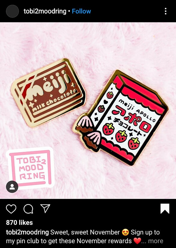
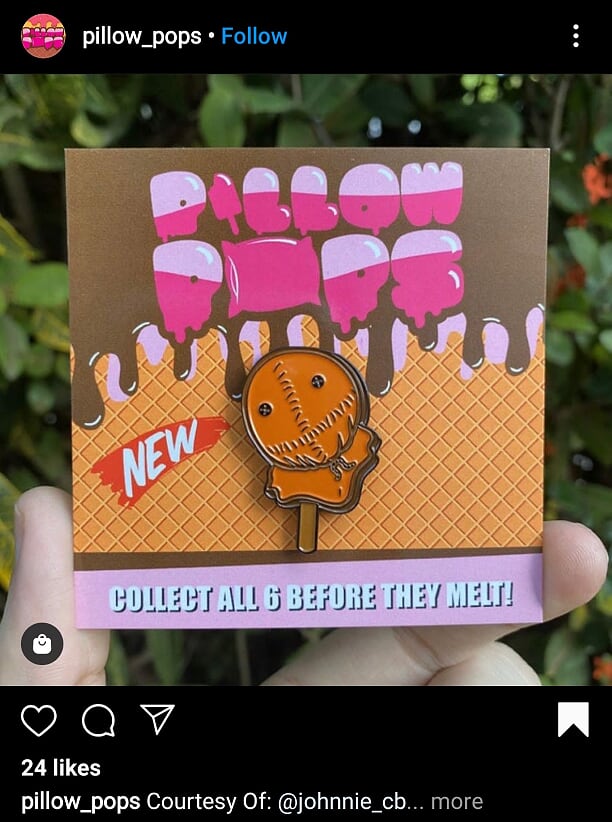
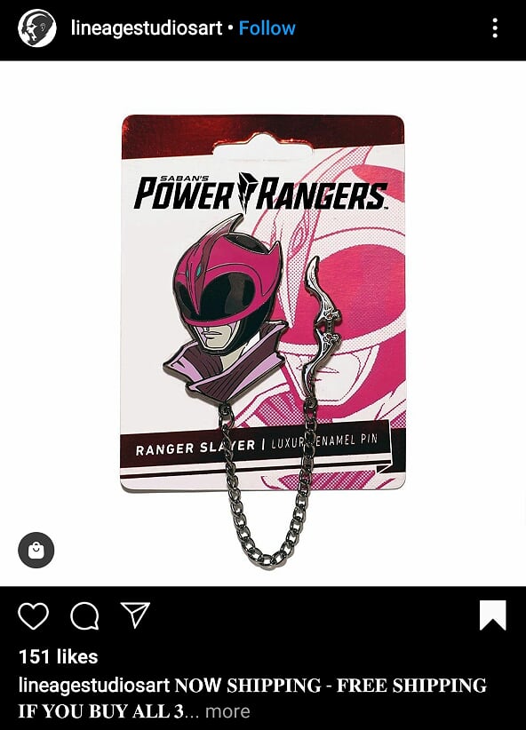
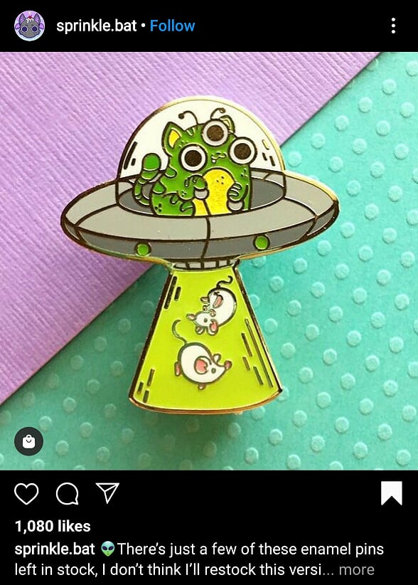
 Instagram Posts of the WeekWeeks 7 & 8Enamel Pin DesignsI love enamel pins. I have a huge collection of pins I keep on a tote bag, all of which I bought at craft fairs and that kind of thing. I think there's something so charming about them and the process of designing them since in ways you're limited to how detailed you can get on them. For my research I just gathered a load of pins and sets that I really like but not necessarily the designs I want to do. Research and Inspiration
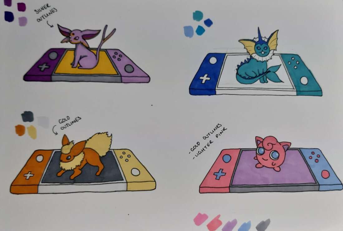
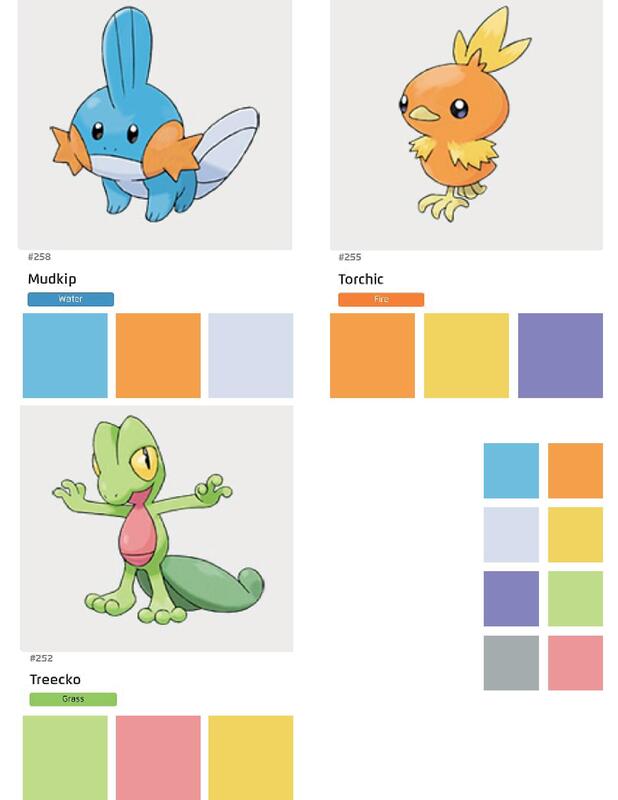
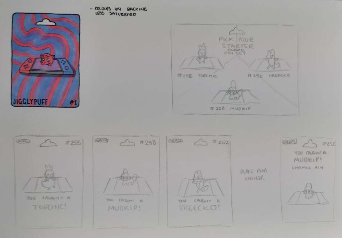
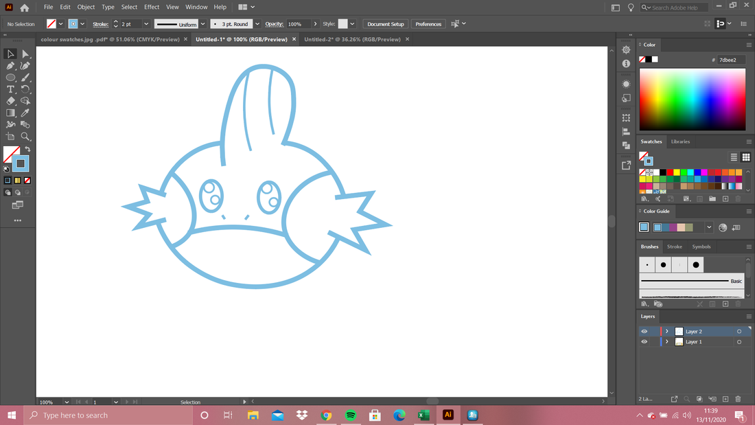
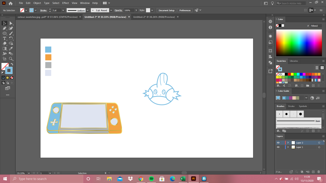
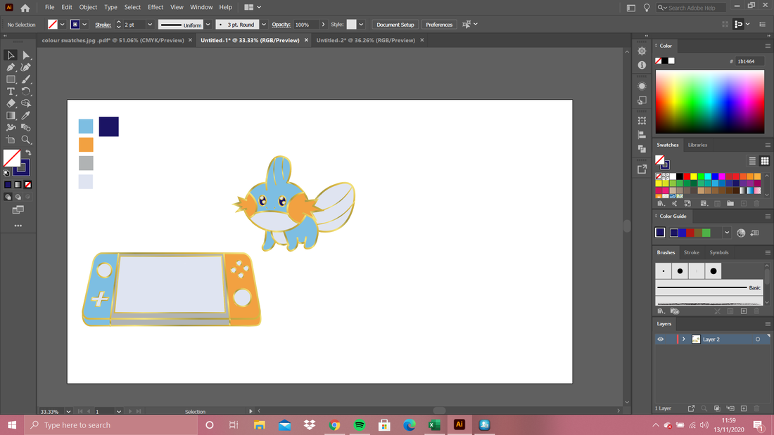
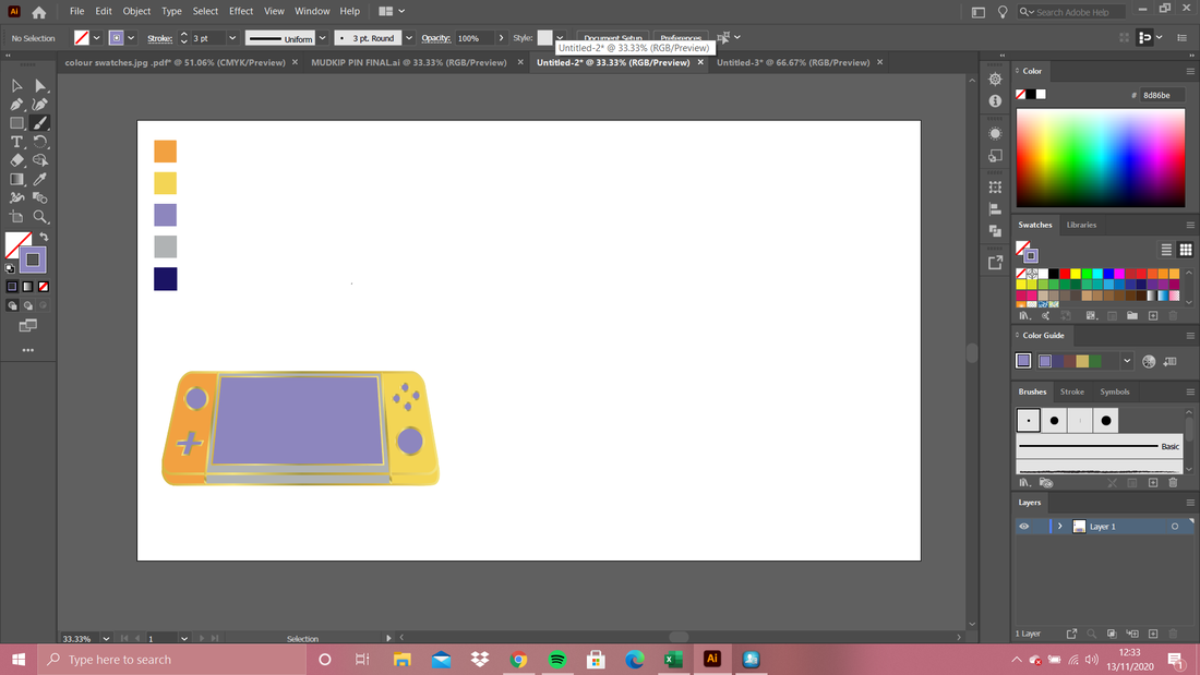
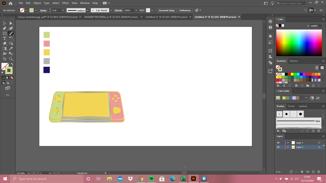
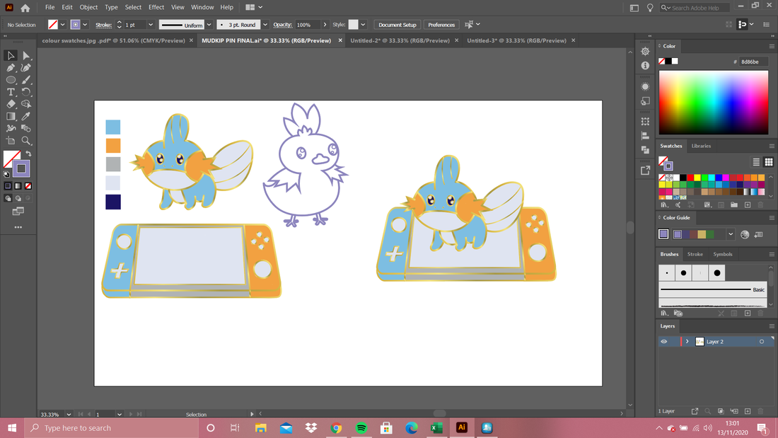
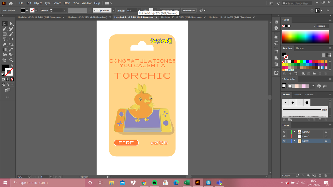
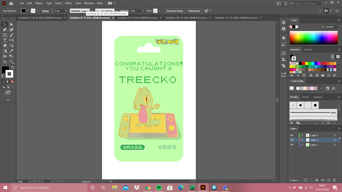
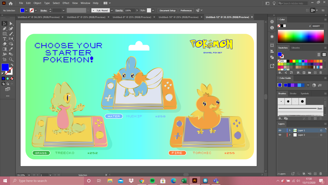
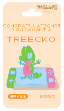
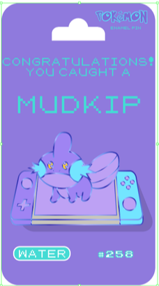
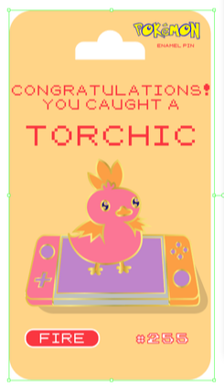
My Pin DesignsFor my pin designs I chose to do Pokémon because I recently downloaded the DLC's for the switch game and I have reignited my obsession. I didn't just want to do a Pokémon on its own though because I didn't think I could do much to make the design my own that way so I had the idea to do the Pokémon sat on the switch and incorporate the main colours of the Pokémon into the colours of the switch.
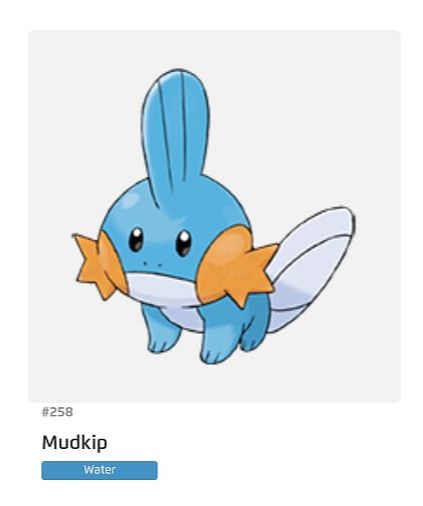
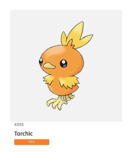
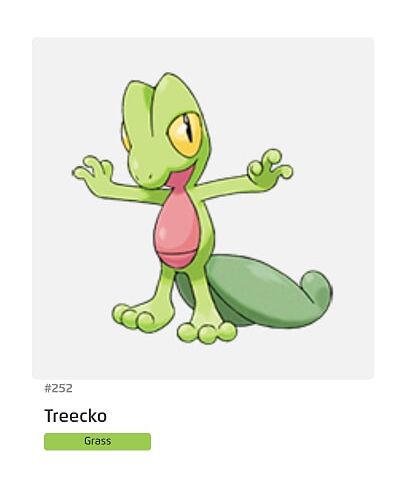
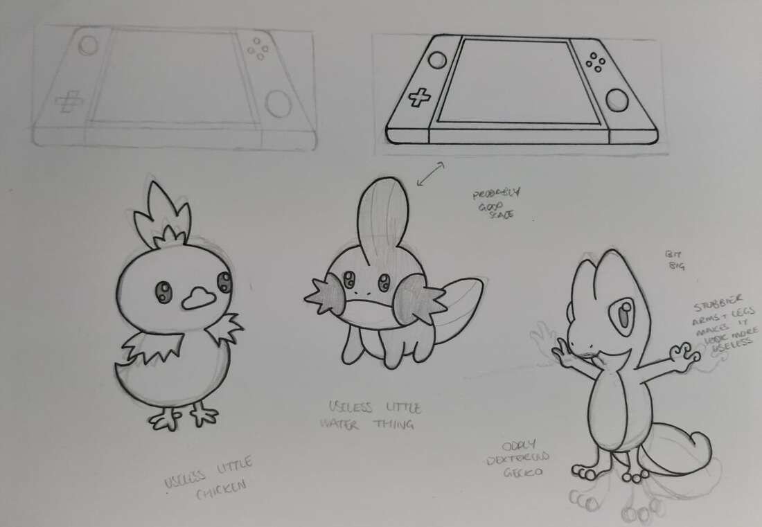
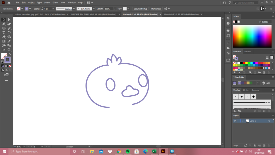
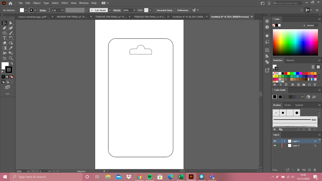
So I started off by picking my three Pokémon and I picked the Generation III starters for a few reasons, firstly because they're a set on their own and they each have a different colour scheme and theme, secondly because their designs are some of the more simple of the starter Pokémons although I did think that Treecko might be a bit more complex compared to the other two since Mudkip and Torchic are just little round useless things and Treecko has arms and a stance and generally looks more competent so I knew I would have to adjust his design slightly to make him fit in a little better with the other two. I did this on paper and sketched it out and just tweaked it until I felt it looked right. I ended up making its body shorter and fatter and making its arms and legs a lot shorter. I messed around with putting its arms down by its side but it just made it look lost so I stuck with the original pose. Once I had the designs I was happy with, I went into illustrator and picked out colour palettes for each of them. I used repeating colours - for example Torchic and Mudkip have the same orange - to tie them all in together and keep it all consistent. Below are my sketches and my colour swatches.
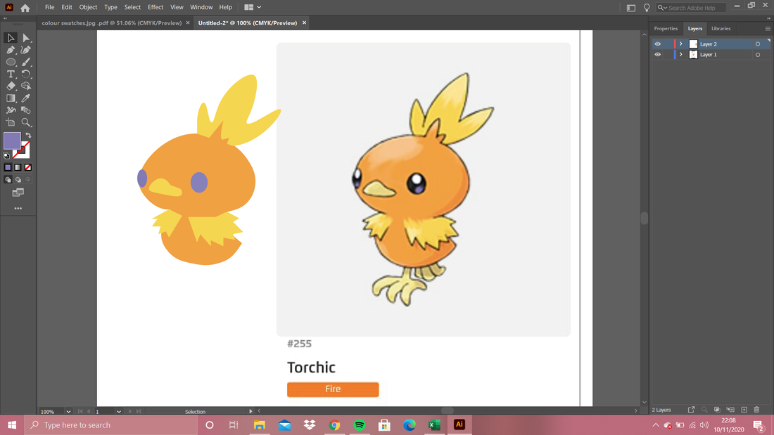
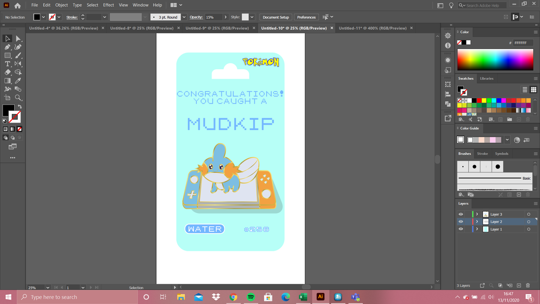
The video below is actually the only video I watched to help me with making the pins as its such a good and informative video. She also showed the colours to use in the gradient to make the metal effect lines and how to set that all up which I think was arguably the most useful part of it. All of the pictures in the gallery below are screenshots from throughout the process, each picture has a brief caption to explain what was going on at the time. 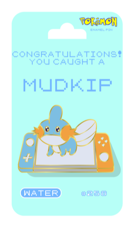 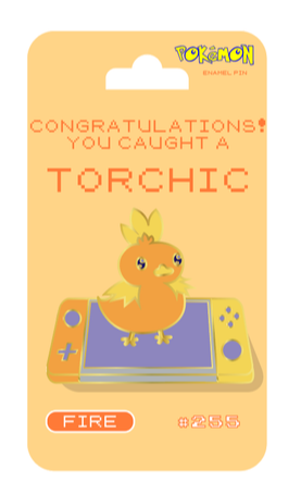 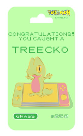 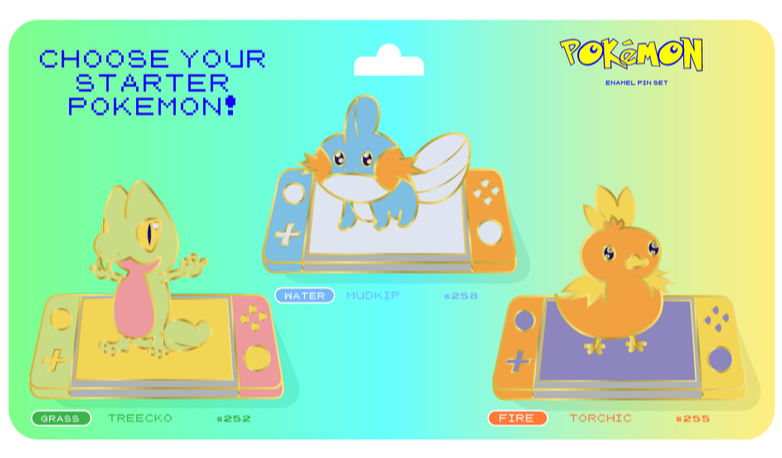 So above are my three final pin designs on their backing board and a fourth multipack set with all three on it. I think they came out really well, and they look pretty convincing. Below are some versions where I adjusted the colours just for fun, I don't think they look better than the originals but I wanted to mess around with the recolour feature and they did come out quite interesting looking.
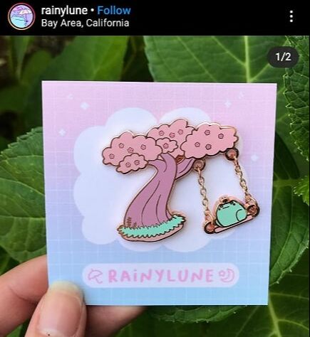
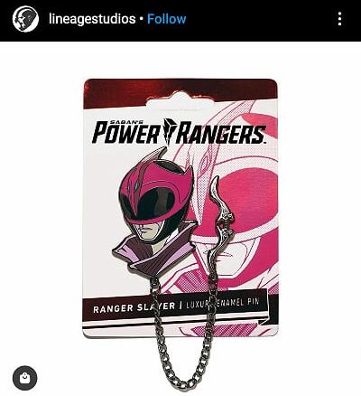
Below is a video from a channel called Shmoxd, I have watched his videos for a few years now and this project reminded me of this video of his. I would love to actually make my pins but I definitely don't have the materials needed that he used and if you get them done professionally they usually have a minimum order of 50 and I definitely don't need that many of them - but the video is pretty cool regardless. More!!!I really enjoyed using illustrator, I had more ideas and I was feeling really inspired by pins like the ones below where chain is used and integrated into the design; so I made more!
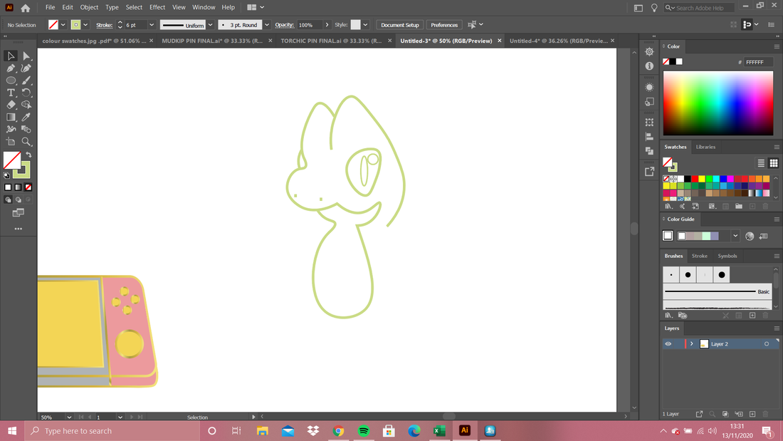
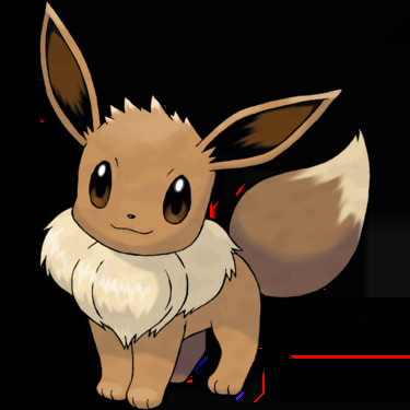
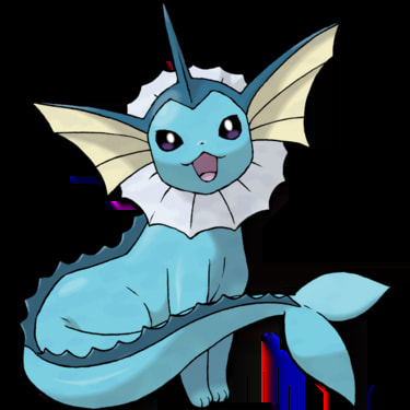
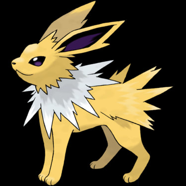
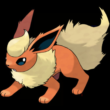
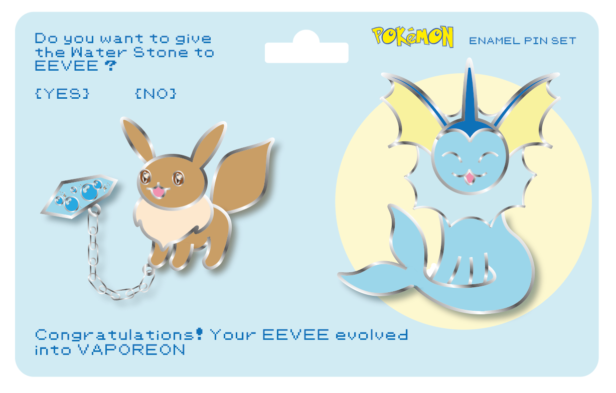
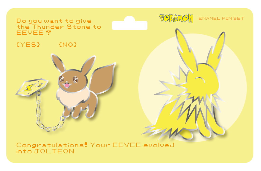
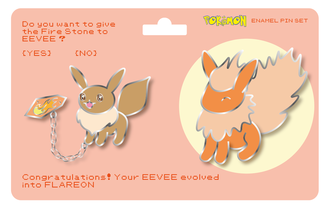
So I know that to anyone who doesn't know Pokémon this explanation will mean nothing but here I go anyway; there's a Pokémon called Eevee and in the first generation games when you wanted to evolve your Eevee you had to choose whether you gave it a fire, water or electric stone which evolves it into a Pokémon of the corresponding type. Flareon with the fire stone, Vaporeon with the water stone and Jolteon with the electric stone. (In later generations they added more stones and more themed evolutions but for now I stuck to the original three) So the concept is, on the board you get an Eevee with one of three stones attached to it with the chain as if you're going to give it to it and then on the other side of the board there's the evolved form. I used slightly different techniques to make these pins, basically just learning from and avoiding any mistakes I made on the first ones and they are definitely an improvement on the first batch. I really love these designs and I'm actually really proud of them :)
The ones above are the first versions and below are after some feedback from Dwayne - he suggested using contrasting colours for the backgrounds so I swapped them around and also added a drop shadow to the card to make it look a little bit more real. 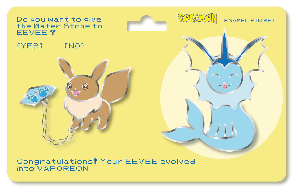 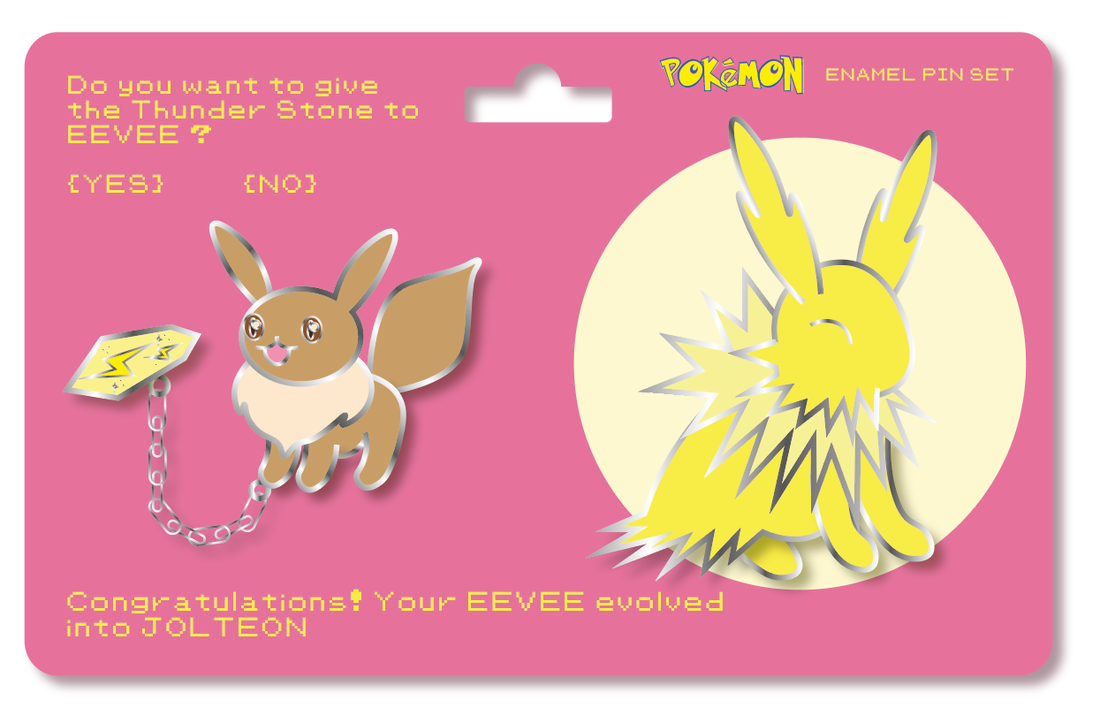 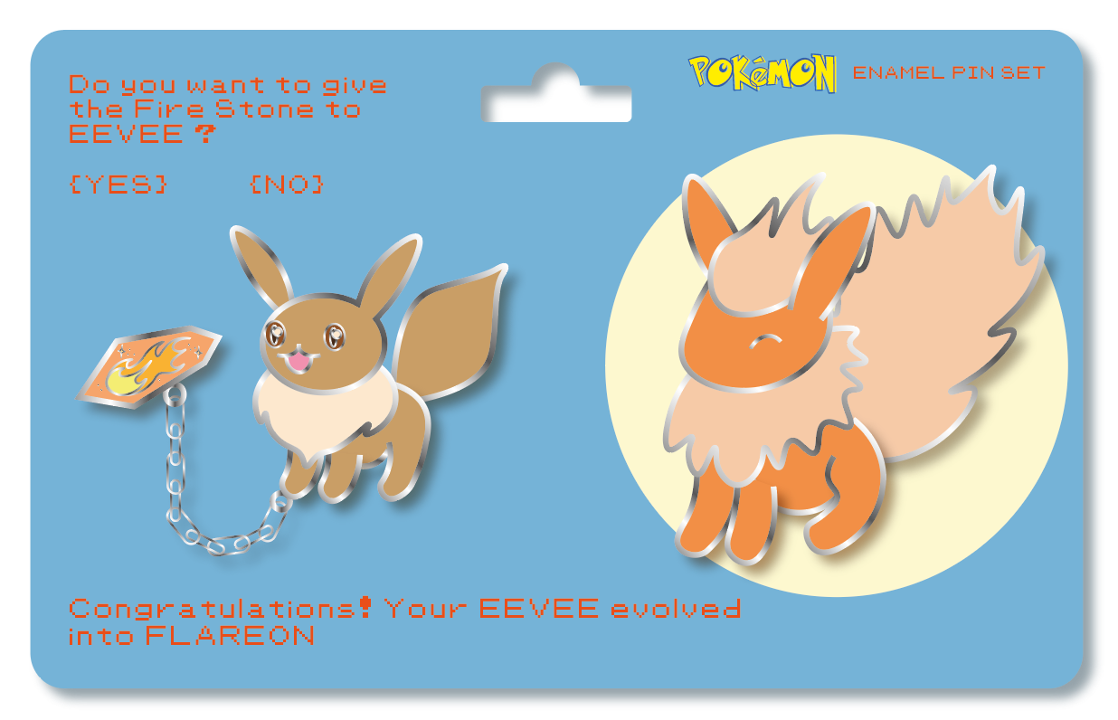 Instagram Posts of the Week(s) |